How Shooting with Gels Can Improve Your White Light Photography

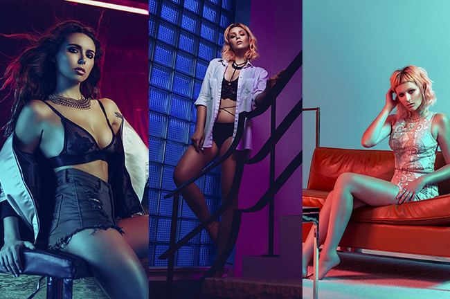
Photographer: Jake Hicks, Model: Amber Tutton
Whether you like colored gel photography or not, there’s certainly a huge amount that can be learned from using them and that knowledge can be applied to other areas of your photography to great effect.

When you start mixing multiple colored gels together in an image all sorts of variables start appearing that simply aren’t present when you shoot with white light alone.
Gels, in my opinion, are one of the most unforgiving disciplines to master in lighting. They don’t abide by the same rule book as white light, and can often create puzzling results that leave you confused. Most of our entire photographic journey revolves around shooting with white light, so to suddenly change that can be a big stumbling block for many. For a start, gels have no “correct” exposure; they laugh in the very face of light meters as their resulting appearance is based purely on your preference rather than right and wrong, and also get really crazy when they gang up. Mixing two or more gels together can create an almighty ruckus of confusing color combos that, again, disregard the rule book on what we already know about color mixing. For example, if you mix red, blue, and green gels together you get white……..wait what?!
People think, “oh, I gotta master white light photography before I play with gels”. Not true – gelled lighting is an addition to creative lighting, sure, but you can also simply use gelled lighting to see what’s wrong with your images.
So is jumping on the gelled lighting struggle-bus worth it? Sure you get some pretty pictures but it’s not for everybody. What can you learn from gelled lighting that can be applied to your regular white lighting?
Reading the Light
In this article, I aim to briefly touch on “reading the light”. I don’t have a better term for it, but what I am getting at is that I see so many badly lit white lighting portraits out there, and the photographer clearly can’t see the error with the lighting. When I say “bad lighting” I am not referring to simply my opinion of good and bad lighting; I’m referring to things like crossed shadows, underlit, dark eyes, no catchlights and etc. Yes, these rules can be broken for artistic merit but not when you’re taking classic headshots or corporate portraits – that is the time for clean flattering lighting, and not the aforementioned spaghetti junction of nose shadows and overexposed fill lights. If, however, they lit these badly lit portraits with gels, the shocking reality of how funky their lighting would be all too apparent.
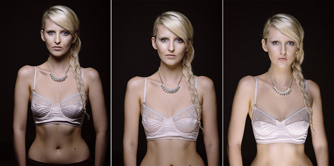
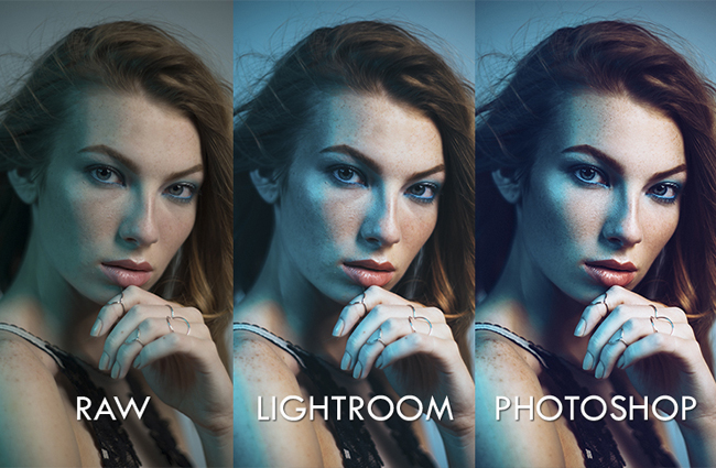
So here are three raw files of simple headshots. I’ve seen all three styles being used commercially and although there is nothing technically wrong with any of them, when they’re put side-by-side like this it should be pretty easy to see which one looks a lot worse than the others. On the left we have a single key light, in the middle, we have a key and fill light and on the right, we have the same again but with too much power on the fill. If somebody had taken this right-hand shot at my studio, it’s my opinion that they would need to be spoken to about some much-needed re-training as I feel this level of lighting is unacceptable in any situation.
Let’s just take a classic simple headshot: one key light above and a fill light below. Both lights are white light so it’s almost impossible to see where the lighting from the key light falls on the face and where the fill light falls. Chuck some gels on there and all of a sudden the reality of where each of those lights is falling is all too apparent.
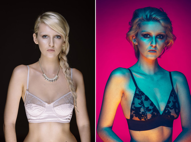
Let’s take another look at that same lighting scenario, but this time we’ll take a shot with a colored gel on the key light and a colored gel on the fill light. It now becomes a LOT more apparent as to where each of those two lights are falling on our subject’s face. We can clearly see that our orange fill light is catching some unflattering sections of the face that wasn’t readily apparent before we added the gels.
At this stage I’m not even referring to exposure and how powerful your key light should be, I’m simply talking about where the light is falling. So what exactly are we looking for? How do we know when the lighting is falling in the right place? First and foremost you need to remember is that I’m referring to lighting people and portraits – lighting is a synergy between light and pose. The best lighting in the world will look crap if the model is looking the wrong way so you have to correctly manage both but the one thing that all of this has in common is you as a photographer being able to “read the light”.
Those who have followed my work for a while or attended one of my workshops will know that I am constantly looking for “planes of light”. When I say this I am referring to having as large a section of color and tone as possible whilst still having engaging lighting. What I am trying to avoid are lots of tiny broken sections of light and color that are busy and visually confusing to the human eye which in turn detracts from the overall image.
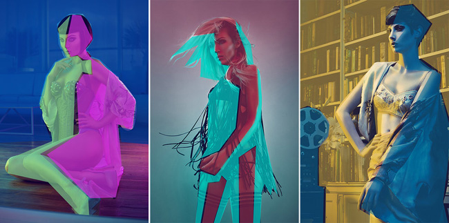
If you look at some of my work, even the most visually complicated lighting is still very clean. I always try to keep my colors clearly separated and as you see in the images above, all of the lighting in my shots is simply separated planes of light.
OK, so we’ve established that we’re looking for large planes of light and not smaller broken sections of intersecting light and shadow. Now let’s put that knowledge into practice and review some of the raw files from one of my gelled lighting workshops and see what I am looking for when I am choosing my favorite shots. Remember, I said that I am looking for large planes of color and I am desperately trying to avoid small overlapping sections of light.
Give it a go yourself with a small group of images below. Can you choose the best shots below?

Here we have a selection of raw files from my shoot. I’d like you to go through and mentally select the shots that show the best synergy between lighting and pose. Answers below.
This is a small selection and it should be relatively easy for you now that you know what you’re looking for but if you’re still not sure then let’s take a look below to see which ones I kept and which ones I discarded.

In these images above you can see which ones I kept and which ones I didn’t.
Did you get them all right? To be fair a lot of the selected ones I have already retouched and published so you might have recognized some of them subconsciously anyway. If you didn’t get them all right or you’re just curious as to why I kept certain shots in and not others, then take a look below and see that I visually describe what I am looking for with those “planes of light”.

So here are my favorites and above I’ve outlined (literally) what I’m looking for with those “planes of light”. You can see how the lighting is clearly separated by my model in these shots, she positioned herself in such a way to literally separate the key light and the fill light with parts of her body.
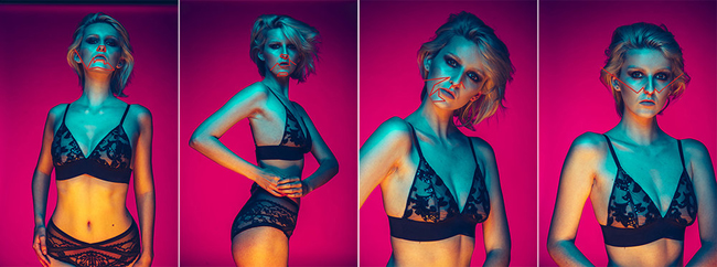
In these shots, I’ve outlined what just wasn’t working lighting wise on the model’s body. This isn’t the model’s fault; she can’t see how the light is falling on her so it’s going to be up to you to firstly know what you’re looking for, then translate that to her. You should start to see what I mean now when I say “busy lighting”. In these shots, the key and the fill light are mixing in awkward ways on the body creating patches and pools of light that are visually distracting from the shots as a whole.
I hope now that you have a better understanding of the term “clean lighting” and some of the things to look for when you’re trying to “read the light”. Granted this is only touching the surface of what great lighting looks like, but I feel it is an important lesson in learning to see the light, and gel lighting helps make that more obvious to the eye.
Bad lighting is something that is made all too apparent when using gels.
Another important point here is that it’s not just about the lighting; remember we said it’s a crucial synergy between lighting and pose. All of the shots above are taken with the same setup but it’s just how the pose interacts with that light that can make or break a shot.
So how does this apply to your regular white lighting portraits? It’s simply an exercise is seeing how the light falls on the model. Remember this crazy colored lighting above is still just a classic key and fill clamshell lighting setup, but it goes a long way to show you what that light is doing even if you can’t see it with regular white light.
Like everybody else, I spent many years shooting with my favorite “go-to” white lighting setups. It wasn’t until years later that I applied gels to those setups and saw for the first time what the light was actually doing. If you hate gelled lighting, then fine, but do not underestimate the power it has to improve your skills as a photographer with regular lighting.
If you get even remotely good with gelled lighting and then decide to never touch them again, I guarantee your white lighting skills will go through the roof.
So what do you guys think; have you played with gels yourself and found out things about your lighting that wasn’t apparent before? Are you tempted to throw some colored gels on one of your classic white light setups and see what it looks like? If you do then I’d love to hear about it.
Finally a big thank you to Amber Tutton the main model in this article. All of these lighting example shots were taken at my recent Gelled Lighting Workshop with her where I talk attendees through this “reading the light” process and how to communicate it to the model. If you’re interested in coming along for the complete breakdown and to learn everything there is to know about gelled lighting then please check out my Gelled Lighting Workshop page.
If you can’t make it to my next workshop then I have also released a 22-hour complete Gelled Lighting Tutorial video. I go over everything from studio lighting setups with gels to being on location with gels plus I also go through my complete retouching and post pro workflow. For more details and a complete breakdown of everything that’s include check out my Coloured Gel Portraits Tutorial.

Jake Hicks Photography
Having been a freelance photographer for over six years, I have been fortunate enough to be involved with some very varied and influential clients. They have chosen me to represent their companies image and ideals because my work is always about ensuring a progressive aesthetic to any given campaign, with my results always standing out for the right reasons. View more of my work on my website: www.jakehicksphotography.com.
Follow Me:


September 04, 2021 at 7:08 am, Barth said:
Hi, Very good and interesting article.
April 26, 2020 at 8:29 am, Eckhardt Kriel said:
Great article. Thanks so much!
March 25, 2019 at 11:07 am, Treats Threads said:
This is pretty awesome. I like this articel .
June 02, 2018 at 8:57 am, James Lee said:
Great article Jake! When I was in art school as a painter we used casts to study light and shadow by taking color out of the equation. Utilizing gels for photography definitely helps understanding and finessing your lights. Great work as always.
November 10, 2016 at 11:57 am, Ruud van Gaal said:
Interesting view on seeing bad lighting like that (colorized). I have used color gels but not as much as I’d like. With my hardware, it’s only an option with bare heads (or a small grid), and I tend to like larger softboxes to get softer lighting. Is it possible to colorgel larger light sources easily? Or do you mostly use quite hard heads with a small gel in front?
November 15, 2016 at 2:06 pm, Al Del Degan said:
You can buy sheets of gel material online or at most camera stores. I have a stack of different colors and they are large enough to cover a small softbox or grid.
March 25, 2019 at 11:08 am, Treats Threads said:
There you go
September 05, 2021 at 8:53 am, Joe said:
I have used large sheets of Gels by placing them in or in front of large softboxes, 24″X24″ & larger