Photographer
noel marrero
Posts: 475
Menlo Park, California, US
For photographers and models, I will provide a (most likely) serious critique. For MUAs if you have before/after images in your port. I'll do one more round before I head to bed tonight.

Model
Loona Wynd
Posts: 1282
South Portland, Maine, US
Have at it!
I am looking to trim it down to about 25 photos, and the more comments and critiques I have the better.
Photographer
4 star photos
Posts: 138
Laguna Beach, California, US
Model
Axioma
Posts: 6822
Antwerp, Antwerp, Belgium
Model
Sarah_
Posts: 1487
Los Angeles, California, US
Yes please 
Photographer
Rik Williams
Posts: 4005
Melbourne, Victoria, Australia

Ok thanks
Photographer
noel marrero
Posts: 475
Menlo Park, California, US
Loona Wynd wrote:
Have at it!
I am looking to trim it down to about 25 photos, and the more comments and critiques I have the better. Cheater, I've critiqued you before.
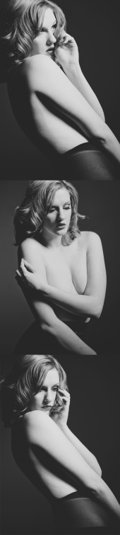
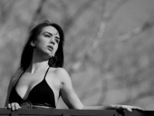
![https://photos.modelmayhem.com/photos/120712/20/4fff96f7debe6_m.jpg]()
#1 Not really my thing, but I will say that I love the way the knots in the rope accentuate the expression in the eyes and mouth. I think the pose and expression underneath all work well together.
#2 I'm not a fan of the hands out. Looks a little to much like overacted and corny B&W horror film.
#3 I like the sadness and the way you capture that with your left arm. Your right arm hanging down isn't really adding to the story IMO. Not sure what the one arm out of the cuff is saying either.
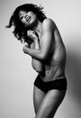
![https://photos.modelmayhem.com/photos/120712/05/4ffebee833272_m.jpg]()
Sexy, and so close to being a great capture. As it is, I think the framing negatively affects the shot. But I would say this shots shows one of your best "assets" and both this shot and the first show it well. Great soft skin, great angle, love the hand held behind the back with the flower.
![https://photos.modelmayhem.com/photos/120712/05/4ffebeb5e92c4_m.jpg]()
Doesn't really say anything. What are you think? What's that sorta smile going to mean. Don't just smile, say something. Give me a sexy smile, or a sultry smile, or seductive smile, or shy smile.
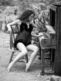
![https://photos.modelmayhem.com/photos/120714/17/50021123cf365_m.jpg]()
Very well done. Again, you did a great job adding to the story. Great position with the hands and arms. Very manikin like. The only part of the pose I would change is to get your head back a bit and elongate the neck. Otherwise, I think you are doing your job here.
Skipping ahead:
![https://photos.modelmayhem.com/photos/120713/13/5000802d75286_m.jpg]()
This is one of my favorites. I shows your shape nicely, and it's soft and sensual. Simple but well executed, great capture.
Overall, I appreciate that you like the fetish and nude work. But make sure the work is not just about skin. I'm not seeing a lot of range in your shots. I like that you went for it on the express in the third one in your fetish set. Due to the tight cropping I can't see what you are really doing. And I don't feel with all that black that it's very well lit.
With your poses, make sure your hands and arms are correctly visible and not to far into or two far away from the camera. Moving hands and elbows into the camera will make them appear larger and disproportionate. Putting your hands on your hips with your thumbs back, makes it look like you are cutting of fingers.
Try to get some more variety in your port than just dark on dark. As I said, I think the blue lingerie is my favorite. Don't be afraid of the light!
Photographer
noel marrero
Posts: 475
Menlo Park, California, US
KW pictures wrote:
I'll be keen to play. This will be tough, shooting outdoor is NOT my strong suit.
![https://photos.modelmayhem.com/photos/120713/20/5000eadda7a83_m.jpg]()
That is just lovely, I wish I'd taken. Great model choice, I love the definition you get while still having it so sensual. Great back lighting, great pose. Love the skin tone.
![https://photos.modelmayhem.com/photos/120711/00/4ffd265ecbc5b_m.jpg]()
This one looks under exposed, causing red discoloration. Looks like she could use some fill. You must have brightened up the hair is post, because it looks very nice. More light in the face and eye would really brighten them up and help them pop more, otherwise they look a bit dull/dead. I don't like the outfit choice, it's too loose on her and hides her shape. In any case, the tree looks nice and sharp, and well exposed, but I want her to pop, not the tree.
![https://photos.modelmayhem.com/photos/120706/17/4ff783476f8b8_m.jpg]()
Okay, that's two. I really need to head down there and shoot her, she's just got this really natural thing going. Now this shot isn't as solid. The first shot had some minor croping of the fingers which I let go because otherwise it was such a good image. However we really loose her fingers and arm in this one. But again, great exposure, otherwise great pose, she's amazing.
![https://photos.modelmayhem.com/photos/120704/00/4ff3ef5d86f3b_m.jpg]()
Another great model choice. Love the backlighting, love the yellow color. The pose looks a bit artificial (and a bit like going to the bathroom). Don't get me wrong, she looks great, but I though I'd mention it before someone else does. I like that the pose tries to get that classic S, but I don't like what it's doing to the hands and arms or how the arm covers the upper body.
Skipping ahead:
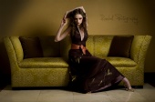
![https://photos.modelmayhem.com/photos/120603/13/4fcbc9073abd5_m.jpg]()
Unlike most of the other shots, this one feels a bit over post IMO. The eyes are popping a bit too much, skins looks unnaturally soft in the face, the lipstick looks a bit too pink. Not a fan of amputating the knees.
Overall I really love your portfolio, wishing I had some of those in mine. You've got some excellent model choices for the poses and environments you are shooting. Some images felt a bit under exposed causing a bit of discoloration, but otherwise good detail on dark areas like hair. Shoot wider then crop in, you are loosing toes and body parts.
Photographer
noel marrero
Posts: 475
Menlo Park, California, US

Model
Jem Iredale
Posts: 1769
Merrimac, Massachusetts, US
Do you have time for just one more? >_
Photographer
noel marrero
Posts: 475
Menlo Park, California, US
Sarah_ wrote:
Yes please First, so how many book covers are you on? Big fan of SciFi and Fantasy so a signed copy would get a loving home.
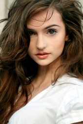
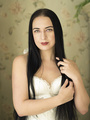
![https://photos.modelmayhem.com/photos/110204/22/4d4ce9ed6721a_m.jpg]()
Great shot. Love the feeling, the far away, external look. I like how you extend the neck and how it adds to this. In contrast, the bottom has more of an introverted look. Again, great job adding to this with the shortened neck thanks to the the head tilt, soft shoulders, and arms turned in. The both feel very natural.
![https://photos.modelmayhem.com/photos/091220/20/4b2ef3990a389_m.jpg]()
As you mentioned yourself, the porcelain look works great for you. I love the middle image. The head down, the look, the pose all give a great sense of personality. The look on the left is not as strong IMO, although part of the problem is the crop which prevents you from using the rest of your body to add to the relaxed look. Instead we get a bit too much tension in the shoulders IMO. The right one has a bit too much tension in the mouth, and not enough expression.
![https://photos.modelmayhem.com/photos/090401/10/49d39fadc24bb_m.jpg]()
Oh my, those are long legs. Looks great from the waist down, although the top is a bit too baggy IMO and looses the shape, but not much you could do about that. On the other hand the feet a just a tad pigeon toed. I would have preferred a slightly different stance, perhaps wider for stronger/power, or knee bent for more on the "cute" side. As it stands I can't tell what the images is trying to say, if it is fashion, or editorial.
![https://photos.modelmayhem.com/photos/120219/13/4f416bf257925_m.jpg]()
Very well executed. While the bottom look is a touch cliche, the lop left image is especially moving. I love the big sad eyes, the slight tension in the eyebrows and lips, as if you are holding back the tears.
![https://photos.modelmayhem.com/photos/110527/00/4ddf4ed74b8ae_m.jpg]()
A bit too much grey for my tastes, makes it feel a bit washed out. May have been a mid day shot for all I know so maybe the original is. Love the look, the head tilt. Not a huge fan of what you are doing with the hand, especially since you are getting it closer to the camera than your face and there is an awkward bend at the wrist. While I see the story in the eyes and head, I don't see it in the rest of the body, but again hard to add with the crop the way it is. It's a bit different that the other shots, so I see why you've kept it, but it's probably one of the weaker ones IMO thanks to image quality.
![https://photos.modelmayhem.com/photos/090513/11/4a0b150fd69b4_m.jpg]()
Very mischievious. Very Breakfast at Tifany's. Wonderful expression. Unfortunate that the capture looses all detail due to shooting into the sun, could have used some fill to help fight the sun. But your part of it is excellent.
![https://photos.modelmayhem.com/photos/091102/18/4aef98a36db5f_m.jpg]()
Very nice. Great expression, wonderful connection with the viewer.
![https://photos.modelmayhem.com/photos/101219/10/4d0e4eababce9_m.jpg]()
I don't think this image is really doing anything for you. The expession isn't saying anything, the post is fairly bland. The shot isn't really saying anything to me and the image quality is a bit low for my tastes. I would consider cutting it.
![https://photos.modelmayhem.com/photos/091213/00/4b24acaf724eb_m.jpg]()
Like the way you extend the leg in this pose. Looks interesting, and a bit dramatic.
Overall I think you have a great port. Wouldn't hurt to cut a couple of the lower quality images, but shows good strength. I feel I know what I would get if I shot with you. On the flip side, I think that also says that you seem to be shooting in your comfort zone. While the port has a decent amount of variety it doesn't have a lot of extremes. You could consider shooting a bit more into those extremes, especially the darker ![https://assets.modelmayhem.com/images/smilies/scary.png]() side if you are looking for growth or starting to feel bored. side if you are looking for growth or starting to feel bored.
Photographer
noel marrero
Posts: 475
Menlo Park, California, US
Rik Image wrote:
Ok thanks ![https://photos.modelmayhem.com/photos/120210/01/4f34e79a0838b_m.jpg]()
Simple yet beautiful.
![https://photos.modelmayhem.com/photos/120703/07/4ff2fced48532_m.jpg]()
Again, simple yet well executed.
![https://photos.modelmayhem.com/photos/120703/03/4ff2c8ed7b8b3_m.jpg]()
Here the eyes look a touch glassy, and the expression isn't moving me. Feels a bit too much like a straight forward headshot just run through auto-editing. I think you can stand to lose this one.
![https://photos.modelmayhem.com/photos/120222/23/4f45f109218b1_m.jpg]()
I like the concept, but I think the execution has a few issues. I find the corner of the floor at the bottom left distracting. It looks like it's shot against seamless except for this one piece which distracts while not being interesting. A more interesting background, or just no visible background would be better IMO. The pose is also not particularly strong. The large curve in her back means she looses some of the curves you want, while projecting her normally non-existent belly forward. The head tilt, and eye connection, and expression are otherwise dead on.
![https://photos.modelmayhem.com/photos/120617/18/4fde7ef8c68a5_m.jpg]()
great pose, love the hear. Great feeling of action and emotion.
https://www.modelmayhem.com/portfolio/p … 5#26491979 18+
Great job. Love the story, love the lighting.
Overall an exceptional port. I love when you tell a story which is most of the time. The other times, I think you sometimes go just a bit to far with the post, at least for my tastes, perhaps because there's not enough other stuff there. My last bit of critique is that you keep shooting one of your models up the nose _ I think the shape of her nose would be a bit more flattering if the chin was down more.
-Noel
Photographer
noel marrero
Posts: 475
Menlo Park, California, US
Jem Iredale wrote:
Do you have time for just one more? >_
Model
Loona Wynd
Posts: 1282
South Portland, Maine, US
noel marrero wrote:
Cheater, I've critiqued you before. true, but sometimes there are things not said. Besides. You could have skipped me :-p
noel marrero wrote:
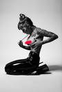
![https://photos.modelmayhem.com/photos/120712/20/4fff96f7debe6_m.jpg]()
#1 Not really my thing, but I will say that I love the way the knots in the rope accentuate the expression in the eyes and mouth. I think the pose and expression underneath all work well together. The knots were designed by my fiance.
noel marrero wrote:
![https://photos.modelmayhem.com/photos/120712/05/4ffec1d5e7332_m.jpg]() #2 I'm not a fan of the hands out. Looks a little to much like overacted and corny B&W horror film. #2 I'm not a fan of the hands out. Looks a little to much like overacted and corny B&W horror film. I was going for fear and horror. I think it was successful.
noel marrero wrote:
18+#3 I like the sadness and the way you capture that with your left arm. Your right arm hanging down isn't really adding to the story IMO. Not sure what the one arm out of the cuff is saying either. I was a bit confused at the photographers choice to have one hand bound and the other not, but I didn't argue.
noel marrero wrote:
![https://photos.modelmayhem.com/photos/120712/05/4ffebee833272_m.jpg]()
Sexy, and so close to being a great capture. As it is, I think the framing negatively affects the shot. But I would say this shots shows one of your best "assets" and both this shot and the first show it well. Great soft skin, great angle, love the hand held behind the back with the flower. That seems to be a site favorite. One photographer mentioned their issue with the shot is that one of the feet is cropped out of the shot. I might have to agree, but I do like the story it tells (which is what the photographer was going for).
noel marrero wrote:
![https://photos.modelmayhem.com/photos/120712/05/4ffebeb5e92c4_m.jpg]()
Doesn't really say anything. What are you think? What's that sorta smile going to mean. Don't just smile, say something. Give me a sexy smile, or a sultry smile, or seductive smile, or shy smile. I was trying for a seductive smile.
noel marrero wrote:
![https://photos.modelmayhem.com/photos/120714/17/50021123cf365_m.jpg]()
Very well done. Again, you did a great job adding to the story. Great position with the hands and arms. Very manikin like. The only part of the pose I would change is to get your head back a bit and elongate the neck. Otherwise, I think you are doing your job here. I was assigned the part of a porcelain doll. It was a very fun shoot.
noel marrero wrote:
Skipping ahead:
![https://photos.modelmayhem.com/photos/120713/13/5000802d75286_m.jpg]()
This is one of my favorites. I shows your shape nicely, and it's soft and sensual. Simple but well executed, great capture. The other two shots of that outfit didn't work because of the shoes and other pose issues.
noel marrero wrote:
Overall, I appreciate that you like the fetish and nude work. But make sure the work is not just about skin. I'm not seeing a lot of range in your shots. I am working on getting a range of emotion and styles. I have come a ways.
noel marrero wrote:
I like that you went for it on the express in the third one in your fetish set. Due to the tight cropping I can't see what you are really doing. And I don't feel with all that black that it's very well lit. Its a "self paddling" shot. I was trying to show the toy in use and how it would feel. The do think that it could have been lit a bit differently.
noel marrero wrote:
With your poses, make sure your hands and arms are correctly visible and not to far into or two far away from the camera. Moving hands and elbows into the camera will make them appear larger and disproportionate. Putting your hands on your hips with your thumbs back, makes it look like you are cutting of fingers. I will take that into consideration. I am trying new things with poses and I am working on getting my flexibility back up.
noel marrero wrote:
Try to get some more variety in your port than just dark on dark. While I do like dark lights in some situation, I think some of the shots are a bit too dark.
noel marrero wrote:
As I said, I think the blue lingerie is my favorite. Don't be afraid of the light! I am not afraid of light. I just seem to have photographers that want to try dark and creative lighting.
Photographer
noel marrero
Posts: 475
Menlo Park, California, US
Jordan Bunniie wrote:
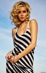
Sure ![https://photos.modelmayhem.com/photos/120625/03/4fe83a409a55b_m.jpg]()
Just a beautiful headshot. Great connection with the eye. Nice softness in the lips.
For this one: https://photos.modelmayhem.com/photos/1 … 76a356.jpg 18+
I think it's a good shoot. I like your pose. Good toe point, almost symmetric on the arms. I unfortunatley find the light hot spot distracting.
The next shot with you on the chair, also distracting with the background, otherwise nice shot.
![https://photos.modelmayhem.com/photos/120610/23/4fd58e58c0928_m.jpg]()
Quirky but weaker IMO. The next couple shots are not as strong as I would like to see in your port and considering how many shots you have you can afford to trim.
For example, a shot of you holding a big leaf doesn't make art IMO. It's just a shot of you holding a big leaf. And some of the environmental nudes are not correctly exposed to your skin, so while the environment detail might be nice, you are blown/washed out.
https://www.modelmayhem.com/portfolio/pic/26987203 18+
Another example of not quite there. The expression is doing much. It's nice that you are bendy, but the knee bend and the foot ruin the curve of the pose.
Two shots down the army cap with garters on the other hand has simpler poses but they are more solid and the expression helps deliver the story and character.
https://www.modelmayhem.com/portfolio/pic/28474084
Now there is a great pose. Unfortunately the capture and post work are not on par with the pose, but great bend and nice extension in the leg.
https://www.modelmayhem.com/portfolio/pic/26233518
Again great extension in the leg.
![https://photos.modelmayhem.com/photos/120421/17/4f9354f705762_m.jpg]()
Beautiful. Great softness in the face. Nice job add innocence to the shot.
Overall, you have some great curves in your poses. You have good extension but you don't always use it. You have a pretty reasonable range of expression, but you don't always hit it as hard as I'd like.
Basically I think the photos are a hair inconsistent, and you should stretch yourself a bit. Really focus when you give the pose, make sure it solid and don't count on the photog to find an correct it. A bit more emotion in the expressions could be good. The more neutral feel works for the art shots, but for the rest I want more emotion for the story.
In any case, I think you could trim the port down a bit and make a stronger one out of it. Would love to shoot with you, hope you head out to the Bay Area.
Photographer
__V__
Posts: 108
Saint Louis, Missouri, US
Model
Jordan Bunniie
Posts: 1755
Salt Lake City, Utah, US
noel marrero wrote:
![https://photos.modelmayhem.com/photos/120625/03/4fe83a409a55b_m.jpg]()
Just a beautiful headshot. Great connection with the eye. Nice softness in the lips.
For this one: https://photos.modelmayhem.com/photos/1 … 76a356.jpg 18+
I think it's a good shoot. I like your pose. Good toe point, almost symmetric on the arms. I unfortunatley find the light hot spot distracting.
The next shot with you on the chair, also distracting with the background, otherwise nice shot.
![https://photos.modelmayhem.com/photos/120610/23/4fd58e58c0928_m.jpg]()
Quirky but weaker IMO. The next couple shots are not as strong as I would like to see in your port and considering how many shots you have you can afford to trim.
For example, a shot of you holding a big leaf doesn't make art IMO. It's just a shot of you holding a big leaf. And some of the environmental nudes are not correctly exposed to your skin, so while the environment detail might be nice, you are blown/washed out.
https://www.modelmayhem.com/portfolio/pic/26987203 18+
Another example of not quite there. The expression is doing much. It's nice that you are bendy, but the knee bend and the foot ruin the curve of the pose.
Two shots down the army cap with garters on the other hand has simpler poses but they are more solid and the expression helps deliver the story and character.
https://www.modelmayhem.com/portfolio/pic/28474084
Now there is a great pose. Unfortunately the capture and post work are not on par with the pose, but great bend and nice extension in the leg.
https://www.modelmayhem.com/portfolio/pic/26233518
Again great extension in the leg.
![https://photos.modelmayhem.com/photos/120421/17/4f9354f705762_m.jpg]()
Beautiful. Great softness in the face. Nice job add innocence to the shot.
Overall, you have some great curves in your poses. You have good extension but you don't always use it. You have a pretty reasonable range of expression, but you don't always hit it as hard as I'd like.
Basically I think the photos are a hair inconsistent, and you should stretch yourself a bit. Really focus when you give the pose, make sure it solid and don't count on the photog to find an correct it. A bit more emotion in the expressions could be good. The more neutral feel works for the art shots, but for the rest I want more emotion for the story.
In any case, I think you could trim the port down a bit and make a stronger one out of it. Would love to shoot with you, hope you head out to the Bay Area. Thank you!
Model
Rachael Bueckert
Posts: 1122
Red Deer, Alberta, Canada
Me please! Im loving your informative critiques!
Photographer
noel marrero
Posts: 475
Menlo Park, California, US
__V__ wrote:
Newbie, so please do. A few quick comments since you are new.
1: Portrait works better than landscape in MM, because the width of the image is fixed. So you need to be selective with the landscape orientation because the images just look smaller.
2: "I have acquired good equipment and have been learning and growing in my skills. " Good equipment doesn't make a good photographer. I know people who can kick my ass any day they want with a cell phone. Drives me nuts. Anyway, keep it short, sweet and professional. I would probably lose the mention of the wife. Also you ARE photographing other models, since I see more than one person in your port.
Okay, onto the portfolio:
![https://photos.modelmayhem.com/photos/120715/12/50031aa6676a3_m.jpg]()
Not bad. The mural is very busy however and distracts from the model. While the model is beautiful the nose ring and tattoo seem at odds with the outfit. Keep her from making to sharp of a turn at the wrist it's usually awkward. Finally keep an eye on the way the clothing behaves as she poses. There's an unfortunate bunching on the left side at her waist.
![https://photos.modelmayhem.com/photos/120714/12/5001cda03ffd2_m.jpg]()
I'm not sure if you were going for this look, but the face looks very flat and 2D. First it's too much retouch for my tastes, but it also the lighting.
Actually I find that people tend to be heavy handed on retouch when they start, then tend to lighten it up over time.
![https://photos.modelmayhem.com/photos/120626/19/4fea771a8119e_m.jpg]()
I like that you got detail in the hair. From the front it's a bit flat, and I'd like to see more roundness in the face. Also a bounce or something to brighten the eyes and/or provide a catch light. Finally this is a bit boring. What's the story? Where' the tension? What's she feeling, thinking?
![https://photos.modelmayhem.com/photos/120615/19/4fdbea30e6963_m.jpg]()
The fetish shot of the feet make for a good B
Photographer
noel marrero
Posts: 475
Menlo Park, California, US
Photographer
noel marrero
Posts: 475
Menlo Park, California, US
Jillian Monica wrote:
Me please? : ) A couple quit nits about the profile:
"I started out with promotional modeling and that eventually led me to modeling and I love it!!!"
Promotional is modeling so this sentence doesn't really make sense. Also, MM is like "short attention span theater". If you are going to use the profile to give us a feel for your personality, try and provide some useful information about your strengths and background. Basically, after reading your profile, I have no idea what you'd be good at, so I don't know what I would hire you for.
You list dance and fitness... Do you have any dance training? Do you know people in the dance community so that I could shoot something with couples? Do you work out at a gym, do yoga, martial arts, Tae Bo? You list fetish but don't have any fetish images. Can I count on you to have leather, tall boots, are you comfortable with suspension, etc...
On to the port:
![https://photos.modelmayhem.com/photos/120705/00/4ff5463dea5d0_m.jpg]()
I like this image. I may have chosen to execute it differently, but I find the lighting and the softness interesting and I think it works well with the mystery.
![https://photos.modelmayhem.com/photos/120624/15/4fe7954254e9d_m.jpg]()
I would toss this one out. Your first two implied are better executed in my opinion, and further they show some expression in the mouth and eyes. This is not as interesting and does not show what you are adding to the shot so it just brings the port down IMO.
![https://photos.modelmayhem.com/photos/120410/15/4f84ba8874a2a_m.jpg]()
Nice, a hint more arch in the back would have added to the sensualness of this shot, but I like what you are doing here.
![https://photos.modelmayhem.com/photos/120422/22/4f94ef4f7392a_m.jpg]()
Okay, but not really convincing on the expression. The white skin with the darks is leaving the clothing and hair under exposed so there's no detail there.
![https://photos.modelmayhem.com/photos/120423/20/4f96177148433_m.jpg]()
The cropping pose are lacking here IMO. You are so hidden by the clothing and rocks, that you are not making a real impact in the shot. The chin is up, but the neck is a bit to forward IMO, hurting the line that the body is making.
![https://photos.modelmayhem.com/photos/120305/14/4f5537ab59580_m.jpg]()
You are hiding you right hand. The left shoulder is higher that the right. The body is very straight. Over all not a terribly interesting pose, and the wrinkled clothing is a bit off putting IMO. I would have preffered the right arm out a bit maybe even bent at the wait to create a diagnal mirror the left arm. Along with a less wrinkled tight top might have better shown an hourglass figure. The pants are dark and one big blob with no detail.
![https://photos.modelmayhem.com/photos/120301/02/4f4f55dca17fa_m.jpg]()
Focus on the whole body, what is your right arm doing hanging down? What expression should you have on your face? Careful not to hide your left thumb behind your waste, it can make it look like it's missing a finger.
Over all, I think you could use some work on your poses. Try to find photographers to work with that have exceptional poses in their ports. See if they can help you fine tune yours. Also you can find books or stuff on the web. As a general rule, think about how a foot, left, body, arm and head continue a line or curve, or how they can bend to complement it.
That being said, the glam shots seemed more natural for you and I think you did well there.
Photographer
noel marrero
Posts: 475
Menlo Park, California, US
Rachael Bueckert wrote:
Me please! Im loving your informative critiques! Off to bed, but I'll get to your tomorrow.
Photographer
Rik Williams
Posts: 4005
Melbourne, Victoria, Australia
noel marrero wrote:
![https://photos.modelmayhem.com/photos/120210/01/4f34e79a0838b_m.jpg]()
Simple yet beautiful.
![https://photos.modelmayhem.com/photos/120703/07/4ff2fced48532_m.jpg]()
Again, simple yet well executed.
![https://photos.modelmayhem.com/photos/120703/03/4ff2c8ed7b8b3_m.jpg]()
Here the eyes look a touch glassy, and the expression isn't moving me. Feels a bit too much like a straight forward headshot just run through auto-editing. I think you can stand to lose this one.
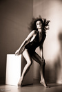
![https://photos.modelmayhem.com/photos/120222/23/4f45f109218b1_m.jpg]()
I like the concept, but I think the execution has a few issues. I find the corner of the floor at the bottom left distracting. It looks like it's shot against seamless except for this one piece which distracts while not being interesting. A more interesting background, or just no visible background would be better IMO. The pose is also not particularly strong. The large curve in her back means she looses some of the curves you want, while projecting her normally non-existent belly forward. The head tilt, and eye connection, and expression are otherwise dead on.
![https://photos.modelmayhem.com/photos/120617/18/4fde7ef8c68a5_m.jpg]()
great pose, love the hear. Great feeling of action and emotion.
https://www.modelmayhem.com/portfolio/p … 5#26491979 18+
Great job. Love the story, love the lighting.
Overall an exceptional port. I love when you tell a story which is most of the time. The other times, I think you sometimes go just a bit to far with the post, at least for my tastes, perhaps because there's not enough other stuff there. My last bit of critique is that you keep shooting one of your models up the nose _ I think the shape of her nose would be a bit more flattering if the chin was down more.
-Noel Thank you Noel, I appreciate it

Photographer
TDSImages
Posts: 1017
Salt Lake City, Utah, US
Photographer
DAN CRUIKSHANK
Posts: 1786
Vancouver, British Columbia, Canada
Ok
Photographer
Devin Workman
Posts: 166
Los Alamitos, California, US
Model
MartaBrixton
Posts: 1022
London, England, United Kingdom
noel marrero wrote:
Off to bed, but I'll get to your tomorrow. Get some good sleep !
And me tomorrow please
Photographer
noel marrero
Posts: 475
Menlo Park, California, US
Rachael Bueckert wrote:
Me please! Im loving your informative critiques! ![https://photos.modelmayhem.com/photos/120715/22/5003a8af109a4_m.jpg]()
It's okay, just not really moving me. Not quite art, not quite glam... That fact that it's different helps, but... I do like the fact that it shows your face in a more natural look, so helps me to know what to expect when I'm looking for something specific.
![https://photos.modelmayhem.com/photos/120704/15/4ff4c5c0a7559_m.jpg]()
Very nice... Great lighting and capture from the photog. Nice outfit. Love the soft skin and shadows. Great makeup, love the pose. Curved in all the right places. I would hire you based on that one shot alone.
![https://photos.modelmayhem.com/photos/120606/15/4fcfd3ef23573_m.jpg]()
Again, not as strong. The color is nice, but the image is a bit soft both in the skin and the left side of the dress. You have an amazing face, I can imagine covering it.
![https://photos.modelmayhem.com/photos/120606/15/4fcfd3da33a34_m.jpg]()
I do like that the image is different. However I don't think the pose or outfit is particularly flattering for you. It can be challenging to shooting straight on to someone's hips and get a flattering shape. I would have taken a few more, played with the outfit, something to get more of your real shape to show.
![https://photos.modelmayhem.com/photos/120424/21/4f9777334d910_m.jpg]()
and
![https://photos.modelmayhem.com/photos/120402/22/4f7a89bc5cf6e_m.jpg]()
This is what I want to see. Both these shots, but especially the second is completely made by the expression and look of your face.
![https://photos.modelmayhem.com/photos/120402/22/4f7a899f791f6_m.jpg]()
Now compare this shot to the one in the white outfit. This shows off that amazing shape you have. Another great shot.
![https://photos.modelmayhem.com/photos/120320/19/4f693a374d021_m.jpg]()
Again wonderful expressive face.
Overall I really love your port. Especially the ones where you get to show off how expressive you are. I think your posing is okay, but I can't tell how much of it is the photog and how much is you. To a certain extent it's in your best interest to make sure the photog poses you well. I didn't see any particularly extreme poses, so it could be something to develop.

Model
hgldhlhgfh
Posts: 576
Dumont d'Urville - permanent station of France, Sector claimed by France, Antarctica
Model
Rachael Bueckert
Posts: 1122
Red Deer, Alberta, Canada
noel marrero wrote:
critique Thanks! I'm trying to get more shoots on the go, but living in the location that I am makes it hard  . And yes, all of the posing is my own. I very rarely get photog direction. Saying that, I do have a lot of room for improvement . And yes, all of the posing is my own. I very rarely get photog direction. Saying that, I do have a lot of room for improvement
Photographer
noel marrero
Posts: 475
Menlo Park, California, US
New Image Creations wrote:
Are you still going? How did I get the Canada crowd?
Your port feels a bit unbalanced. I feel like you have a mix of strong and mediocre shots. I would recommend cutting out at least a third.
![https://photos.modelmayhem.com/photos/120715/13/50032855a4bb9_m.jpg]()
I appreciate what you are doing here with the color, but just doesn't hold my attention to much. I'm not the biggest fan on lots of post or gimmicks. I like the music pages but have no idea how they relate to the image.
![https://photos.modelmayhem.com/photos/111223/08/4ef4ad7135e07_m.jpg]()
Again, too much about post IMO. The hair is dull. Hair sprites sticking out on the right side of the image. It's as if you fell in love with the black markings and didn't pay attention to the image as a whole.
![https://photos.modelmayhem.com/photos/110618/17/4dfd4133df086_m.jpg]()
Not the most interesting pose. Breaks in both writs, uninteresting floor. Feels like a clash of colors as well. Strange bend in the wall. It's too snap shotish.
![https://photos.modelmayhem.com/photos/110618/16/4dfd359cb3677_m.jpg]()
This is better. Better outfit, better colors, better pose, better post. But still, that little ledge is distracting and so is the shadow.
![https://photos.modelmayhem.com/photos/120408/12/4f81e209e8cc8_m.jpg]()
Now, this is much better IMO. Good use of DoF, great use of in and out of focus portions of the outfit, neckless, etc... The light looks great on her, the skin tone looks great. No distracting background, no distracting shadows.
![https://photos.modelmayhem.com/photos/120408/12/4f81e2056fe33_m.jpg]()
Another good use of DoF to pull focus to the face. Nice skin tones, nice lighting.
![https://photos.modelmayhem.com/photos/120330/01/4f756a4a244e6_m.jpg]()
The next two look over smooth and unnatural. Don't like the skin tones. The lighting is very flat, so the face looks 2D.
![https://photos.modelmayhem.com/photos/111223/08/4ef4b0ffdd08a_m.jpg]()
Compared to this, I would not have guess the same photog took both shots. Here the shadows in the face create rounding and a sense of 3 dimensions. Great detail, love the makeup. Nicely done.
https://photos.modelmayhem.com/photos/1 … bda2d4.jpg 18+
Nicely done. Good exposure, good use of the environment, has feeling and tells a story. The pose, curtain, and expression, all help tell that story. Just would have liked a touch more sharpness in the eyes.
![https://photos.modelmayhem.com/photos/120106/19/4f07b5306137a_m.jpg]()
You are loosing some of the seperation between the hair and the background. Would have liked a bit more light on the hair to pull it out and get detail.
Overall a mixed bag. I think some of your shots show much stronger technique than others. The single shadow just off to one side of the model makes your shots feel like a snap shot taking with an on camera flash. They also tend to have lots of face softening and possibly other post, while ignoring the distracting bits of the background. Your low key shots are generally better IMO, where you are paying much closer attention to where you are allowing the light to go. Time to do some cutting IMO.
Photographer
noel marrero
Posts: 475
Menlo Park, California, US
Annalise Blackwood wrote:
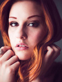
i'll play ![https://photos.modelmayhem.com/photos/120708/12/4ff9d96d64b0c_m.jpg]()
Not great images IMO. Between under exposure and/or the blue tinting, it does unpleasing things to your skin town. The hair is very lifeless and dead. And the cropping isn't great. On your side, I generally like the expression for this set. Very 'russian' or at least would be very a stereotypical look for us in the US. So works with the outfit and story IMO. On this image however I have no idea what you are doing with your left arm. It doesn't seem to consciously be part of the pose.
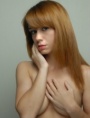
![https://photos.modelmayhem.com/photos/120617/23/4fdeca3bcb6c6_m.jpg]()
Now compare your hair here, where it's very vibrant. Granted this isn't in your control, but you might consider it when deciding what images to put in your port.
![https://photos.modelmayhem.com/photos/120619/20/4fe146b84f3bf_m.jpg]()
What the expression here... Too much of a flat stare. For pinup I would expect something mischievous, or seductive, or sensual. Make sure to nail the expression.
https://photos.modelmayhem.com/photos/1 … aec597.jpg 18
You look lovely, but you need to make sure your pose shows you well. Compare this image to the next one. Notice how you tightened your core in the second shot. You didn't tighten in this one and it doesn't show your shape as nicely. However I like the face better in this one, the second kind of has your staring off and the eyes are not well lit.
![https://photos.modelmayhem.com/photos/120627/19/4febc65363596_m.jpg]()
Hand a bit awkward. Colorful, but doesn't showcase you as a model.
![https://photos.modelmayhem.com/photos/120625/18/4fe9134b32854_m.jpg]()
Better. I like the intensity, and the connection with the viewer. Great effect with the hair, and the focus of the lighting on your face and eyes. Same for the next two however I like the third one least. The outfit hides your shape so it's not as feminine. Generally you want something tighter fitting to show those curves.
![https://photos.modelmayhem.com/photos/120411/00/4f85362be7479_m.jpg]()
Careful when doing dance shots. While it's fine to do the Black Swan makeup look, when you try to do the pose, it is extremely challenging for someone without dance experience to hit/hold a solid dance pose. And to someone with a dance background, the pose will tend to look awkward. I am not a ballet expert by any stretch, I would expect the toe to just touch your knee instead of going past, and your elbows should be out more an perfectly symmetrical. In addition, the black on black means we are losing your shape so the core becomes a bit of a blob. I would remove this image because it shows a bad pose.
I think you have a great face, and your figure would work well in glamour and pinup.
For the more artistic stuff, I think you want to work on your pose. Especially symmetry, lengthening, and continuing a line. Also work on taking up space and showing strength in your pose . Some of the images have a bit of slouch in them. I think you want to broaden the shoulders and take a stronger pose instead of letting them hunch in.
Model
MelissaAnn
Posts: 3971
Seattle, Washington, US
If you're still going.
Photographer
noel marrero
Posts: 475
Menlo Park, California, US
|


 side if you are looking for growth or starting to feel bored.


 . And yes, all of the posing is my own. I very rarely get photog direction. Saying that, I do have a lot of room for improvement


