|
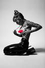
I've just published my first website. There are still lots of images to add and a few tweaks to be done but I would be very interested in general opinions on the style and content. www.akmacretouch.com Jul 30 12 12:58 pm Link style regular, content looks ok for now  Jul 30 12 02:00 pm Link I love everything in it Aug 05 12 05:12 pm Link Any other useful observations? Aug 14 12 11:29 pm Link Nice! It's very clean and well put together. Scratch the italics on the services page it makes it hard to read. Italics should be reserved for qoutes only such as on the about page. Otherwise very good. Tom Aug 15 12 12:00 am Link I've scratches the italics: thanks Tom. I don't know how I missed something so obvious. Aug 15 12 10:22 am Link It might be interesting to set up a few test pages with the current white along with darker backgrounds and try them on some test groups. Or just set up a poll and ask people to vote their preference.     Aug 16 12 11:46 am Link Thanks Peano, I'm interested in the poll idea. How would I go about doing that? If that sounds like a stupid question it's because I'm new to this critique forum. a k Aug 16 12 11:55 am Link I like white. It works well with most beauty images. Black background darkens the whole image, creates the illusion of a harsher contrast and deeper shadows in the image. At least that is how I see it. Beauty, weddings, fashion, anything that is meant to look clean looks better against white IMO. Aug 16 12 12:10 pm Link AKMac wrote: I've never done it, but search on Google. I quickly found several sites that let you set up free polls. Aug 16 12 01:03 pm Link Thanks Peano, I wan't thinking of going that public - I thought you meant an MM poll. a k Aug 17 12 11:31 am Link Very nice. I hope you have a pre-post option on every image. I found it on some but not others and, of course, viewing a retoucher's portfolio, that's what we're looking for. Very clean. Aug 17 12 11:40 am Link DAN CRUIKSHANK wrote: +1 Aug 18 12 12:02 pm Link I've added some more pre/post options, because a number of people have suggested the same thing. I was in two minds about it with some images because I felt that the retouches hopefully spoke for themselves, and also I feel a little bit uncomfortable about the unfavourable contrast of before and after images. Regarding the white background - there are definitely some specific images which will look better on black, grey or even a coloured background, but I think white works for the majority of my images and gives the overall feel I'm after. Aug 22 12 05:27 am Link |