
Photographer
Photography by Ricky
Posts: 334
Melbourne, Victoria, Australia
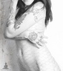
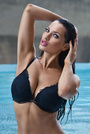
Check out my avatar and let me know what you think.
Photographer
Photography by Ricky
Posts: 334
Melbourne, Victoria, Australia
Mary Geraldine wrote:
Nay. Why? 
Model
Mary Geraldine
Posts: 1697
Valdese, North Carolina, US
The background is distracting, the crop is awkward, the skin is too blurred, and the eyes are too white.
But this is just my opinion and I don't know anything about photography. You might want to stick around for the opinion of someone who matters. ^_^
Model
LisaInLondon
Posts: 707
London, England, United Kingdom
Nay, it screams tacky with those clashing colors.
Model
Mary Geraldine
Posts: 1697
Valdese, North Carolina, US
LizaK wrote:
Nay, it screams tacky with those clashing colors. That too...

Photographer
E H
Posts: 847
Calgary, Alberta, Canada

Mary Geraldine wrote:
The background is distracting, the crop is awkward, the skin is too blurred, and the eyes are too white.
But this is just my opinion and I don't know anything about photography. You might want to stick around for the opinion of someone who matters. ^_^ Have to agree100% I would add the shoes are massive compared to the head,,,so Nay
Model
Mary Geraldine
Posts: 1697
Valdese, North Carolina, US
E H wrote:
Have to agree100% I would add the shoes are massive compared to the head,,,so Nay Yeah see, I thought it was the light color of the shoes standing out against the relatively darker background that was making them stand out to me... But you are right. The angle or something makes the size look disproportionate.
OP, I don't want you to think I am picking on you. I just definitely don't think this photo would be the best avatar to display your work. I think it is too technically flawed.
Photographer
Nate Miller
Posts: 21
Warrensburg, Missouri, US
Nay. It looks nicely exposed. The models is lovely and the dress isn't bad for her but the background, crop, and composition aren't working. I'm pretty much with the other posters as to the specific reason.
Model
_ Robyn Elizabeth _
Posts: 436
London, England, United Kingdom
Personally I think that any of the other images in your port are better as they are more unusual.
Your current avatar to me looks quite standard and so probably wouldn't make me look at the rest of your port, but the others are more interesting and original and I would want to see what else you have. I particuarly like the one on the far right.
I don't have that much experience so this is just my opinion.
Photographer
Trevor Martin
Posts: 518
Sydney, New South Wales, Australia
Nay.
Too small for the amount of detail, and for me the colour clashes

Photographer
Lee_Photography
Posts: 9863
Minneapolis, Minnesota, US
Nay,
Over processed skin and eyes
Models pose
Color clash, models wardrobe and background
Model should be at the right 1/3 location of photo
Wish you well

Photographer
Orca Bay Images
Posts: 33877
Arcata, California, US
Big nay.
That high-midriff dress is totally unflattering to the model; makes her look bottom-heavy and it otherwise conceals her shape.
That background is busy as hell.

Model
Nadia Ruslanova
Posts: 465
Tampa, Florida, US
drop the tacky background and sub it for some props, then a yay
Photographer
Photography by Ricky
Posts: 334
Melbourne, Victoria, Australia
Mary Geraldine wrote:
The background is distracting, the crop is awkward, the skin is too blurred, and the eyes are too white.
But this is just my opinion and I don't know anything about photography. You might want to stick around for the opinion of someone who matters. ^_^ Not sure why you said crop is awkward
Photographer
Photography by Ricky
Posts: 334
Melbourne, Victoria, Australia
LizaK wrote:
Nay, it screams tacky with those clashing colors. Sorry for making your eyes pop out lol
Photographer
Photography by Ricky
Posts: 334
Melbourne, Victoria, Australia
E H wrote:
Have to agree100% I would add the shoes are massive compared to the head,,,so Nay The shoes are massive anyway. So what if your model wearing Noritaka?
Photographer
Photography by Ricky
Posts: 334
Melbourne, Victoria, Australia
Mary Geraldine wrote:
Yeah see, I thought it was the light color of the shoes standing out against the relatively darker background that was making them stand out to me... But you are right. The angle or something makes the size look disproportionate.
OP, I don't want you to think I am picking on you. I just definitely don't think this photo would be the best avatar to display your work. I think it is too technically flawed. Well Mary, I didn't think you are picking on me, but my pic. lol. I must admit it is a massive shoes for her, but she still manage to walk in style. How's that?
Photographer
Photography by Ricky
Posts: 334
Melbourne, Victoria, Australia
Nate Miller wrote:
Nay. It looks nicely exposed. The models is lovely and the dress isn't bad for her but the background, crop, and composition aren't working. I'm pretty much with the other posters as to the specific reason. Thanks, it took me a while to figure out the exposure. Alright, I still don't get the crop thing.
Photographer
Photography by Ricky
Posts: 334
Melbourne, Victoria, Australia
_ Robyn Elizabeth _ wrote:
Personally I think that any of the other images in your port are better as they are more unusual.
Your current avatar to me looks quite standard and so probably wouldn't make me look at the rest of your port, but the others are more interesting and original and I would want to see what else you have. I particuarly like the one on the far right.
I don't have that much experience so this is just my opinion. Thanks for that. I'm just trying on something not unusual (which can be boring?). Which one you mean on the far right?
Photographer
Photography by Ricky
Posts: 334
Melbourne, Victoria, Australia
Trevor Martin wrote:
Nay.
Too small for the amount of detail, and for me the colour clashes What kind of detail you after?
Photographer
Photography by Ricky
Posts: 334
Melbourne, Victoria, Australia
Lee_Photography wrote:
Nay,
Over processed skin and eyes
Models pose
Color clash, models wardrobe and background
Model should be at the right 1/3 location of photo
Wish you well What's wrong with the dress? I thought she pulled it off.
Photographer
Photography by Ricky
Posts: 334
Melbourne, Victoria, Australia
Orca Bay Images wrote:
Big nay.
That high-midriff dress is totally unflattering to the llama; makes her look bottom-heavy and it otherwise conceals her shape.
That background is busy as hell. Would have thought this dress shows off her legs well?
Photographer
Photography by Ricky
Posts: 334
Melbourne, Victoria, Australia
Nadezhda Repina wrote:
drop the tacky background and sub it for some props, then a yay Any suggestion?
Photographer
Critical Eye Studios
Posts: 132
Washington, District of Columbia, US
Melb Rick wrote:
Check out my avatar and let me know what you think. How was this shot? and what post work was done?
Photographer
Photography by Ricky
Posts: 334
Melbourne, Victoria, Australia
Critical Eye Studios wrote:
How was this shot? and what post work was done? This was shot outdoor with a portable flash. Post work includes background, drop shadow, model's skin.
Photographer
Orca Bay Images
Posts: 33877
Arcata, California, US
Orca Bay Images wrote:
Big nay.
That high-midriff dress is totally unflattering to the model; makes her look bottom-heavy and it otherwise conceals her shape.
That background is busy as hell. Melb Rick wrote:
Would have thought this dress shows off her legs well? The legs are nice and there's even a shoulder to be seen, but you might as well have the model wearing a big pumpkin.
Photographer
BrandonLundby
Posts: 117
Las Vegas, Nevada, US
nay.
I actually enjoy the background however the model's posing is very unflattering and I think that the post work could have been executed differently(referring to the model[eyes, skin, and overall body shape].) Not a fan of that dress, looks like a homecoming dress. As the others said, colors are definitely clashing to me as well.
Photographer
Photography by Ricky
Posts: 334
Melbourne, Victoria, Australia
Orca Bay Images wrote:
Orca Bay Images wrote:
Big nay.
That high-midriff dress is totally unflattering to the model; makes her look bottom-heavy and it otherwise conceals her shape.
That background is busy as hell. The legs are nice and there's even a shoulder to be seen, but you might as well have the model wearing a big pumpkin. May I borrow your big pumpkin please?
Photographer
Critical Eye Studios
Posts: 132
Washington, District of Columbia, US
I am going to provide a contrarian point of view based on your response…
I have seen this type of "Look" (in fashion mags generally the use of pastel colors to provide contrast) before, however everything was done in camera. I think your concept is good. I would recommend in the future doing everything in camera and not rely on post work. It’s your post work that's pulling down the image. With that being said.....
I am giving it a 1/2 Yay.
I like the model, her expression. I especially like the wardrobe styling (nice color to the dress and shoes). I like the dress against the selected background color.
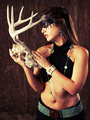
Your best image so far in port is your "hunting season" image.
This is my unsupervised opinion.
Photographer
Photography by Ricky
Posts: 334
Melbourne, Victoria, Australia
B C L wrote:
nay.
I actually enjoy the background however the model's posing is very unflattering and I think that the post work could have been executed differently(referring to the model[eyes, skin, and overall body shape].) Not a fan of that dress, looks like a homecoming dress. As the others said, colors are definitely clashing to me as well. What's your suggestion for the model's pose?
When you said clashing colors, are you referring to model's skin tone against her dress or her against the background?
Photographer
Photography by Ricky
Posts: 334
Melbourne, Victoria, Australia
Critical Eye Studios wrote:
I am going to provide a contrarian point of view based on your response…
I have seen this type of "Look" (in fashion mags generally the use of pastel colors to provide contrast) before, however everything was done in camera. I think your concept is good. I would recommend in the future doing everything in camera and not rely on post work. It’s your post work that's pulling down the image. With that being said.....
I am giving it a 1/2 Yay.
I like the model, her expression. I especially like the wardrobe styling (nice color to the dress and shoes). I like the dress against the selected background color.
Your best image so far in port is your "hunting season" image.
This is my unsupervised opinion. Thanks for that.
Photographer
Orca Bay Images
Posts: 33877
Arcata, California, US
Melb Rick wrote:
May I borrow your big pumpkin please? You should still be able to find some at a reasonable price in your area.
I avoid shooting high-midriff dresses if I can. No need here for pumpkin suits.
Photographer
Photography by Ricky
Posts: 334
Melbourne, Victoria, Australia
Orca Bay Images wrote:
You should still be able to find some at a reasonable price in your area.
I avoid shooting high-midriff dresses if I can. No need here for pumpkin suits. So what other kind of dresses you will avoid as well?
Photographer
Orca Bay Images
Posts: 33877
Arcata, California, US
Melb Rick wrote:
So what other kind of dresses you will avoid as well? Anything with loud prints. Other than high-midriff and loud prints, I'm pretty flexible. But I just don't like shooting dresses that make a model look like she's pregnant or has a huge ass.
Photographer
BrandonLundby
Posts: 117
Las Vegas, Nevada, US
Melb Rick wrote:
What's your suggestion for the model's pose?
When you said clashing colors, are you referring to model's skin tone against her dress or her against the background? She completely lost her neck. faced more forward and less posed and more of a movement. dress against skin and background.
Photographer
BrandonLundby
Posts: 117
Las Vegas, Nevada, US
Critical Eye Studios wrote:
I am going to provide a contrarian point of view based on your response…
I have seen this type of "Look" (in fashion mags generally the use of pastel colors to provide contrast) before, however everything was done in camera. I think your concept is good. I would recommend in the future doing everything in camera and not rely on post work. It’s your post work that's pulling down the image. With that being said.....
I am giving it a 1/2 Yay.
I like the model, her expression. I especially like the wardrobe styling (nice color to the dress and shoes). I like the dress against the selected background color.
Your best image so far in port is your "hunting season" image.
This is my unsupervised opinion. +1
Photographer
Photography by Ricky
Posts: 334
Melbourne, Victoria, Australia
B C L wrote:
She completely lost her neck. faced more forward and less posed and more of a movement. dress against skin and background. Based on your avatar, isn't that your model lost her neck and chin as well?
If she faced more forward, you will probably get to see only half of her face?
|

