|
Forums >
Digital Art and Retouching >
Color grading for editorial cohesion - suggestions
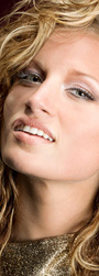
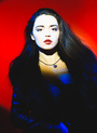
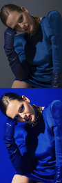
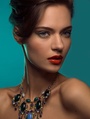
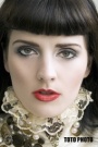
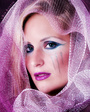
I'm exploring how I might color tone the first three images (new) in my MM portfolio, to give them some editorial cohesion and mood. Looking for some suggestions from retouchers who regularly do editorial color grading. Thanks! Feb 14 15 07:22 pm Link I just tried something with curves and selective color.    http://i60.tinypic.com/206bx2f.jpg http://i58.tinypic.com/9jk77k.jpg Feb 15 15 08:09 pm Link  Feb 27 15 11:51 pm Link    Feb 28 15 01:26 am Link  Feb 28 15 05:20 am Link pixel dimension ilusion wrote: cool, looks like Instagram effects. Feb 28 15 10:47 am Link Ivo Adrian wrote: can you please share how you did that? Jun 04 15 09:41 pm Link I'm fairly new to color grading, but with my new geek tool, its a breeze. Loving every bit of it, here is the result:  Jun 05 15 09:56 am Link Here is another version Cyan. The above one is Teal.  Jun 05 15 10:01 am Link For those looking to create "Alternative Looks" from their standard images like the OP... there maybe two or more parts to the process. First, knowing how to create and then modify the desired color changes in Photoshop... and Second, figuring out what toning color combinations are the best to use (the most artistic or the most popular). 1. Learn the tools necessary to create the color shifts you want. Learning how to use the coloring and toning features of curves, gradients, selective color, or the split toning tools inside of Photoshop, Adobe Camera Raw and Lightroom is of prime importance to getting that "Editorial Look" for your own images. There are various techniques and tutorials that can be Googled to get the steps involved in creating these hip, artsy, artistically off colored, trendy looking images. What is sometimes involved in color grading is making the white tones in your image to become some other color. For Example: taking the white values in your perfect image and turning them yellowish...and taking the darker shadow tones of your image and contaminating it with a blue tint. That is your standard complementary color toning combination(yellow and blue). If you were to look on a standard color wheel...the color directly opposite the color you want to use is its Complementary Color. You can use that complementary color as a seed to begin your grading trials (Yellow/Blue, Green/Magenta, Red/Cyan etc). You can then also try the Secondary and Tertiary colors as starting points for tones that look great together too. A lot of thought was put into the color wheel...and it may help you find the pairs that look coordinated. Google "Color Wheel" in the image part of the site to see the different kinds of color wheels. Read how they work... and how to use them... to make coordinated color decisions. It is also customary in color toning images to change the brightness or underlying tonality of your images. You might darken the underlying luminosity of the skin to make it appear ruddy... or you might want to add in a curve to make the skin look bronze or golden. You might also work with the Hue/Saturation/Luminance adjustment layer tool to get the skin saturation to come down and get another look for the skin. You might use the Brightness/Contrast adjustment layer to give the skin some visual pop. Each layers "Opacity Slider" is great for adjusting the intensity of the tones and colors you are looking for. Since color grading is highly artistic...what color and how much of it... is of critical visual importance. A color at 100% opacity may overwhelm the image...when an opacity adjustment of 7%...can give a very delicate hint of color! (Youre now a color grading genius!) You should also look into the concept of "Adjustment Layers" and "Non-Destructive" retouching methods. Non-destructive techniques are clean, clear, transparent, and they are infinitely adjustable... even after you save your image! This methodology gives you absolutely astounding creative control and the ability to create a beautiful final color balance for the image... without having to use the history brush. One very important tool is the "Layer Mask". Toning the whole picture at once might be nice...but by using a "Mask" with color toning...you can selectively apply the color to only certain parts of the image... and you can control where... and how strong the effect is... anywhere in the image... and then you can change your mind 100 times! Gradients are also useful for color grading. These are some of the tools necessary to get the effects that John Allen, the OP, is talking about. But... I think Johns ultimate question is more about point two. 2. What Colors and what Looks are possible...and which treatments would I like the best for my images? Its all well and good to know HOW to create the looks...but which Looks are the ones I should use on my images? That question is equally important. Sometimes there is a color theme suggested by the dress colors in a magazine article, or maybe the colors of a sunset would be a great set of colors to try to match, or the colors of the backgrounds etc. You might want to contaminate all the dark tones with a magenta cast because that is the color of the background in the image...or maybe you use the opposite color very subtly to create a complementary opposite look. Maybe you are sick and tired of pure white tones in all your images like the OP...so you can warm up all your white tones with the red cast...and paint it on artistically using a mask to control where that happens. ITS ALL ART... ITS ALL JUDGEMENT. Its all individual and variable. What your magazine editor likes this month might be very different from what you have in mind!!! She is sick and tired of the yellow blue look this week...and she would jump at using your images if they were of the green magenta look... JUST BECAUSE IT IS DIFFERENT LOOKING!!! Its fashions job to change things up...so we all feel out of date...so they can sell us more different looking clothes. Making things look radically different this year is how they generate continued sales. So, maybe the fashion editor would like your purple magenta tones better this issue because it looks great against the new makeup they are featuring on page 116. So now you are the smart, trendy, artsy photographer... because you gave her the off color images she needed to help her re-inforce a new trend. So which color grading LOOK is the best this quarter? The colors that the editors and art directors are looking for to create that different kind of look. Thats business...and it changes constantly. Whats hot in your color grading choices this year will certainly change too. So, more to Johns point... what color combinations are possible, which ones might look good on my perfectly shot and perfectly color balanced boring images, and which ones excite my visual fancy more than others. And more than that...what combinations are the magazine editors looking for these days? What combination of color contamination and toning will the art director love this week...because she is sick of blue and yellow...maybe Green will be the new look...because it matches the color of the fancy table cloth!! So Heres The Beef - for John: Here is a link to a Photo Gallery of 560 suggestions of magazine quality color graded images! Its full of visual ideas and examples... to look at... and to pick out some looks you might like. https://www.presetshop.com/gallery-wall/ See what color Looks YOU like the best! See what can be done... and what it looks like! Figure out how they did it! Get some great visual ideas and examples. Also, do a Google search on "Color Graded" or "Color Presets" for more examples and more preset companies. Here is a link to a very large collection of professional looking "Magazine Tested" color presets that you can buy today. They can give you that "Magazine Quality Look" with just a couple of mouse clicks! That is... if you want to spend some money against the problem. https://presetshop.com/shop/ Its a great collection of pre-tested visual presets. There are free presets available too... if you include the word free in your search terms. (I dont work for these guys...there are other companies too) ---------------------------------------------- Often when color grading...the original photography has a lot to do with the final outcome that you create in Photoshop. Some of the Looks have certain photographic requirements to make them look their best. So, reverse engineer these looks. What do I need to do in my photography to get a great result? What can I do with Photoshop or canned presets? What color looks would be great to use...like John was originally asking. There is a lot that you can do. You first have to have a vision and desire for alternate colored images...then you need to Learn how to do it...then you need the Inspiration of whats possible for new looks for your own photography. Johns OP question is on the right track for a lot of us! Great Color Grading = Photography, Photoshop, and Inspiration Examples. Jun 05 15 11:37 am Link Oscar S wrote: The teal is my favorite so far. Jun 16 15 04:10 am Link Honestly, the easy, hassle free way is to download color presets for light room. Trust me, they are a life saver when I do shoots and want to batch edit my photo's. Check here: http://presetlove.com/ Jun 17 15 03:21 pm Link Thanks Mickey. I love the Teal look myself as well. It is from the Proworkflow Panel for photoshop. Color grading is just one of the things it is capable of besides many others. Take a look: https://www.youtube.com/watch?v=yw7RgM0Zc4M Jun 25 15 07:52 am Link Dont over think it, break your image down into simple concepts. Shadows, midtones and highlights and take note of the exiting palette of colour that naturally exist in your image and generally stick to it, if you try to add a complimentary colour grade to an analogous palette it wont look quite right. It usually helps to desaturate your image or at least balance out the saturation before attempting colour shifts. Forget plugins, actions and presets, all they do is dumb your ability to use Photoshop. With smart selections such as luminosity masks and curves you can accomplish any look you can imagine. Jul 07 15 07:18 am Link Ivo Adrian wrote: amzing toning bro. Jul 07 15 09:01 am Link my version  Jul 07 15 09:12 am Link TMA Photo and Retouch wrote: TMA, thank you so much for your in-depth description of the process. You not only answered many questions I've been dying to ask, but some I hadn't even thought of yet. Such help is one of the reasons I value MM so highly. Jul 07 15 03:06 pm Link TMA Photo and Retouch wrote: Very helpful post. Thanks for taking the time. Jul 07 15 03:13 pm Link |


