|
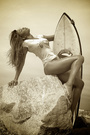
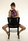
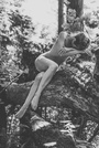
Its me again  I know I'm a pain in the .... I have just uploaded a new black and white. So now there are 3. Are they keepers. Should I keep the new one as my avatar ??? I know I'm a pain in the .... I have just uploaded a new black and white. So now there are 3. Are they keepers. Should I keep the new one as my avatar ??? ELENA xxxxxxx Apr 11 15 09:12 am Link  Didn't care for this one, and I'm not sure why, my brain just says no. I *think* it's because I look at it and it feels like a colour photo with the colour taken out, instead of looking like a BW photo... something about the tones. But that's just me. Nice abs though, well done.  Love the old-school edit feel of this one, without it, it's a nice shot, it's even better with it. Very Sophia feeling.  This one is great, and I'm not just saying that cuz it's implied! Great extension of the toes, both feet, the angles are great, nice light, smooth sand all around you, really nice shot all round. Apr 11 15 09:22 am Link I really like the second one. It's got a rawness to it that I appreciate a lot. Apr 11 15 10:03 am Link Pieter Vandeur wrote: +1 Apr 11 15 03:54 pm Link I also like the second one best. Apr 11 15 04:14 pm Link Elena Antonia Pappas wrote: I loike #1 and #3 . The nude is amazing... I think it is implied also? Apr 11 15 05:03 pm Link #2 Apr 11 15 07:26 pm Link DespayreFX wrote: ^^^ 100 % agreed Apr 11 15 07:48 pm Link For me, just with a very quick look, the issue with the first and third shot are the cropping.. the one side with the vacant space needs to be cropped out a bit, and that is why those two feel out-of-balance. Apr 11 15 07:54 pm Link For me the composition on the 3 B&W’s feels like you are crowded over to photo left, it seems to work best with more space in front of the model then behind, gives the model some place to move into First one head is very centered [Would be interesting to see this in Color with a different crop] Second head is on left side of photo center, with lots of space behind your back [It also seems to lack punch, eyes are dark] Last your feet are almost touching photo border but all that empty space behind you [Great legs] Wish you well Apr 11 15 08:49 pm Link Love that 3rd Shot !!! Apr 11 15 10:05 pm Link and the other 2 are ok Apr 11 15 10:05 pm Link Hi there. https://www.modelmayhem.com/portfolio/pic/38340202 So I have told you that you are stunning before. So let's put that aside. I have issues with this picture. The quality is a little off to me. Some parts look a tad pixelated. And you look like you are in focus but something is still making the image look slightly out of focus. There is something going on with that. I have seen the same thing happening with other images you have posted. Anyway, aside from that I am not a fan of that top at the beach. It's like, you obviously can't swim in that, it sort of makes your neck go missing a bit, it's not really built well enough so it just looks like you decided to wrap a scarf around yourself, and the print with the Indian-like Elephants makes me think more of India than the setting you are in. I also have an issue with your hair on the left. The wet hair is good don't get me wrong, but it's sticking out in a way that doesn't look right to me. The hair on the right side looks great though. Is this a terrible picture? Hell no. I just think you can do better than this. Oh and the cropping, you are too to the left and for no good reason. https://www.modelmayhem.com/portfolio/pic/38278156 This has the same pixelation issue. It is what it is. You should figure out why that keeps happening with the work you post on here. Do you resize and edit images before you post them up? Something is going on with that. Again it's make the quality of your images look off. Anyway, I like the picture but I do have an issue with it, your eyes. The one on the left I can see both of the white sides. The eye on the left I can only see one. That is causing me to think you are slightly looking in different directions and in turn it's creating a disconnect. That bugs me. https://www.modelmayhem.com/portfolio/pic/38278155 I would say I like this best but only because the quality is better. However, this could have been a TON better if the hair wasn't what it is. Please don't shoot me, but your hair looks almost like a mop. It is half dry and half wet and clumped together almost. It shouldn't been wetter and better separated. So are any of them BAD. No, you don't take bad pictures. I haven't seen you look bad in pictures. I just think that whoever you are working with, whether it be friends or photographers, they aren't giving you quality all the way and more attention to detail is needed. Or maybe I'm just picky as hell and notice these things for no good reason. Whatever lol. Hope this helps. Apr 12 15 03:06 am Link Apr 12 15 01:13 pm Link Elena Antonia Pappas wrote: Apr 12 15 01:21 pm Link First of all, it's your port, keep the ones you like, take any input here with a grain of salt (unless it's unanimous! ). But purely on the basis of thinning out your port (and I think that's a good idea) here's how I would approach it. First of all, any time you have more than 1 shot in the same outfit, pick one, remove the rest. First BW shot, take that out. Last shot first row, lol, that's quite a tan line Nice shot, don't see anything special about it though, it could go. That yellow and black bikini is cool, imo 3rd shot, elbow in the air, best one, take the other 2 out. White floral top, first one, second one you have a funny thing going on with your mouth. Love the top btw. Work through all the duplicated outfits like that. Here's ones I definitely would *not* take out:       I notice after going through that most of the ones I said were definite keepers were all done by the same guy, whether it's him, you, or the both of you, he makes you look great, if it's an option, I'd recommend shooting more with him. hope that helps, that's what I think, I'm sure others will have other ideas. Apr 12 15 02:02 pm Link DespayreFX wrote: Apr 12 15 02:19 pm Link Elena Antonia Pappas wrote: Thank you.. Thank u... Thank You.. If just two more photographers would take the time to do the same as you I would be able to cut done my portfolio by half. Interesting that all the photos (except for one) you like are taken by Anthony Neste. My most favorite photographer from Florida USA. Apr 12 15 02:30 pm Link Elena Antonia Pappas wrote: Don't know him, never seen his work before, but it's got definite style and refinement in his shots, and he makes you pop! I love that combination of you two... and you're welcome. Apr 12 15 02:43 pm Link Likin' the top one of these . . .  . . . as well as the last in the set, they all have a 60's feel to them, which I enjoy . . . oh, and of course, the model choice is wonderful . . .  SOS Apr 13 15 08:12 am Link Elena Antonia Pappas wrote: Elena Antonia Pappas wrote: Apr 14 15 05:11 am Link Lee_Photography wrote: Elena Antonia Pappas wrote: Elena Antonia Pappas wrote: Thank you Lee as always you a great help . You right about the photographers...and I'm going to ask the next one to do a headshot using Rembrandt lighting Apr 14 15 08:09 am Link |


 I'm confused