|
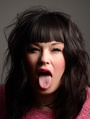
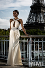
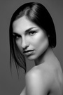
I would love to get some feedback on my photos. This is new to me and has been a great learning experience! Technique, composition...I'm curios what you all think! The editing process has been a challenge! I'm mainly struggling with colour. My monitor isn't calibrated and the colours don't look the same when I send them to other devices... I really enjoy playing with lights. Most of these were shot in my home studio. I'm currently using speed lights but thinking of a set of studio lights to have more modifier options. Thanks! Apr 16 15 05:29 pm Link  You have the model in a no shoot zone, you should either rotate her for a profile shot, or rotate her back till her nose does not poke through the outline of her cheek, the why. Where you have her rotated now her nose looks bigger than in real life. Bring the crop left side of photo in, so it just touches the model, this will eliminate the “gutter” which allows the viewer’s eyes to wander off the bottom of the photo [Adding a back light or hair light would help separate models head from background, top back of models head]  Busy background, busy top are all distractions from the models face  Up the nose photos are the least flattering of model angles Hair lacks detail, most of it looks more like a mass than separate strands of hair  Too much space above models head Pointing the knees at camera is not flattering to them [Think long legs in a standing pose to flatter models legs] Suggested crop, just at models bellybutton, and halfway between models head and top photo border  The cropping on this photo is quite good, you have enough of the model showing at the bottom of the image that it balances out all of her hair.  Favorite photo To add dynamics, keep models head as it is and place models body on angle to camera. I wish you well Apr 17 15 05:17 am Link https://photos.modelmayhem.com/photos/1 … 28ae58.jpg This my favourite, im not into heavy editing and prefer keeping it real. Well done, the rest im not a fan off, thats my own two cents though. Goodluck out there :-) Apr 17 15 12:03 pm Link Thanks for the great advice. Some good things to consider. I'll play with the cropping on that one. I'll keep that in mind during the next shoot! Apr 17 15 08:17 pm Link I think it's fun to experiment with lighting and think you have a better handle than most beginners when it comes to that. The more you practice with getting the light right the better it will be so I'll leave that one to you to develop on your own. Others have made comments about your composition and model posing and I think those are the areas right now that can use the most improvement. For example: I feel the negative space above the models' heads in almost all your photos makes them feel off-balance.   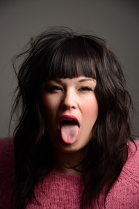 In the examples above, the top three can be corrected by cropping the top a bit more in post. Because the hair is such an important part of the fourth photo, I would suggest cropping from the bottom. In this shot I think the negative space works because it is on all four sides of the model... setting her at a distance from the viewer. I think her pose and blank expression add to the 'distance' in the shot.  Apr 18 15 09:53 pm Link Interesting points! Some of those I left the extra space simply to maintain the 4x6 aspect ratio. Other was to keep the subject in the centre. Thanks for the feedback. I've remove a couple already. I'll need to make some better ones to replace them with! Apr 19 15 06:02 pm Link You already have some good feedback above. Just wanted to add that you have great taste in models, and have been lucky to work with those faces. I see some nice lightning and experimentation. In the end, it's all about engagement and emotion. Learn the technical, and then forget it. Don't throw away an interesting and great shot just because a nose broke the cheek line or you cut off a limb in camera. Sometimes clients and agencies have selected photos where a hand was cut off or something I wouldn't normally use. But I guess the image had something of value they wanted. Pretty soon, all this stuff becomes second nature.  EDIT: I like your avatar. Apr 20 15 01:43 pm Link |


