
Photographer
ImOutOfHere
Posts: 2227
New York, New York, US
Sitting at home. Doing nothing. In the mood to give some feedback. Interested? Then here are the options:
OPTION A: Post 1 picture for me to give you feedback on, either via link or the actual image. Only post once please.
OPTION B: I can give you feedback on the first 5 images in your portfolio. The first 5 only, no others.
Pick A OR B. Please keep in mind that i like to give honest and often very detailed feedback. Nothing I say will be about you as a human being. It will be about you as a model or as a photographer.
STATUS: Still open for business!
Photographer
Laura Elizabeth Photo
Posts: 2253
Rochester, New York, US
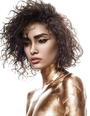
I love your feedback! I know it's technically 2 images but i shot this recently and always like a second opinion  ![https://photos.modelmayhem.com/photos/151003/09/5610006ee8dba_m.jpg]()
Photographer
ImOutOfHere
Posts: 2227
New York, New York, US
Laura Bello wrote:
I love your feedback! I know it's technically 2 images but i shot this recently and always like a second opinion
![https://photos.modelmayhem.com/photos/151003/09/5610006ee8dba_m.jpg]() Top picture is amazing. Sure the eye contact is not there BUT her expression is nice enough and her presence is strong enough that it doesn't matter at all. She is stunning and your work on this is stunning as well. If i had to be nit picky as hell here, I would say that the stray eyebrow hairs she didn't pluck all the way on her right eyebrow, the bottom part, could be taken out and then on the right eye, there is one eyelash in the bottom of the eye that is sort of bent that could be straightened. That's me being real picky though lol. I don't think anyone would really care about that stuff.
Second picture is amazing as well. Again, if i had to be really picky I would say that the stray strands of hair between the very bottom of her nose and the very top of her lip could be taken out. That's all I can really point out though. Amazing work on both.

Model
Clearly Clarissa
Posts: 51
Kitchener, Ontario, Canada
Hello! I choose Option B- critique on my first five photos in my MM portfolio. Thank you!
Photographer
ImOutOfHere
Posts: 2227
New York, New York, US
Clarity wrote:
Hello! I choose Option B- critique on my first five photos in my MM portfolio. Thank you! No problem. Ok here I go...
NUMBER 1
![https://photos.modelmayhem.com/photos/150611/22/557a6fcd3d147_m.jpg]()
You yourself aren't doing a thing wrong here, and you are obviously beautiful, but the photographer's work is a different story. First of all they lit you way too harshly. Notice how blown out one side of your face is. That's not good. Your eyes are dark and don't pop as much as they should. They also did absolutely no cleaning of the image on top of that which is just terrible in my opinion. Lastly, it looks like they sharpened the whole thing thing which doesn't make things better because little imperfections caused by the lighting are now in focus even more so. I think this person failed you.
NUMBER 2
![https://photos.modelmayhem.com/photos/150929/21/560b6a7ee04dc_m.jpg]()
Photography-wise I feel that the image is grainy and for no good reason because it looks like there was enough light around to minimize that. You are also not really in focus and I don't like how shaded you are around the face. It's just kind of flat. As for you, your pose is ok but I would've had you curve your back a tiny bit more just to add more shape and then your face is a tad too blank and not emoting anything so I would have changed that too. I'm also not sure the pearly necklace goes with the hippy vibe I'm getting from the rest of the outfit.
NUMBER 3
![https://photos.modelmayhem.com/photos/150924/19/5604b80aab252_m.jpg]()
Your smile is stuck between genuine and fake. It looks a tad rehearsed. As for the photographer's work, the retouching is crazy extreme on your skin. No one looks like that, not even in heavily retouched ads. It's so absurd that it ages you because heavy retouching like that implies the retoucher wanted to take a ton of years off of the person. Also, the necklace you have on is more of a distraction than anything. It looks more like string than an actual piece so it's not adding much in general.
NUMBER 4
![https://photos.modelmayhem.com/photos/150924/19/5604b798cfabd_m.jpg]()
I like it. It's fun. Nothing to really say here except that the photographer should have extended the background so that the floor didn't show up in the picture. Not really that big of a deal though. It's good.
NUMBER 5
![https://photos.modelmayhem.com/photos/150924/20/5604b9706e584_m.jpg]()
I like that you look pretty and soft and that you look good and not retouched to death. My issue here is that the background seems a tad too important with the green and all those shapes and in turn it's taking the focus away from you.
So in general, work with better photographers. When you look at the work of people you are thinking of working with, if it's for TF, make sure they are worth your time. Pay attention to all of the details in their work first. However, if it's for paid stuff, it's a job so just make sure you get paid and that you are comfortable with what the photographer wants obviously. If they happen to give you any of those pictures and they suck whatever, at least you got paid.
Photographer
Nor-Cal Photography
Posts: 3718
Walnut Creek, California, US
First five please. Thanks.
Photographer
ImOutOfHere
Posts: 2227
New York, New York, US
Nor-Cal Photography wrote:
First five please.
Thanks.
No problem, here I go:
NUMBER 1
https://www.modelmayhem.com/portfolio/pic/39496237 (18+)
Alright so this image to me is average. It shows that you know how to expose things properly and capture beautiful shapes but that's all I get from it because it doesn't really say much about you as a photographer. It's straight out of camera apparently which is something I'm personally not ok with. I think of photography as an art form, for me it's about taking one thing and turning it into something more. There's no polish here, she's just holding a hair dryer with the Revlon brand purposely displayed with no purpose. There's also soap on the counter in which that brand is shown too. This isn't an ad for something so showing the product names is an unneeded distraction and makes no sense unless it was being done in some kind of commentary kind of way, but I'm not getting that here. It's just too straight out of camera, not thought out enough, and shot from a very bland angle in my opinion. The whole scenes feels a tad too orange/yellow as well.
NUMBER 2
https://www.modelmayhem.com/portfolio/pic/35548926 (18+)
When I think of nudes I think of NOTHING on so immediately I'm like, why is she wearing a watch? Is that a belly button piercing I see? Oh she has earrings on too? AND a necklace? AAAAAND bracelets?! It's just distracting to me. I'm also having issues with the quality of the image. First I noticed that her face is not in focus, then I noticed that it gets pretty grainy down towards the bottom, but my biggest issue is that the lighting isn't as eye catching as it could've been. Don't get me wrong, I like the red, but she is a tad dark from her breasts up. Maybe it was done to hide her face but then the picture becomes about the light on her boobs. I just think certain areas would've benefited from more highlights.
NUMBER 3
https://www.modelmayhem.com/portfolio/pic/36289277 (18+)
The overall quality of the image is questionable to me. It looks slightly grainy and again it looks like her face might not be in total focus. I like the pose better in this one but I don't like the yellowish color on the background or the shading on the background. The shade transitions aren't really nice and smooth. I can see hot spots and then messy spots on the background towards the bottom. I feel like your work would benefit from retouching greatly. I mean, if you look at the reflection/shadow of her feet there's a bit of background tear messing up the shape of it and you left it there. That's a two second touch up job. It makes you come across like you don't care about details, but as a photographer, specially doing nudes, you need to show that you do.
NUMBER 4
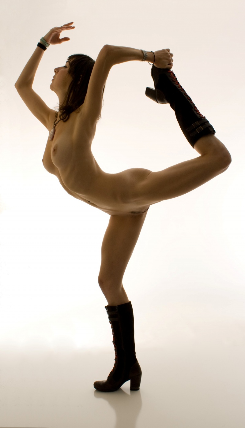
https://photos.modelmayhem.com/photos/1 … c915ad.jpg (18+)
She seems to be in focus and the background doesn't look as messy, but again, I'm not understanding the nude with all the accessories and hairbands and boots and stuff. I also still have an issue with the yellowish background and at the bottom of the image, on the left side, i can see you ran out of background but you didn't retouch that out. Again, details are good. Also, I noticed that you already featured this model in your portfolio. In my mind, I like to see a new person per port slot. It just makes it look like you are trying hard to fill up space instead of posting what is actually your best work.
NUMBER 5
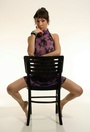
https://www.modelmayhem.com/portfolio/pic/22116730 (18+)
Nice image overall. She is in focus, quality looks a tad better but she needed some retouching (specially on the leg up on the chair), and while the chair is ok, I almost wish I could have seen her in a different setting like maybe by a window or sitting on something less traditional (even on the background itself would've been fine). Lastly, i like all her tats, that single bracelet covering up one of them looks misplaced.
And that's what I have to say. So basically:
- Attention to detail is key (specially with what the models are wearing)
- Retouching, even slightly, can be your friend
- Focus should always be on point
- And there are some image quality and slight lighting issues that need to be looked at
Hope this helps.
Model
Pixie Galore
Posts: 141
New York, New York, US
Are you still bored? Can I play? My first few are new and could use some CC...
Photographer
ImOutOfHere
Posts: 2227
New York, New York, US
Pixie Galore wrote:
Are you still bored? Can I play? My first few are new and could use some CC... No problem. Here we go...
NUMBER 1
https://www.modelmayhem.com/portfolio/pic/39547367 (18+)
You look good in it and it's a nice picture. My feedback would be to whoever shot it. I think your head should've been titled up more so that one side of your face was more in complete sun and then the other in total darkness. I also would've taken out the belly button ring because it's really not adding anything and sort of taking away from the classical nude vibe I'm getting. Lastly, the jean marks (I think?) on your lower stomach I would've removed along with that one scar (vein?) on your shoulder. Still, very good picture of you.
NUMBER 2
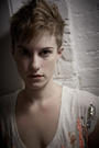
![https://photos.modelmayhem.com/photos/151022/12/56293a48adfde_m.jpg]()
I like your body language and the overall look of it BUT I think the angle of your head here and the glasses aren't working well. Because of the angle, your head looks a bit too large for your body. I would've asked you to put your head down a lot more. As for the glasses, while cool, here I feel like they are taking away from what could've been a very editorial model look for you. They turn the shot into librarian chic instead, which while not bad, I think the route without them would've been better and allowed the viewer to connect more with your eyes.
NUMBER 3
https://www.modelmayhem.com/portfolio/pic/39523336 (18+)
I like the vibe of it but there are some technical errors here. First, you're not really in focus. I can tell by your hair. That's a problem for me. Second, the pose is causing you to sink it a lot and some of your shape gets lost like your feet. Maybe had your legs been off to the side or both or your feet under, or maybe legs up in front it would've looked better. Not sure which but as it is, yeah, I wish i could see more.
NUMBER 4
![https://photos.modelmayhem.com/photos/151022/11/56292edc62769_m.jpg]()
While your expression is ok I would've asked you to open your lips a tiny bit more and then to relax your face a little more. You look slightly tense but not tense enough for that to work if that's what you were going for. As for the photographer, the retouching is really bad and so is the lighting. Your skin looks way too blurred, skin color is all over the place, and there are just too many hot spots. The quality overall isn't good either and the whites in your eyes are an odd shade of gray and your eyes don't pop.
NUMBER 5
https://www.modelmayhem.com/portfolio/pic/36637349 (18+)
I believe I have given you feedback on this one before but just in case, I like it a lot. I love your aggressive, no f's given pose. The quality of the image isn't great but it's such a good picture that it doesn't kill it for me. The photographer could've taken out the belly button piercing because it's not adding much but whatever, that's just me and my preference.
And that is really it. Hope this helps!
Photographer
ImOutOfHere
Posts: 2227
New York, New York, US
Open for business again for a bit!
Photographer
phantom of the light
Posts: 114
Albuquerque, New Mexico, US
I'll go for it. First five.
Photographer
ImOutOfHere
Posts: 2227
New York, New York, US
phantom of the light wrote:
I'll go for it. First five. Hi there,
I have actually given you feedback on the first 4 before. The 5th one however seems to be new so....
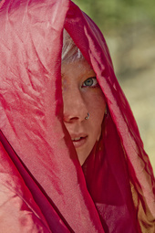
![https://photos.modelmayhem.com/photos/140407/16/534335af1039a_m.jpg]()
There's a lot of weird retouching stuff going on with this image. Her skin is way too smooth and spotty and reddish in areas. There's even an odd purplish/violet sorta magenta color at the upper bridge of the nose on the left that should not be there. That all needed to be handled better in my opinion. You also added blur to certain sections where it doesn't make a lot of sense to me. Like her eye is in focus but her nose, which is in front, isn't BUT then the cloth is and isn't in spots where it should and shouldn't be. Also, the cloth has little brown spots that look painted on. The retouching overall just seems off to me. I hope this helps.
Photographer
Nor-Cal Photography
Posts: 3718
Walnut Creek, California, US
Yajhil Alvarez wrote:
Hope this helps. Thank you very much for your detailed critique. Yes, it does help.
Photographer
ImOutOfHere
Posts: 2227
New York, New York, US
Eric SUN wrote:
B.
Thanks in advance. No problem.
Alright so..
NUMBER 1
https://www.modelmayhem.com/portfolio/pic/34714560
Nice image overall. Things I would've changed? Well her hair looks sort of too sharpened to me. The sweater highlights could be taken down a notch along with the ones on her hands. Fly-aways taken out a bit would help this look even more polished. Lastly, her skin looks a bit too smooth in the face, specially when compared to the body, there should be a nicer balance between the two.
NUMBER 2
https://www.modelmayhem.com/portfolio/pic/34809814
It's an ok image but personally I am not a fan of the sepia tone thing unless there's a reason, like to go back in time or something. It just doesn't add anything to this image for me. Also, there are things that should've been retouched like the belly button piercing hole that is now just there, the tiny stretch marks on her boobs, the long hair strand or scar right under her eye, some of the highlights on her panties, and some strays on her boob and by her clavicle but those little strands are not that big of a deal.
NUMBER 3
https://www.modelmayhem.com/portfolio/pic/38530617
The whole thing feels a bit too dark. The weight should've been turned more in order to capture the actual shape of it, and while I like that there was an effort made to get creative with the background I'm just not sure it really goes with the gym vibe.
NUMBER 4
https://www.modelmayhem.com/portfolio/pic/37736578
She's a tiny bit too bright overall and the hands turned inwards like that is are a bit awkward. Also, while her face is flirty it's not flirty enough, she almost looks pissed a bit. Maybe had her mouth been open slightly it would've looked better and less tense.
NUMBER 5
https://www.modelmayhem.com/portfolio/pic/37333762
I like this one the least of them all which is a shame because there are good elements in it. Like I like the color of the background and what she's wearing for the most part (not sold on the skirt color with the background). However, she has severe red eye specially on her right eye, the sword makes no sense with her location and outfit and her mouth just looks weird. It's not flattering to her.
So overall I think you do good work but there are some execution problems here and there. My biggest issue though is the logo/watermark. It's too huge, specially in number 4. Your pictures should speak for you, not your elaborate logo/watermark. Hope this helps. Great models!
Photographer
ImOutOfHere
Posts: 2227
New York, New York, US
Alaimophotography wrote:
I'm game. First 5. Ok, here I go....
NUMBER 1
https://www.modelmayhem.com/portfolio/pic/39602182
The image is pretty flat overall. I know you titled it moon light but if that's what you were going for maybe a blue-ish color would've made more sense overall. I also think you should have taken out that strand of her on her cheek (her face) and cropped it so a little bit of sand was on the bottom of the image under her arms. The crop right at her arms seems a bit abrupt. Overall i like the pose and the model.
NUMBER 2
https://www.modelmayhem.com/portfolio/pic/39577064
Same model, I usually like to only see a model once in a port unless it's from a VERY different shoot. Showing the same model and from the same shoot just comes across as not having enough work to show, to me anyway. Very nice image overall. The retouching is nice and clean. Wish you had shown more of the foreground again and maybe her hand. Is she holding a phone or something btw? I think I spot something metallic on the cropped hand. Lastly, maybe you should have toned down the tan line highlights a tiny bit.
NUMBER 3
https://www.modelmayhem.com/portfolio/pic/39496146
The image is pretty flat, well she is pretty flat and one color. Her skin doesn't look real and there's some weird pixelation going on all over like a quality issue. Also, the wood in front of her is taking too much attention from her. I mean, maybe if it was just one piece showing and she stuck out a little more it would've looked nice but there's like two pieces and it just looks messy to me.
NUMBER 4
https://www.modelmayhem.com/portfolio/pic/39453001
I like it but again i wish you had more foreground. Cutting out her butt and cropping it there makes no sense to me visually. I also think that since one of her eyes is more lit than the other you should've tried to balance it a tiny bit more so that the difference isn't so noticeable specially since one eye looks much bigger than the other.
NUMBER 5
https://www.modelmayhem.com/portfolio/pic/39420873
I like the outfit but her holding her glasses like that and her facial expression make her seem pissed and like she's about to tell you off. Opening her lips more would've helped. Also, the quality issue and retouching issue in number 3 is the same here. It has a weird quality to it and her face looks too even colored and unrealistic.
Hope this helps!
|


