|
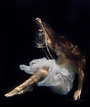
Hello Hive Mind. I uploaded 8 photos to my portfolio of a gymnast with a pink top. I would like your feedback. What I did right/wrong. Especially if you see any retouching issues. Which one(s) are portfolio worthy? Which one's to chuck? All feedback is welcome. Thank you. - WCL May 16 16 06:57 pm Link They're in a style that's good for commercial applications but the cropping is too tight which throws off the composition. May 16 16 08:06 pm Link If these photos are already cropped, I would revisit them and re-crop to provide more space above her head and less space below the bar. On the other hand, if you are showing the full frame, I would retain #3 and try for a more square crop on the others, but, if the opportunity was there, I would reshoot with different framing. May 16 16 08:22 pm Link Her Top is Very Pink May 17 16 01:32 am Link -- image 40647483 - covered in a block pattern? don't know how that got there. -- 2 others - 40647904 & 40647495 - roof bracing steel and drywall seam could be retouched out to extend crop upwards I agree with others - cropping is too tight May 17 16 02:45 am Link Confirming that cropping is the issue here. May 18 16 07:54 am Link Photo 1 It is an interesting action by the part of the subject, but there is nothing that takes this photo to the next step. Composition, this might work better as a horizontal image, fingers and toes are quite close to borders, hand position could be improved. Photo 1 and 2 look like the same image just a different crop.  Pose the body to make it look perfect, models right elbow has the skin bunching up, a bend in the elbow would get rid of that, point right toes more.  Extend the legs so they appear long  Great smile Shape of models left arm can be improved, instead of bending in at elbow, arch back sit up tall, extend the legs for a long appearing look.  Suggested for removal  This is the best shot in your portfolio, [level horizon.].  Another great shot! I wish you well May 18 16 08:20 am Link Hmmm, I personally feel that this is your only best, professional photo:  The pink gymnast ones are repetitive, I'd say post two good ones that do not have much similarity. This one should definitely be removed:  You should have removed the flash and stand from the image:  Green screen/ composition photos really need work, you can tell they are not done properly. I really wish I could comment on each one but I don't have that much time. Good luck. May 18 16 10:03 am Link That blurry sword thing doesn't inspire action, it's just blurry. May 18 16 10:04 am Link Warren Leimbach wrote: A gymnast in a pink top ...maybe I'm just old but I still remember the 1996 Olympics in Atlanta and the Magnificent 7. May 18 16 11:07 am Link Thank you everyone, especially those who gave detailed answers!!! May 20 16 02:30 am Link |