|
Forums >
Digital Art and Retouching >
Painterly feel effect
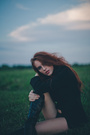
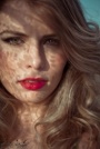
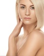
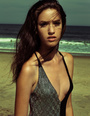
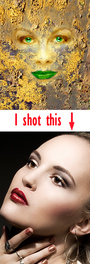
How people achieve that? is, the only way, to remove noise (much noise) to get that? i tried d&b, and shadow/highlights but aren't as powerful as removing the noise (it seems, for me) but with my method, seems like a bit different the result. any other way to do it? examples:   Jan 02 12 07:13 am Link To me, the first photo isn't particularly 'painterly'. The second is closer, but still doesn't seem like a painting. I do it by capturing the image in low light, then I play with the colour saturation and vibrancy, as well as the contrast. Jan 02 12 07:31 am Link yes i know it's not a very paint effect, in fact i want only that little feel like these examples. usually after all my workflow, at very last i reduce noise and add low percentage of virtual monochromatic noise for the depth, and depending on the size of the subject (full body or half body) i come across an almost good result, but i'm not satisfied, something is different. and i think they don't use the reduce noise to get that feel Jan 02 12 07:43 am Link Regardless of the adjective you use, the histograms for those two images can give you some hints about achieving the effect. In both images, the histogram is pulled back a little from the right side, the mass of the histogram is left of the mid-point, and in both, while there is a kernel of blacks blocked up on the left side, the trend of the mass approaches zero on the y axis at above zero on the x axis. That's a long winded way of saying using curves or levels to short the histogram on both ends is one part of getting the effect.  I'd also say it's likely that both of those have some cross-processing effect applied.  Jan 02 12 07:54 am Link Daniele Burza wrote: Try open answer level layer. Change the RGB's value. Jan 02 12 08:00 am Link 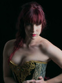
Photographer Posts: 1268 Grove Place, Saint Croix, Virgin Islands of the United States There are two different looks you are asking about a glazed look is a little different than the 'painterly' thing. I think you need to take a look at the 'glazed' look forum post - https://www.modelmayhem.com/po.php?thread_id=529697 Has lots of great info about each. Jan 02 12 08:25 am Link yes there's there's cross process on red and blue and maybe a bit on the green curves, plus i think exposure/gamma or rgb curve for the false blacks and whites (glazed look). so there's toning, that helps for that effect. but i still don't understand how a non-reduced noise image can achieve that feel i can say with a watercolor filter in softlight (reducing opacity) can bring a shape like that feel, but differently from the reduce noise thing, is more noisy-pixelated. sorry for my english, it isn't my first language! Jan 02 12 08:30 am Link Aside from the lighting (which is very important), I think the effect you see in these two examples is mainly cross-processing. Check the RGB values in the shadows and highlights to see how they're crossed. The following edits were done with curves.   Jan 02 12 08:31 am Link Deirdre Holmes wrote: i know that thread, i've read everything if you see the last post is mine, without receiving no more answer i edited that to write a new thread Jan 02 12 08:32 am Link Peano but it seems (for me) that in the examples, the subjects are a bit more "plastic" (see the faces), but just a bit Jan 02 12 08:36 am Link Daniele Burza wrote: Could be. That's easily done in various ways -- NR, surface blur, or a plug-in like Portraiture. Jan 02 12 09:05 am Link I know the top picture is Jaime Ibarra. He is on this site and does give tutorials. He is a very nice guy and will talk your ear off. https://www.modelmayhem.com/59023 and no Jaime does not blur his pictures, trust me.  Jan 02 12 09:11 am Link what do you think about this? this time i didn't use the strong remove noise. 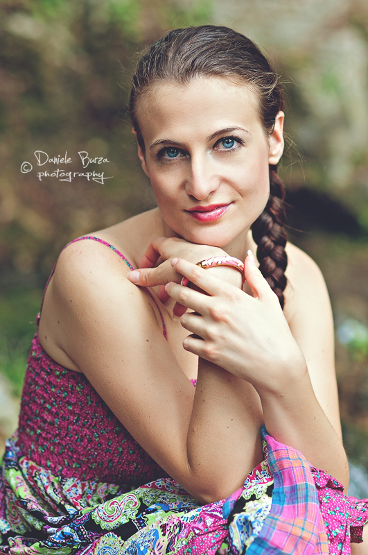 Jan 02 12 03:32 pm Link Daniele Burza wrote: Looks nice. Here's another interpretation. There's no right or wrong in any of this. I wanted to pull the light in on the face a bit more and mellow out the overall tone ... (If this shot were for a clothing advertisement, then this treatment obviously wouldn't do.) Jan 02 12 03:57 pm Link a question, you didn't contrast it right? (asking this because in the "glaze" thread i read that these styles usually use low global contrast / tone contrast) you got down the light a bit + did something with the curve for the color, am i right? anyway good, i like that tone Jan 02 12 04:13 pm Link Daniele Burza wrote: Right, I reduced contrast around the edges and tweaked curves for color. Jan 02 12 04:19 pm Link thank you for everything man, thanks for the hints! Jan 02 12 04:22 pm Link If this is anything like what you're after I could tell you how I did it. 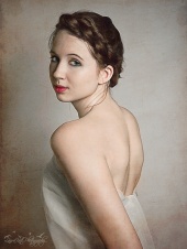 I'll still trying experimenting myself as I want to try some more 'painterly' portraits in the future Jan 02 12 09:42 pm Link Laura Kate Photography wrote: I consider that a painting like portrait. I was trying to achieve an effect like this in a photo. i would like to know Jan 03 12 06:50 am Link Marcus Turner Photo wrote: Hey Marcus. Here are the directions for my process as well as I can remember. *Also please forgive typos and grammatical errors, its been a long day lol. Jan 03 12 08:11 pm Link try photomatix tone mapping for painterly etffec Jan 03 12 08:22 pm Link Hi. Did u guys saw the work of Joanna Kustra. I love jaime ibarra work and i kinda know how he gives that effect to his photos but Joanna is absolutely amazing. Apr 09 12 06:40 pm Link Daniele Burza wrote: 1) You should ask Corwin and see if you can absorb his knowledge. Apr 09 12 06:57 pm Link I'm very interested in the highpass and gaussian technique. How is it done? Do you duplicate the image into 2 layers? And then use a highpass filter on one (that turns the image grey)? What are their blending modes? I also am interested in knowing how to clone large areas of skin from a small one. I just cannot seem to get the cloned areas to be seamless... it all ends up looking like a huge patchwork of skin from different sources. Laura Kate Photography wrote: Jun 02 12 06:46 am Link Diogo de Sousa wrote: thanks for the name...great stuff Jun 02 12 08:32 am Link Hello! The mediafire link has expired. Could you repost this somewhere? Thank you! Marcus Turner Photo wrote: Jan 27 13 05:04 am Link you can get a great painterly effect using HDR if you ever tried that, like so  Jan 28 13 06:18 pm Link When I think of "painterly", I look at it maybe a bit more literally. My cheesecake pinups are heavily influenced by Elvgren paintings, so I intentionally go after what some call a cartoonish look. The way I get the look I am after is really just a bunch of d&b. Here's one that isn't a cheesecake pinup, but that definitely got a bit of that treatment. 18+ https://photos.modelmayhem.com/photos/1 … 700fc7.jpg Jan 29 13 08:02 pm Link Laura Kate Photography wrote: Could someone repost this file? Would love to take a look. May 25 13 06:16 am Link These are paintings, but I really like the colors. http://wonderthinkanswer.tumblr.com/pos … s-by-serge Does anyone know how to make your photos have this sort of color? What kind of gradient mapping is needed? Jul 05 13 07:02 am Link You can get a decent painting effect using GIMP G'MIC, but it's more pastel than oil: 1. Use the GIMP G'MIC Kuwahara and Lylejk filters on two duplicate layers. 2. Put both duplicate layers over the original image in Value mode at 32% opacity. 3. Smooth and adjust the colors. This is what I get.  Jul 05 13 12:08 pm Link A little extra smoothing of Sausage69's photo using the Anisotropic Smoothing filter in GIMP G'MIC (with the settings shown below) turned it pretty close to an oil painting.   Adding another duplicate layer on top, running it through the GIMP G'MIC Photoillustration filter, and putting it in Multiply mode at 64% opacity makes this.  Here's the original for comparison:  Jul 05 13 12:46 pm Link Take Jaime's class or buy his video. Worth every cent... Jul 05 13 01:03 pm Link felix martin wrote: Jaime ? Jul 05 13 01:34 pm Link Jul 05 13 01:52 pm Link thank you, checking now Jul 05 13 01:58 pm Link Here's my attempt at making Jaime Ibarra's photo look more like a painting, using basically the same technique I used on Sausage69's photo above.  Here's the original:  Jul 05 13 02:27 pm Link There are a number of techniques that I think are often found in “painterly” photos. However, I don’t know whether there is an exact “recipe” for painterly photos. I’ve also seen photos that I’d put in that category that do the exact opposite of some of these techniques. Having a “painter’s eye” no doubt would be helpful. This photo includes several of them. Soft lighting. Soft backgrounds. Using light to emphasize what you want to emphasize and de-emphasize what you don’t. Selective placement of texture and detail. Muted colors. Using complimentary and split complimentary colors, related colors, triads and tetrads for your color pallet. Muted blues and golds are a classic combination. Actually in the digital world, blue and yellow are opposites. In the painter’s world, blue and orange are complimentary colors. (You can get a color wheel that will tell you everything you need to know about color theory for about $7.)  Green and red are complimentary colors. You rarely see primary colors or bright colors in painterly photos. These are muted variations of green and red. This photo also is low in contrast – and D&B is used to carve and emphasize shape and form. Also note the abstract background of related colors. You rarely see solid color backgrounds in these photos. 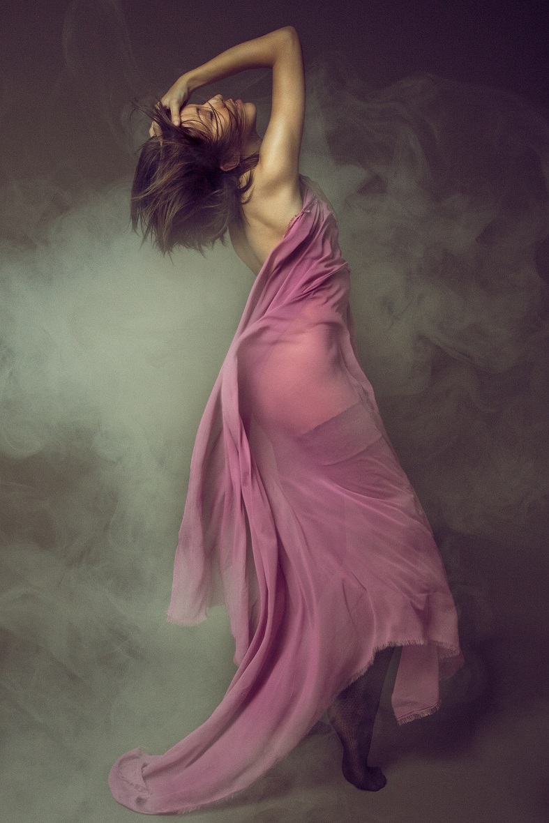 There’s a class of painted fabric backgrounds called Rembrandt or Old Masters backgrounds. These painted backgrounds usually look something like out-of-focus clouds and generally include variations of the same muted colors, often with related colors mixed in. I couldn’t find an example of one of these backgrounds on MM. The Old Masters backgrounds of 40-50 years ago were more subtle and superior to those of today, imo. Almost every portrait studio used them to add a painterly touch. http://www.backgroundsbymaheu.com/rembrandt.html http://www.dennymfg.com/Products.aspx?S … b6ab04dd88 http://savageuniversal.com/products/can … s-backdrop http://www.backdropoutlet.com/OLD-MASTER/products/1009/ Low contrast. You’re more likely to see low-key (at least left-of-center on the histogram, maybe not true low-key). You’ll rarely see true black, and you’ll almost never see true white.  Soft-focus or out-of-focus backgrounds – and even “abstract” backgrounds. 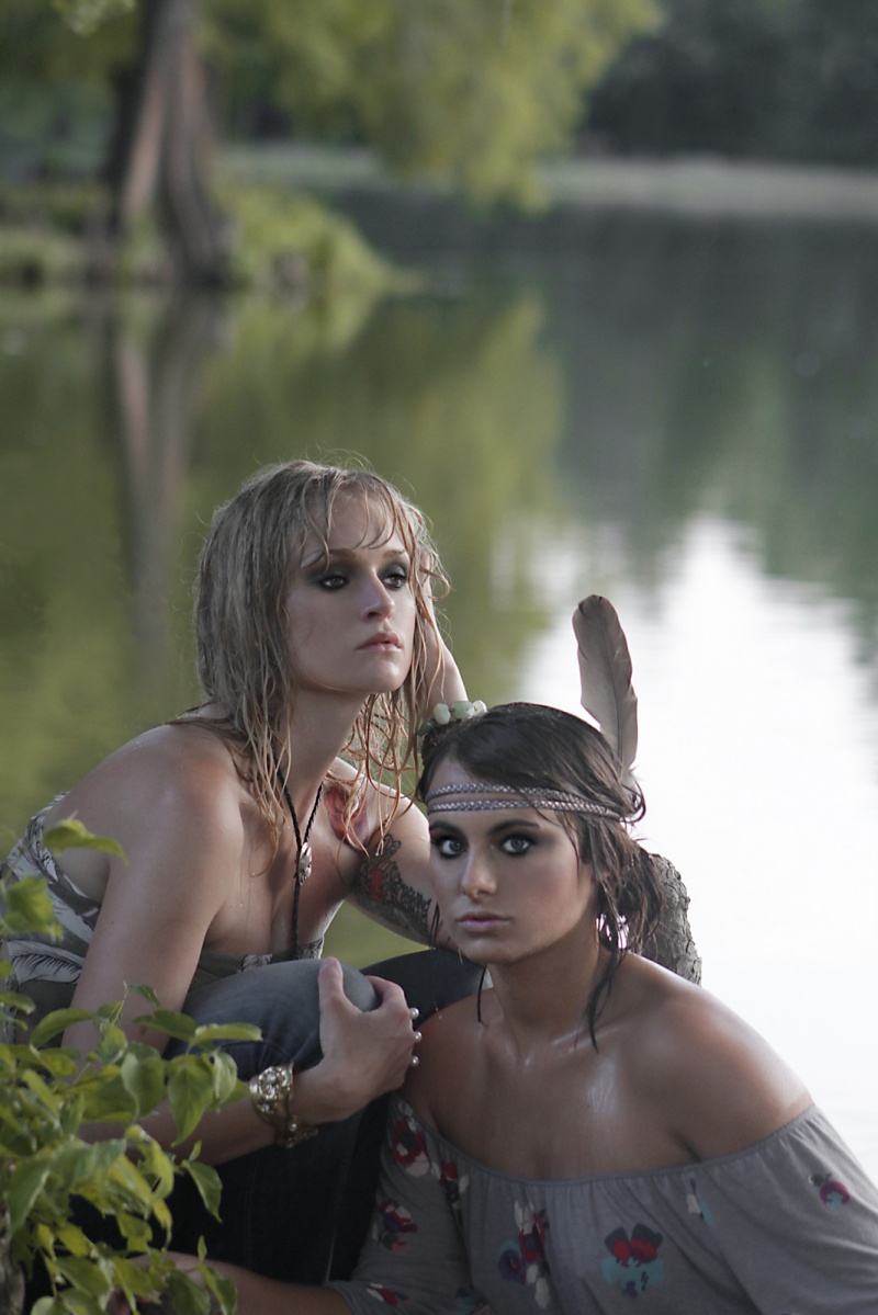 Backgrounds of related colors (essentially adjacent to each other on the color wheel). Backgrounds that appear to be made of brush strokes. Here’s a folder of photos that I consider (or considered at one time) to be painterly. The may be a few in there that I wouldn’t put in the folder today – maybe close, but not as close as others. https://www.modelmayhem.com/list/518804 This may be the “most painterly” photo in the list. 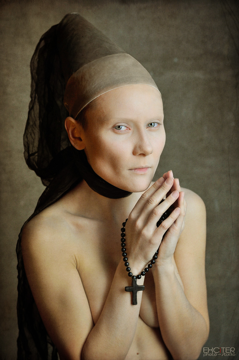 What do they have in common? Jul 05 13 02:55 pm Link Check the work of Scott Deardorff . . . Before: http://www.pbase.com/calford/image/58617347/original After: http://www.pbase.com/sdfp/image/58931715/original Also Fred James: http://www.fredjames.com/c.aspx?n=Artwork Jul 05 13 03:11 pm Link Peano wrote: Excellent links. Jul 05 13 03:49 pm Link |


