|
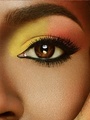
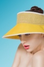
I've been working hard to up my skill level. I think I've hit the wall and have broken through it to a much better level than my previous work. I'd like critiques from professionals as to what I need to look into correcting or perfecting. Any advice is very much appreciated.  Close up:  Mar 30 12 09:27 am Link The only thing that really stands out to me is the discrepancy in color between the face and from the neck down. The lower half is appearing to be more yellow to me, and there seems to be a bit of obvious magenta in the shadow right below her chin. Mar 30 12 09:52 am Link Jesse Stuckey wrote: Yeah, I definitely see that now. Thank you. Mar 30 12 09:57 am Link BorderlineBunny wrote: No problem, it always helps to have a second pair of eyes Mar 30 12 10:12 am Link I think it would benefit from a slight highlight above her lip, just so her filtrum doesn't look so flat & long. x Mar 30 12 10:23 am Link DP Mar 30 12 10:38 am Link Jesse Stuckey wrote: DP? I know of a few things that might mean. Dr. Pepper, Double Post, and Double something else, that I really don't think you're referring to. Haha. Mar 30 12 11:04 am Link The shadows on her neck and body seem too dark compared to those on the face. Especially the neckline. A little d&b or opting for a dark background would reduce the contrast there. Mar 30 12 11:10 am Link Did a good job and definitely your best in your port. Few things you might consider - ears, if it were a cosmetic ad beauty shot you'd probably get the request to slightly reduce them - hair could use some work (but it's a bit strange crop considering what they did with the hairstyling..) - Would dodge a bit to get rid of some harsh shadows and then also for some shaping/carving. - I'd either go for your toned version with a colored background or remove the toning for more natural skintones and a white bg  Mar 30 12 01:19 pm Link Robert LC wrote: Very insightful. Yes, I did think about reducing the size of the ears. I did some work in matching them (one stuck out further than the other) and I can totally see that the tone is much more appealing with a toned background. All excellent food for thought. Mar 30 12 02:41 pm Link Sure, hope it helps. I also ask clients what the use and context of the image is. Maybe the background I did doesnt match that (and I dont dislike your version, but in general I tend to see beauty ads where there's either not a lot of creative toning, or there is a real or artificial background/whitespace for text). If this is their final crop, I'd make the hairdo more symmetrical (since you cant really get what the styling is with this crop) and clean it up some more. Perhaps round off her right shoulder as well. Also noticed the upperlip can use some dnb to round it up and the lower one is a bit warmer and could use some colorcorrection imo. Gd luck  Mar 30 12 04:28 pm Link |