|
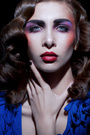
Apr 13 12 01:01 pm Link Apr 13 12 01:02 pm Link If I could do that I would be pretty stoked! Nicely done  Apr 13 12 01:06 pm Link its a bit too yellow for my taste and I would prefer with less or no peach fuzz on her chin and nose. Apr 13 12 01:07 pm Link CRUIKSHANK PHOTOGRAPHY wrote: Thank you:) Apr 13 12 01:14 pm Link Koray wrote: Thank you, I'll keep in mind. Apr 13 12 01:33 pm Link Great work, the only niggle I have is that the tone does not look like a natural skin tone, a little too much green a bit more magenta maybe. Now if that's what you were going for, that's a different story... Really nice work, it doesn't look like plastic, otherwise and the color thing is probably subjective. Apr 13 12 01:43 pm Link Studio2707 wrote: Thank you. Yes the skin tone is really a little green. Apr 15 12 10:43 pm Link Other than the fact that the skin color is a bit off, I like it a lot. I especially like the fact that the original pore structure seems to have been retained (rather than replaced with a "sand" pattern or synthetic pore structure). My main question is how the MUA and photographer managed to create the unusual shaped lip gloss. Apr 15 12 10:54 pm Link I disagree about the colors. I think it works great with that red and the only reason people see it off is because it's next to the original. Remove ALL THE HAIR everywhere. Update this thread. x Apr 16 12 04:10 am Link Good one but agree regarding the skintones and the little fur. It looks a bit like dirty wax but I think you can easily get away from that by raising the brightness of just the skin a bit. There's a bit magenta on the teeth, so it seems. Also, did you use inverted HP for the chin? It looks a bit odd. I think a tiny bit more DnB will be good to really smooth the skin (mid level, not pixel-level). If you use a desaturation layer and a curve adj layer, set to overlay or multiply, you'll see there's still some grunge. (I removed some magenta and cyan from the reds as well, but even if you prefer your deeper red, brightening the skin would still be a good idea imo)  Apr 16 12 05:50 am Link I agree with Natalia, It looks beautiful to me!! Less hair and that's finished!! Apr 16 12 03:27 pm Link The pores on HER left side look just a bit bigger for my taste, the skin is too sharpened at some spots and probably the hairs make that more visible. There's a halo around the chin and too much magenta in the teeth. And I liked the first colors of the skin you made, it looked right. Apr 17 12 02:11 am Link I would clean that lip line up....to perfection....im still on the fence about the skin tone i would play with the blues in the curve and see...whats out there explore....none the less it looks pretty good though. How long did it take you if you don"t mind me asking? Apr 17 12 11:34 pm Link In my opinion we can all get carried away given constructive criticism... No body wants the perfect image, actually I don't think is on trend any more the perfect everything. So in my opinion someone should stop before we destroy the image!! Less is more! Apr 18 12 02:46 pm Link Over all you did a great job in my opinion. The only thing is I have noticed some Hue variation on the lips. Apr 19 12 08:01 am Link I liked the little beauty marks...I think your should have left them. Apr 19 12 08:06 am Link Thank you all for criticism and advice! I was very busy so the long answer. May 02 12 08:55 am Link I like the retouch job. The color is fine as long as that is what you wanted... and I'm very OK with the "peach fuzz". But I agree that the "beauty marks" should have stayed. May 02 12 09:02 am Link May 08 12 08:57 am Link Looks good in Robert's color refinement. Colors were a bit off in the original edit. Also, changing a color of any make-up is never a goo idea, unless it was a client request. Overall, you did an admirable job. Jul 26 12 04:18 pm Link Love what you have done. Amazing work. I just agree with the majority of the comments - skin is too green for my taste. Jul 26 12 08:28 pm Link I personally would of left the moles/marks. I think it adds character. But no biggie. I feel like the corners of the nostrils to the mouth area the skin texture seems a little different than the rest of the image. Below the chin the skin seems over sharpened or maybe its the hair? I love love love how the lips came out and the editing of the teeth. I feel like the chin is a bit flat though. I'm okay with peach fuzz. Of course, everyone has their preferences of whats more appealing. Sep 04 12 10:51 am Link |