|
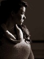
Let me know what you think. Not a professional but I think I have improved since I first came to MM. Still in the learning phase so constructive criticism is welcome. Mean spirited comments are not necessary. Thanks. Nov 23 12 04:17 pm Link  Eyes appear to be squinting Lipstick color appears not to match upper lip vs. lower lip, looks like you adjusted it in Photoshop Less head tilt, distracting background  The eyes are the window to the soul, only when they are open Areas to work on include model posing, location selection and lighting Big logos are a distraction Nov 23 12 08:18 pm Link  this is by far my favorite. Good complimentary colors, she's not squinting, good eye contact, nothing distracting in the background and nothing unflattering about the model. In the shots of the model in the beige skirt and blueish shirt, the skirt bunches up some belly fat and the short shirt exposes it. As the above commenter wrote, there is lots of squinting. I'd recommend photographing in the shade(with something as a reflector), on an overcast day or just after sunset etc. this is by far my favorite. Good complimentary colors, she's not squinting, good eye contact, nothing distracting in the background and nothing unflattering about the model. In the shots of the model in the beige skirt and blueish shirt, the skirt bunches up some belly fat and the short shirt exposes it. As the above commenter wrote, there is lots of squinting. I'd recommend photographing in the shade(with something as a reflector), on an overcast day or just after sunset etc.Nov 24 12 12:40 pm Link Thanks for the critique (both of you). I will keep all that you have given me in mind the next time I shoot with either of them as well as when choosing photos for my port. Nov 24 12 05:24 pm Link |