|
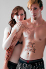
I've been practicing retouching for a few months and would like a professionals oppinion on an image I retouched!! Before editing: https://www.modelmayhem.com/portfolio/pic/30833053 After editing: https://www.modelmayhem.com/portfolio/pic/30832175 Dec 01 12 11:13 pm Link In before someone asks to see the "before" image. Dec 01 12 11:29 pm Link This will probably get moved to the Critiques Forum. You did good on skin smoothing, especially on the face. Not a lot of texture can be noticed, neither before or after, so I won't comment on that. But the after has more visible uneven tones than the before, with a more pinkish tone in the face skin and hands. Playing with the contrast slider could have done that. What is too much is the logo and the text that I feel ruin your image. Both logo and text is blow-up in Photoshop and makes those jaggy edges so visible. Text can be any size in Photoshop, logos can be traced, but it takes some knowledge of the pen tool and patience to do it. I'd also suggest learning pen tool for extractions, although yours would have worked just great with select color+del, but it is very obvious you used a large soft brush as an eraser, from the shoulder that blends in with your logo on the right side. Also, and this is likely just a matter of preference, but I think military images look best on location or with backgrounds swapped in PS if done in studio  Dec 02 12 01:36 am Link You did a fairly decent job for a beginner. In the after image, the background text is too overpowering. I would suggest looking into the adjustment layers options to enhance specific colors. There is too much red in the final image maybe a bit of yellow and more cyan or green to bring the skin tone more toward that of the brown cami trousers to give a more realistic look to the image. Maybe add a bit of dodging on the pants leg to even out the shadows down low. keep pushing. Dimitrio Dec 02 12 02:11 am Link I'm not a professional but I can point out some observations. As the others said, the logos really don't work. I also noticed that you've got a bit of bleed through on her left arm. Maybe you were using the eraser tool with a soft brush? Anyway, I think it's a good first effort. I'm learning more myself each time I do a project. Keep working! DCP Dec 02 12 03:24 am Link The logos are really bad. She looks like she's floating in mid air on jagged text. And you left part of the logo on her arm.. You've brightened up the image but now there are areas that are completely blown out - the sides of the shirt for example, are totally blown out which makes them blend in with the white background and, IMO, makes the model look wider than she really is. It also looks as if the skin work is just blur applied to the skin. It looks very shiny and plastic like, and there are still areas like the top of her hands that look unfinished because of visible veins. Overall color/tones are wonky. Very red in the skin. Dec 02 12 09:49 am Link |