|
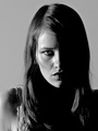
My goal for 2013 is to raise the bar in terms of my look. I'm currently focusing on composition, posing the models, and post processing. Any feedback on how to improve would be greatly appreciated. Feedback on what works and doesn't work in my portfolio. Images that are heading in the right direction and images that are doing the opposite. Thank you for your time and I look forward to hearing the feedback, both good and bad. Jan 13 13 02:52 pm Link No ( @ Y @ )'s ??:-))))))))) JK! Jan 13 13 03:03 pm Link Eliminate the logo  Details Clasp on necklace [Photoshop out and or keep it behind llamas neck] Raise camera to level near llamas eyes The llamas pose looks confusing as to which way she is going, body to photo left, face to photo right Raise crop to just above elbow Where is the llamas right arm? Lighting seems a bit flat Whites of eyes look over processed  You are not getting any light into the llamas eyes, too high as indicated by nose shadow, Every time you repose the llama check the lighting  Too much head tilt Cropping you seem to like cutting off the fingers Jan 13 13 03:17 pm Link Thanks for the input Lee. Much appreciated. Jan 15 13 01:45 am Link George Ruge wrote: Haha, still trying to figure out how to respond to this. Jan 15 13 01:45 am Link Pay attention to the crops, where you cut people's appendages off, where the line of the head ends; pay attention to the background poles and highlights which steal attention from the subject. Jan 15 13 07:30 am Link George Ruge wrote: I believe he is asking where the boobs are?....just my guess! haha Jan 15 13 07:41 am Link Light Writer wrote: Thanks. I'm unfamiliar with the term "line of the head ends". Would you have an example with one of my images? Jan 15 13 10:16 am Link I think your images are lovely. I do feel that they all look very similar to each other though. many are cropped like the one before and all have the subject dead center. maybe try some close beauty shots or farther away full body shots with the rule of thirds? and I'm sorry but I agree, I think your watermark is large and distracting. cheers to my Seattle neighbor~  Jan 18 13 03:41 pm Link |