Retoucher
pixel dimension ilusion
Posts: 1550
Brussels, Brussels, Belgium
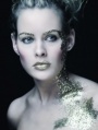
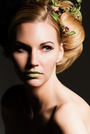
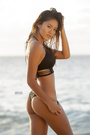
hi i having a problem that when i retouch with an more saturated tone my client always refuse it and they like more brownish look like this my goal ![https://i49.tinypic.com/r7oqqd.jpg]() this my replicate , but i cant get the same look and get so fustrated ![https://i49.tinypic.com/11brsjm.jpg]() i started from here ![https://i45.tinypic.com/11gjc6f.jpg]() any help will be apriaciated ,if possible be lil specific ,thks in advance
Photographer
AJ_In_Atlanta
Posts: 13053
Atlanta, Georgia, US
Hve you tried B&W adjustment layer, set to tint and blended multiply. Adjust to taste/mask etc.
Retoucher
FLEXmero
Posts: 1001
Madrid, Madrid, Spain
Contrast the red and green channels setting the midpoint where the face's limit of dark and light is, and then desaturate to compensate the resulting increase in saturation.
Also, you did get the result. Those happen to be different images. Reduce light a little and compensate saturation if it increases.
Retoucher
pixel dimension ilusion
Posts: 1550
Brussels, Brussels, Belgium
AJScalzitti wrote:
Hve you tried B&W adjustment layer, set to tint and blended multiply. Adjust to taste/mask etc. yes is the first thing i did
Retoucher
pixel dimension ilusion
Posts: 1550
Brussels, Brussels, Belgium
FLEXmanta wrote:
Contrast the red and green channels setting the midpoint where the face's limit of dark and light is, and then desaturate to compensate the resulting increase in saturation.
Also, you did get the result. Those happen to be different images. Reduce light a little and compensate saturation if it increases. how i increase the contrast in thhe chennel ?with s curve is the only way i know to add contrast
Retoucher
pixel dimension ilusion
Posts: 1550
Brussels, Brussels, Belgium
pixel dimension ilusion wrote:
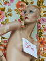
how i increase the contrast in thhe chennel ?with s curve is the only way i know to add contrast thks i went to the channels and adde contrast to the whole channels and then ,desaturate, and reduce the light in the face and to me it look better
think to red gren channel did it thks
Retoucher
pixel dimension ilusion
Posts: 1550
Brussels, Brussels, Belgium
pixel dimension ilusion wrote:
thks i went to the channels and adde contrast to the whole channels and then ,desaturate, and reduce the light in the face and to me it look better
think to red gren channel did it thks to me this is better but will practice i get it thks for the help
![https://i45.tinypic.com/309lbmg.jpg]()
Retoucher
FLEXmero
Posts: 1001
Madrid, Madrid, Spain
pixel dimension ilusion wrote:
thks i went to the channels and adde contrast to the whole channels and then ,desaturate, and reduce the light in the face and to me it look better
think to red gren channel did it thks Exactly. 99% of the color moves are done with curves. Just add subtle contrast to the red and green channel but placing those 2 points carefully where they belong. Usually in skin, there are 2 tones: One in the darkest side of the face and one in the light part of the cheek. Do your colors focusing on that area of the face. Some areas of the whole skin will go too dark or too light. Correct those BELOW the main color adjustment layer.
If you're only colorizing skin, it's a good idea to create a group with a perfect mask of the skin. Then you can put watever adjustment layer you need inside of that group without having to do precise masks anymore.

Retoucher
Peano
Posts: 4106
Lynchburg, Virginia, US
Here's how I went at it ... Step 1: With the target image visible, I eyeballed a curves adjustment on your image, going for more cyan in the highlights and more magenta in the shadows. Here's how my curves turned out (I didn't use any sample points or monitor any color values -- just eyeballing it): ![https://imageshack.us/a/img600/4838/channelsu.jpg]() Here's what that got me: ![https://imageshack.us/a/img546/6232/brown1m.jpg]() Step 2: Hue/sat adj. layer. In the reds, rather than reduce saturation, reduce lightness. I pulled that slider back to -30, resulting in this: ![https://img542.imageshack.us/img542/4243/brown2.jpg]()
Photographer
Gulag
Posts: 1253
Atlanta, Georgia, US
Gradient can be one of your tools too.

Clothing Designer
GRMACK
Posts: 5436
Bakersfield, California, US
Peano wrote:
Here's how I went at it ...
Step 1: With the target image visible, I eyeballed a curves adjustment on your image, going for more cyan in the highlights and more magenta in the shadows. Here's how my curves turned out (I didn't use any sample points or monitor any color values -- just eyeballing it):
![https://imageshack.us/a/img600/4838/channelsu.jpg]()
Here's what that got me:
![https://imageshack.us/a/img546/6232/brown1m.jpg]()
Step 2: Hue/sat adj. layer. In the reds, rather than reduce saturation, reduce lightness. I pulled that slider back to -30, resulting in this:
![https://img542.imageshack.us/img542/4243/brown2.jpg]() Very nice job on the explanation Peano!
I put this in my Bookmarked folder.
Retoucher
Peano
Posts: 4106
Lynchburg, Virginia, US
Add a hue/sat adjustment layer and, in the reds, pull the lightness slider back a little -- or just desaturate the reds a little. pixel dimension ilusion wrote:
to me this is better but will practice i get it thks for the help
![https://i45.tinypic.com/309lbmg.jpg]()
Retoucher
pixel dimension ilusion
Posts: 1550
Brussels, Brussels, Belgium
Peano wrote:
Add a hue/sat adjustment layer and, in the reds, pull the lightness slider back a little -- or just desaturate the reds a little.
thks Peano awesome
Retoucher
pixel dimension ilusion
Posts: 1550
Brussels, Brussels, Belgium
FLEXmanta wrote:
Exactly. 99% of the color moves are done with curves. Just add subtle contrast to the red and green channel but placing those 2 points carefully where they belong. Usually in skin, there are 2 tones: One in the darkest side of the face and one in the light part of the cheek. Do your colors focusing on that area of the face. Some areas of the whole skin will go too dark or too light. Correct those BELOW the main color adjustment layer.
If you're only colorizing skin, it's a good idea to create a group with a perfect mask of the skin. Then you can put watever adjustment layer you need inside of that group without having to do precise masks anymore. gracias hermanito
Photographer
Jay Lee Studios
Posts: 1239
San Diego, California, US
The lighting is VERY different, that may have a lot to do with the "LOOK" they want but they need to understand getting tones the same is one thing but shadows on the other hand is different.
Retoucher
pixel dimension ilusion
Posts: 1550
Brussels, Brussels, Belgium
Jay Lee Studios wrote:
The lighting is VERY different, that may have a lot to do with the "LOOK" they want but they need to understand getting tones the same is one thing but shadows on the other hand is different. thks
Photographer
LORANCE
Posts: 264
San Diego, California, US
Some Great information here.... thanks

Photographer
Daniel Ecoff
Posts: 426
SHERMAN OAKS, California, US
i think Peano nailed it with some good sense of color and simple execution. If you try and use your sampling tool a bit you can dial in even closer. The lighting is a bit more direct but I think the tone is achievable. Curves/Hue/Sat should be all you need. You can also achieve this in CB in place of the curves.
Retoucher
pixel dimension ilusion
Posts: 1550
Brussels, Brussels, Belgium
Daniel Ecoff wrote:
i think Peano nailed it with some good sense of color and simple execution. If you try and use your sampling tool a bit you can dial in even closer. The lighting is a bit more direct but I think the tone is achievable. Curves/Hue/Sat should be all you need. You can also achieve this in CB in place of the curves. thks

Photographer
Paul Ferradas
Posts: 113
San Jose, California, US
Very interesting, I've never tried this before but it looks promising. thanks AJScalzitti wrote:
Hve you tried B&W adjustment layer, set to tint and blended multiply. Adjust to taste/mask etc.
|


