Oct 18 13 10:54 am Link  Another one I'm not so keen on, maybe the colours and style are a bit too bizarre for me Oct 26 13 01:14 am Link  Oct 26 13 04:49 am Link Rik Williams wrote: Not sure "worst" is the best word, since worst implies bad, but this is my least favorite. Oct 26 13 05:22 am Link You made it pretty hard for me!!!  Oct 26 13 06:09 am Link Shirin, It was impossible to pick a "Worst" as None of your pictures are "Worst" by any sort of the imagination! I did pick this one as I love the look and I want to go against the grain here! Your Avatar, by the way, is Spot On gorgeous! All the Best, Edward  Oct 26 13 11:34 am Link  Oct 26 13 07:16 pm Link  Not a big fan of this one Oct 26 13 08:16 pm Link Rik Williams wrote: Oh Rik, Oct 26 13 08:47 pm Link  This, you've got enough pictures where photographers can see your look, you don't need a bad selfie in there. Oct 27 13 09:54 am Link Ariadne Photography wrote: Thats my "recent look" picture. Oct 28 13 04:18 am Link Shirin McBennett-Sheen wrote: Oh no I get that, but maybe put it on your front page and not in your port, I'm just super against any cell pics in ports lol sorry. But here I'll pick another one, not really awful just not my fav Oct 28 13 04:31 pm Link Nothing wrong with this...Just not on the level of your others.  Oct 29 13 06:00 pm Link  Oct 31 13 11:51 pm Link dd photography wrote:
Nov 01 13 12:00 am Link  You have such an awesome range of looks! They're all great but I have to pick one, and I love jack in the box so... Nov 01 13 11:19 am Link  You can hardly see your face and the concept is silly. Also, the tip of your right hand is cut off, ruining the composition. Nov 01 13 04:10 pm Link Apologies for not posting the photo in the forum. (I consulted the how-to thread to learn how but all the instruction screenshots are missing) https://www.modelmayhem.com/portfolio/pic/28503885 You have some great work in your port, so this falls short. The shooter in the back hjas an odd expression (and is basically photobombing you). Everything about the image looks amateurish compared to the other great images in your port. Nov 01 13 04:51 pm Link  I don't really like this one, I don't think all those shadows work and it's too grainy looking for my liking. You do have some really cool shots in your portfolio though Nov 02 13 06:20 am Link  Unflattering. Nov 02 13 02:53 pm Link Jorge Kreimer wrote:
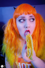
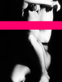
Nov 03 13 10:59 am Link  You've got kind of a deer-in-the-headlights expression. And you're looking upward, which leaves a lot of white at the bottoms of your eyes (known as canoe eye, because the whites form the shapes of canoes). Nov 03 13 11:08 am Link  retouching drives me crazy, the red stripe on her face is a huge STOP sign. The hat? You have MUCH better avatar choices! Nov 06 13 05:45 pm Link The pose is awkward, the eyes look like they have camera shake and lack sharpness, and the random out of focus things at the top are distracting. https://www.modelmayhem.com/portfolio/pic/24710233 Nov 06 13 06:27 pm Link  I really dislike the models expression. The rest of your port is incredible  Nov 06 13 06:40 pm Link This was hard cause I really like your work. I would say this one just because the one next to it is way cooler and almost the same idea.  Nov 07 13 05:00 am Link  Surprisingly your avatar is my least favourite of your portfolio. I think it is bland in comparison to your other lovely shots, and definitely doesn't do you justice having it as your main image Nov 07 13 12:54 pm Link Neon Glow Light???  Nov 07 13 06:43 pm Link It's UV light, what's wrong with that?  I don't like this one of yours:  Nov 08 13 02:11 am Link gotta agree! whoops! Nov 08 13 08:17 am Link Nov 09 13 09:04 am Link  Nov 09 13 10:52 am Link 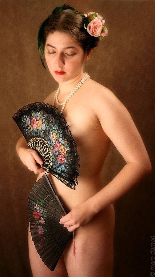 Nov 10 13 09:44 am Link  Nov 10 13 09:56 am Link I would have kept a little contrast in the photo it looks a little flat (the after photo of course. Tiffiney www.tiffineyc.com Nov 10 13 09:58 am Link s c i a t h wrote:
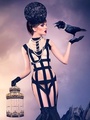
Nov 10 13 10:01 am Link I would have to say this one. Why? Nothing really wrong with this, but all the rest are so damn good!  Nov 10 13 10:04 am Link  Something about the pose/ The way that top is laying kind of makes her blockyor hides her figure in a not so strategic way. Nov 10 13 10:22 am Link Sorry Robby. I just don't get the plague mask.  Nov 10 13 10:30 am Link Marc Damon wrote:
Nov 10 13 11:03 pm Link |