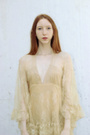
Third time working with gels so I'd love a critique, really though I just wanna know if I should put put this in my portfolio and switch something else out. Sep 13 13 06:25 pm Link You have much stronger work in your port now, so I would say no. I'm in my opinion the color is a little to strong for this shot. Sep 13 13 07:05 pm Link What he said.. You don't need it. It was a nice trip to go through your nice port. Sep 13 13 07:16 pm Link Actually most of your portfolio seems to show off the skill of various make up artists. Yes you light and shoot it well, but you need shots that show you skill as a pure photographer. Sep 13 13 07:29 pm Link While there are elements to this image that I do like a lot (model's serene look, makeup, skin retouching, colour from the gels), her hand appears to float in from nowhere and her fingernails are distracting. I realize that it is probably fancy nail detailing but it really does look like chipped nail polish at first glance to me. If her hand was not in the shot, I would say add it but I don't think your port will benefit from this particular image. Sep 13 13 07:30 pm Link RTE Photography wrote: Actually I'm the MUA in most of the shots and actually the model was in this one I just did the styling. I'm a little confused though, do you mean I need more shots with no makeup at all or just more natural shots as in no retouching? I can understand the first suggestion, the latter however probably just won't happen. My style just isn't for a pure, untouched look, especially in close beauty shots so I don't think I'd put anything like that in my port. I might play around with it though just for fun. Sep 13 13 07:38 pm Link sweet gamine wrote: I do have a bunch of other shots with her without her hand in the image so maybe I'll retouch one of those to see if it just works better in general even if I don't put it in my port. And yea the nails were all nice and fancy but I think you just can't tell from the position and slight blur, oh well. Sep 13 13 07:39 pm Link I can't help thinking that this particular shot might be great converted to black and white (with some adjustments)... It's just that it has such great dramatic effects, that it almost looks like it was meant for black and white. Sep 13 13 07:45 pm Link LightDreams wrote: I actually do like it in black and white too, the model just really wanted some colored gels and I loved the way the effect looked on her braided hair. Here's a quick black and white conversion. Sep 13 13 07:51 pm Link It's an amazing image. Very nice. But, your portfolio is really good, so I'm going to be *very* picky. For intense makeup shots, which get lots of attention on MM, the more intensely lit ones, like many others you have, get MORE attention and more potential at work. The nail polish throws me off and I have to look close to see it's intentional, and I don't love the dimple she is pressing into her cheek. Sep 13 13 08:22 pm Link I do like the black and white better, but I'm still not convince it has a place in your portfolio. Sep 13 13 08:23 pm Link K I C K H A M wrote: Very picky isn't a bad thing Sep 13 13 09:00 pm Link Here's another shot from the set in case anyone feels differently about this one. I'm kinda eh I think, good but maybe not port worthy  Sep 14 13 05:49 pm Link Lovely work Ariadine, but for my eye, she's too green. I realise you were using gels, but I don't feel green is a very flattering skin tone. With a revised colour pallet, I'm certain it would rate far higher with viewers. All the best. Sep 14 13 06:12 pm Link Rik Williams wrote: Weird you say she looks green cause I was using a blue gel, hmmmm. Maybe it was just too cyan of a blue and it got to close to the sickly green look or something. Maybe I'll just stick to one gel next time and keep the light on her face natural. Sep 14 13 06:17 pm Link Ariadne Photography wrote: I love this in B&W and in my opinion should be in your portfolio. Sep 16 13 01:55 pm Link |


 you gave good advice, I'll see if I can find another image from the set without hands so then I don't have to worry about the nails and dimples and maybe if I make it black and white it'll be a better image.