|
Forums >
Digital Art and Retouching >
from sh*ty to not so sh*ty
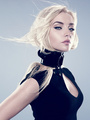
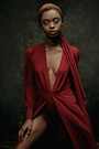
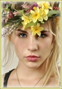
I've been struggling with some "not-great" photos for a catalog, although reshooting would be the logical answer, Is not an option for me. So far I've made color and tone adjustments (roughly, that's why it looks like I've masked it in a blindfold). Does anyone have any tips on how to make this look a bit more decent before D&B or any final adjustments? [img=http://s28.postimg.org/uyf7y1bxl/conversion1.jpg] May 27 14 12:49 pm Link Original looks great to start with. What would you like to achieve? May 27 14 03:34 pm Link The photographer gave me a lot of freedom, at first she wanted the photos to have the J. Crew feel, but she had to use that garland background. I think this is the best reference based on what I'm working with.  May 27 14 06:15 pm Link I guess embrace the on camera flash look is the best you can do. You have to explain to the client that their lighting is completely different then the one in the reference photo and that you can try to achieve similar tones but the photo will never look the same unless they re-shoot it with the right lighting. May 27 14 06:17 pm Link Thanks A-M-P, you're totally right! but as I said above, reshooting is not an option, The photographer as well as the client are well aware that the end result is not going to be anywhere near the ref I posted, I have to use these images and give them a light / happy feel, maybe not exactly like the example, but a lot lighter, less yellowy. In the link above is a color & tone adjustment I made (after trying a few), but I feel a little stuck and wanted to get some opinions on what other adjustments might work better before moving on d&b and other final details. May 27 14 06:40 pm Link You can do it in RAW conversion and then apply to the whole set. Why are you using adjustments? May 27 14 06:46 pm Link IMO the original image is not all that great exposure wise. I think your adjustments and skin tones are now much better. It's difficult to really give a better opinion without seeing the image in a larger view. One thing that stands out to me is the background. I personally feel that the image is far too busy and it might be a good idea to put a but of a blur on the paper decor behind your model. I'll assume that you are selling "her" image and not that of a decoration company. Beautiful model and nice work!! Good luck dear!  May 27 14 06:56 pm Link Tiffany Garrett wrote: Oh yeah! I didn't mean literal adjustment layers. Adjustments as in modifications, although additional adjustment layers could work too, I guess. May 27 14 07:01 pm Link What version of PS you use? May 27 14 07:10 pm Link Tiffany Garrett wrote: CS6 May 27 14 07:15 pm Link Tiffany Garrett wrote: LOL May 28 14 03:58 am Link Thanks Natalia! May 28 14 02:00 pm Link |