clayton cooper wrote:
Hi there. Apologies for the delayed response!
Life.
It gets in the way.
Of Model Mayhem. 
Let's have a look at your work!
I see that a good chunk of your work is in-studio with studio lighting. You've got a good start on your key lighting and I get the feeling that you know what you're looking for with the dramatic, shadowy lighting.
The persistent thing I see is that while you have the key light well-set and your background exposures set, there isn't a lot of separation between the subject and the background. A little bit of rim or back- light on your subjects can go a long way toward creating visual distinction between the subject and the background.
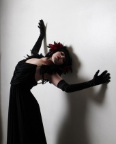
Take this shot for example:
![https://photos.modelmayhem.com/photos/140601/09/538b4eb60237c_m.jpg]()
The model is lovely, there's a good connection and the pose is cute/sexy. She's lit nicely and has some dramatic shadows on the face. You've got your key light off camera and to the right (her left) and I like the subtle shadows she creates on the wall. If you were to bring her a step or two away from the wall, and place a lower power, focused light slightly behind her and to the left, you could get some subtle rim-lighting that would add a huge sense of dimensionality and make her really pop in the image. Having her take a step forward away from the wall will also soften those shadows from the key light and smooth out the image overall.
I say this with the most constructive intent: That lack of dimensionality or separation is something that persists in all of your studio shots. Your work has a good feel though and it's clear that you can 'see' the light. I'd recommend doing some reading about lighting setups and see if you can't tweak what you do to improve it to get a bit more visual pop out of your images.
You've got a great feeling for the dramatic. This shot is great - I love the space around her - it definitely adds to the overall feel:
https://www.modelmayhem.com/portfolio/pic/33240304
I'd like to see some of that space or headroom in some of your other shots - a few of them lean toward feeling a bit visually closed-in.
For example:
https://www.modelmayhem.com/portfolio/pic/32018628
This is lovely. Great model, smooth lighting, great pose. It just feels a bit cramped with the crop so close to her head. If it was pulled back a bit you'd get some breathing room and a frame crop at a more flattering part of her legs which might serve to emphasize those pretty lines and curves even more.
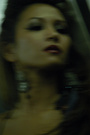
My final criticism is that the skin textures and eyes look a bit too 'shopped at times. This is a great shot but it her eyes and skin are a bit overdone. I feel that a lighter hand with editing would make for a truly beautiful, soft image.
![https://photos.modelmayhem.com/photos/140730/18/53d9984142e16_m.jpg]()
Hope that helps and doesn't sting too much. You've got a good eye and a great sense of drama. Keep it up!
Cheers,
Clayton
Thank you so much for taking the time to go through my port and give me great insight on what I can do to improve my images. Your points are spot on with lighting and separation and I will work to get better at this which will hopefully, improve my photography. Thanks again, I really appreciate it!!