How to Develop Your Own Unique Style of Photography
This article is written by a member of our expert community. It expresses that member’s views only. We welcome other perspectives. Here’s how to contribute to MM EDU.
A proliferation of images has most of us asking whether or not we have found our voice amongst so many others.

With digital photography, engineers and color scientists made the appearance model of digital imagery to try to emulate WYSISWYG. And they did a great job.
The captors themselves don’t see an image even close to how it looks after being processed. What you see on screen is an abstraction as it passes through many steps, many states of image building, by running the document through a processor. The good news is that, for those who shoot raw, having a digital negative is an opportunity—a playground for you to find your unique vision and bring it to life.
When film was the only support for photography for the masses, the film had an inherent bias to it in terms of color, density, grain character, etc. Even if shot and processed without straying from the recommended process, it still had a “look”.
That look, however, was only expressing a single preference—an attempt to represent a pleasing color, similar to that seen by the eyes and imagined in the mind.
How did photographers start developing unique signatures?
For Peter Lindberg, it involved shooting under exposed Tri-x, and then pushing in development. That gives deep blacks, some grain, and a shiny highlight. Color films were cross processed in many ways that created a signature.
Nick Knight, for example, did lots of VPS color negative in E6 chemicals. Some did color negative over exposed 4 stops, and pushed 2+. Lots, perhaps too many, did E6 in C41.
Like a color palette, the way you use a knife to push the paint around on a canvas, like the very act of construction of a painting, photography is no different. Peter Lindberg, Nick Knight, Paolo Roversi, each and every photographer wants to find a signature to what they do to differentiate themselves. While Lindberg likely has his influences in darker post war graphics yet ranging back to the “follies” era, that dark romantic style is in fact his signature. It is definitely part of his creation, before during, and after. Without the processing, the images would be turned towards a more mainstream image with less unique style.
Nick Knight came through a punk rock era, and was surely around artists that were using hallucinogenic and delirious colors derived through not only film such as Polaroid, but in film processing techniques. In fact Nick Knight likely was a pioneer in that respect, pushing the limits of what could be done by processing to the extreme. When you looked through any Avant Guarde magazine, you knew without reading the credits it was a Nick Knight series. That is what a signature is.
Paolo Roversi had worked most of the time with Polaroid 8×10. By mixing up the film negative and positives and lighting for this marriage, the results were always a unique blend of a color array, tone, and density, which created the look on film. One cannot forget that the models, styling, photographers interaction are just as important, yet we are talking about the development aspects that derive a signature.
Since the demise of Polaroid films, Roversi has had to adapt in a new way. We now see full evolution with a similar look from digital capture. The cold and soft shadows and creamy pink rose highlights are simply created in development from raw images. His signature is maintained, and we go on recognizing the total look, digital or not.
Searching for a unique style
These days we are again searching for a unique style to our images. This starts before an image is even opened in Photoshop.
Your signature is a cumulative effect of all of the elements lighting, composition, and in the case of model photography, models styling, hair and makeup, and décor. Yet, why leave all the intention up to a generic WYSIWYG delivery?
As I see it, every image from raw has enormous potential. Not only at the time of capture but after the fact, and after being developed and edited. The more you learn and practice on your raw images the further you can push the edges, and find your signature, unique to your images.
Images in RAW format are just information files off the captor, and a lot of other details needed to draw an image. The image is actually three channels of monochrome levels of the response to what color was hitting the photosites. It is all mapped to through processes to form an image as you see drawn on screen, camera LCD etc.
Accepting the images with the controls sets by default will not put a signature other than generic on your creativity.
To make your voice sing, record your signature into your images is by exploring digital development from raw. Personally, I love Adobe LightRoom, yet that is simply because LightRoom is a visual dream machine. The exact same color conversion engine and controls are built into Adobe Camera Raw. Every version of Photoshop will have some version of ACR in it. You can use Bridge as a browser and organization tool, and ACR as the portal into what you are doing onscreen.
What gives you that look exactly?
For me, it is the tone shape, and volume created. Since the RAW image is by default made to look like reality, you must change that truth to something else. While that can be anything, what I think is the key, is the way the shadows define the depth as well as the tone distribution, the way the saturation makes the image either illustration, and overall coloration which plays into the mood evoked.
An image that lives is one that becomes dimensional by its shape, and being it is 2D it can only be by tone, and where the tones are, how they are distributed. Since the default capture should be fairly close to what you think you saw (granted exposed correctly) you could say, well that is it, you would be missing the opportunity to make a signature out of your images.
This edu article is about the notions of making a signature, not a tutorial on the applications used, yet some examples are here for relevance. [My blog contains tutorials on lighting and LightRoom development settings.]
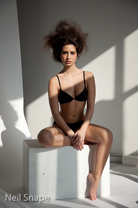
The first is a daylight primary source photo, afternoon sun. As shot tethered, into LightRoom directly the images looked like example 1. That is the default rendering of the raw. Close enough to what I saw albeit more contrast as the eye sees into shadows that a camera cannot.

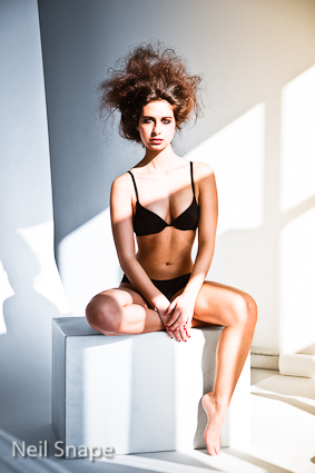
Example 2 is the first set of correction I applied for the images coming into the computer while shooting. Adjustments to exposure, tint, white balance, and fill light all helped to make it look like I thought I wanted to see it without adding a “look”.

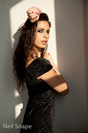
Example 3 is where by adding split toning, some brush strokes to dodge and burn, changes in individual color HSL, all add a signature to the image. By adding a touch of magic, it becomes an image that has a hint of coloration, a touch of highlight and shadow that shape the image, and all make it a beautiful reality.

Example 4 is simply a revisit, another control set on top of the image in example 3, just the same could have been on top of a virtual copy from raw as a start point. It too has a signature, as the de-saturated look is popular, and when combined with the previous highlight and shadow tones, some local dodge and burn, and color tweaks it becomes a very strong statement without any retouching.

Your signature must be made in B&W
The key to B&W is contrast, and where the tones are distributed.
As the color defaults, the B&W default control sets are made to represent a generic panchromatic view of the said image if you simply click on the B&W setting. Same goes for the B&W control settings in camera, or any other editing program.
LightRoom is supplied with a lot of presets like sepia, high contrast etc, even infrared. They are a good start point for beginners. Other third party apps or plug-ins like Nik software have very good presets. Yet beware, you are not creating a unique signature by using widely distributed presets!
What LightRoom or ACR offer, are methods of filtering what the captor saw in three color channels, back into grey levels. One way to begin is by selecting B&W, and then going back up to White Balance. Then the tint will quickly move the tone around, allowing you to play with that. Next, is the all-important B&W color distribution sliders. You find some dynamic edits happen visually as you move the distribution of what the captor saw in color relative to where you set the assumed adjusted white balance and tint.
After you’ve created a dynamic image it’s not finished. The Tones panel is your last playground that will make or break the images.
Once you’re there and happy with your style choice (a potential “signature”) made in the negative, save that preset so you can apply it to more images and adapt it to other shoots.
Things like clarity, fill, sharpening and grain are all just more additional “voices”. I usually apply a first set, and then do whatever pixel level editing in Photoshop, and then return to LR for making further virtual copies, with yet more development settings.
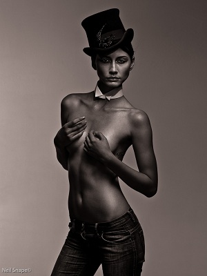
Here is an example. B&W 1 is the default RAW preview.

B&W 2 is a highly modified control set with increase in exposure, black clipping, tone curves, white point, B&W distribution, then split toned to give it that sepia tone which I love.

Credits:
Model: Sandra Falga
Photographer: Neil Snape


March 01, 2015 at 7:57 am, tom rose said:
Good stuff, and useful, but it begs the question, “Why have a signature style at all?”. Of course a portfolio where all the images have are in the same style looks nice, and a definite style might help a professional to market his work, but artistically it is very limiting.
There is one aspect of style that is always there. That is the part that is a consequence of what interests us, and how we see it.
But the end result might be stark monochrome, riotous colour, reduced colour pallette, front to back focus, narrow plane of focus, an uncluttered subject, or something in its environment, natural, artificial, …. the possibilities are endless.
Why can’t a photographer have a variety of “signature styles”. Different subjects cannot all be treated alike. Yet how boring it must be to always shoot the same subjects in the same way.
February 29, 2012 at 5:39 am, Angel Grey said:
I know you probably grow weary of people kissing certain nether regions but I was just having this conversation recently. Not only is there another photographer in agreement but it’s none other Mr. Snape himself. Thank you for the educational piece, and the confirmation of my path’s assumption.
February 28, 2012 at 11:13 pm, Jon Lilley said:
I am a huge fan of Neil’s work. I agree with the article on a technical level but I believe that a signature is something that should come on an intuitive level – in many respects simply how we reflect the world in our own distorted mirror. As artists and artisans we are duty bound to create a signature, or personal style that grows out of ourselves as people.
There is no doubt that advanced editing techniques that Lightroom et al, can afford us give us greater scope for making our mark but I wonder if it is done too consciously: if it is thought through and arrived at rather than felt, that it will always fail to convey the emotion and style it should?
I love your Neil. Many thanks for sharing.
February 27, 2012 at 10:24 pm, Greg Autry said:
Great Article. Brings back some good ole memories…Tri-X, VPS, wow…
January 03, 2012 at 12:01 am, EBZ Images said:
great point of views
January 02, 2012 at 6:05 pm, Dennis said:
Thanks Neil. I appreciate the great resources you have made available on your blog and your inspiring portfolio.
December 14, 2011 at 5:53 am, Richard Arnold said:
Well said, Neil. Something to think about.
December 13, 2011 at 4:03 pm, Greg Smtihsom said:
Thanks for all the info. I’m always looking for ways to dig myself out of a photographic rut.
December 10, 2011 at 3:40 am, Robert McCadden said:
Great article. Sure a bunch of great info is provided, but more importantly it gets you thinking. I’m confident that everyone who reads (and thinks about) it will walk away w/ a better artist.
December 10, 2011 at 12:35 am, Jay Young said:
Excellent article!
December 09, 2011 at 2:43 pm, Richardbiermanphotos said:
Well done for this Neil, About time the truly knowledgable got involved here!
December 09, 2011 at 11:18 am, Danny said:
I adore this writers work, and as well strive for greater tonality creating depth in my digital images, but in a recent trial of a number of RAW converters I found that although LR3 did better than most of the converters I tried & trialed, another I use actually resolves highlights, low-lights and detail substantially better. To each their own I suppose, and clearly Neil has found the software that works incredibly well for him! He happens to be one of the few photographers whose work I look to for inspiration 🙂
Example-pix available upon request 😛
December 09, 2011 at 11:21 am, DBI said:
Danny AKA DBIphotography Toronto (Who cannot figure out how to create an account without signing up for stuff he does not care for!)
December 09, 2011 at 9:32 am, Titus Powell said:
Really, really good article. Thanks Neil! Time I tried LightRoom!
December 09, 2011 at 8:46 am, Info said:
Thanks, Neil. A great article.
December 09, 2011 at 6:18 am, Greg said:
In all the Arts, the artist’s who are most successful are the ones who have truly found their voice. This article goes a long way in providing samples and explinations as to how a Voice if found, in photography. Good Job 🙂
December 08, 2011 at 8:28 pm, Atsilawaya said:
Excellent advice!
December 08, 2011 at 6:54 pm, Tttallman said:
Finally, we have a well-written, informative article with great illustrations of principles described. I especially appreciated the post-processing walk through. Well done! I agree with Steven H. artistic vision is very difficult to teach but Neil did an excellent job.
December 08, 2011 at 5:56 pm, bob said:
this article is basically interesting and accurate But it, like most edu articles, is in serious need of a good editor!
This may have something to do with the fact that the author is writing in a 2nd language… but it may just be for other reasons – i don’t know – or care.
Good grammatical construction allows the reader to “flow” through the article without having to constantly try and figure out what the author was really trying to say.
So i have come to the conclusion that unless the quality of the writing in these articles starts to improve, i am just going to ignore this part of model mayhem.
December 08, 2011 at 5:11 pm, Pauldempsey said:
Very well said – establishing your own style is very important – I would have loved to see composition mentioned as one of the key ingredients. It seems to me that most photogs spend most of their energy trying to learn interesting ways to manipulate color and tone yet overlook the importance of composition – so many could improve their work significantly if they had a better understanding of composition and cropping –
December 09, 2011 at 10:36 pm, C Drzymalski said:
Nick Knight know for his highly experimental work is more likely to be using Quantel paintbox.
His Pirelli calender shot on film WYSIWYG then scanned.
Queen’s ‘The Miracle’ album cover shot on film and then digitally reworked on Quantel.
David Bowie ‘Aladdin Sane’ photographer Brian Duffy re worked air brush by Philip Castle. Not via Adobe PS or any other digital program.
All these effects we see as Adobe PS have been done before by other means such as posterization which I’d worked on before PS and digital manipulation programs.
December 08, 2011 at 1:09 pm, SandraFalga said:
I love Neil photography Techniques 🙂 Excellent read. Hug *sandra falga
December 08, 2011 at 10:58 am, Firepaws2003 said:
I think digital opens up the possibilities f working in any style you think fits your subject at the moment. Signature styles seems too limited though vision is quite another matter entirely. One can have a look but one also has to have a reason for that look for that subject to appreciate that style
December 08, 2011 at 6:57 am, Stealingtimestudios said:
This was a enjoyable and appreciate read… thank you to the author
December 08, 2011 at 3:57 am, AV said:
This is great, I was just talking to someone about style… great article, thanks.
December 08, 2011 at 3:14 am, Anonymous said:
One of the very few articles worth reading!
December 08, 2011 at 12:52 am, Anonymous said:
Superb Article 🙂 Thank you!
December 07, 2011 at 11:45 pm, Ken Yee said:
Nice article on developing your “processing style”..thanks Neil.
December 07, 2011 at 10:19 pm, Steven Hlavac said:
Excellent article. One of the few I’ve seen here that addresses the “artistic vision” of an image, something that is very difficult to teach. It also speaks very well about the aspect of “harnessing” post-processing, rather than hiding behind it, and does so in a way that bridges the common workflow that exists between film and digital…