|
Forums >
Digital Art and Retouching >
Let's Talk About Carving
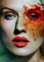
If you're a serious retouching, you'll know what "carving" is. If you're an experienced retoucher, do you have additional tips and tricks to how to carve? I carve on neutral, soft light grey layer using pure white and pure black with brush settings: 100% opacity; 2% flow. I am using the "pressure" options of the advanced brush settings. The practical usage of carving is in the "restructuring" of anatomy. If you know how and where to carve, you could enhance and shape the area in question. I don't claim to be an expert, but I think I am getting pretty good at carving. I think another term is "painting with light" (PWL), where I'd draw in highlights and shadow where it should be and at times where I felt they should be to have that "painterly" appearance. Dec 23 11 01:25 pm Link Hmm I remember a thread like this where people shared their preferences (try a quick search). It wasnt specifically about carving, just DnB in general, but it was discussed (some people might have missed it or newly entered the site in the meantime though). Dec 23 11 01:48 pm Link I think that things like "carving" and "PWL" are all under the umbrella terminology...unless I have missed something. "Carving" to me is a specialized dodging and burning, where the retoucher is adding highlights and shadows. RobertO van der Laan wrote: Dec 23 11 01:51 pm Link Hey Ronald, any feedback as to why use 100 opacity and 2 flow? I saw the "art of dodge & burn" dvd and Kuroslaf (can't remember if its spelled this way) had the same general use. I use 10 opacity and 15 flow for general carving but if I'm doing dodge and burn to alter texture in skin I can go higher By the way I use separate solid color layers set to soft light either for carving/contouring and doge & burn. Dec 23 11 01:57 pm Link I think I've wandered into the wrong room, thought this was a christmas thread with tips for the turkey dinner. Dec 23 11 02:03 pm Link Haha, we could talk about that carving too! :-) Rob Mac Studio wrote: Dec 23 11 02:05 pm Link Ronald Nyein Zaw Tan wrote: It was discussed as well: RobertO van der Laan wrote: Dec 23 11 02:08 pm Link Rob Mac Studio wrote: Dodge the china when you get in a heated discussion with your family in law but dont Dec 23 11 02:10 pm Link The reason for the 100% opacity and 2% flow is for control purposes and building up strength or gradient. Where as the inverse (for example) 2% opacity and 100% flow sets the upper limit. Try this experiment. Open Photoshop. Create a white canvas and have pure black as the foreground color. Activate your brush and for the purpose of the experiment, turn the advance settings to all OFF and have only smoothing on. Draw a straight line, either vertical or horizontal. Make 10 strokes (starting with the up, draw down, and back up again). Do that 10 times and you will the strength building. Repeat and switch the opacity to 2% and flow to 100. Try 20 strokes. Try 50 strokes and you will see that the darkest you could see correlates to "2%" blackness (assuming your foreground color was pure black). THAT is the reason why I use 100% and 2% flow. Cuervo79 wrote: Dec 23 11 02:21 pm Link  I would suggest buying and drawing this head for a while until one can draw it from memory from any angle - http://www.planesofthehead.com/memorize … detail.php One cannot effectively sculpt the planes of the face and head until one knows what they are. Dec 23 11 02:26 pm Link Hi Ronald, I come across that subject my self a quiet few months ago. What I was advised is to study drawings, draw , anatomy study might be involved and a lot of practise. For my self I started with a book called ,,drawing on the right side of the brain,, to get an idea of how things to be drawn and how to ease the process of learning. Then I started drawing from the the photos and so on. This gave me more confidence when it comes to carving. I am sure you got some knowledge but every little helps though. Dec 23 11 03:14 pm Link Ronald Nyein Zaw Tan wrote: That exactly why I do it like that and not with flow. I need the control of lifting the pen to add Dec 23 11 03:18 pm Link Rob Mac Studio wrote: Hahahahaha. Good one! Dec 23 11 04:08 pm Link Krunoslav-Stifter wrote: I interpreted this as a question. Perhaps I misunderstood that hooked punctuation at the end. Ronald Nyein Zaw Tan wrote: Dec 23 11 04:20 pm Link My bad. Well, I guess not. I think I recorded most of them in the DVD. Dec 23 11 04:22 pm Link Both, I am trying to find a good file (of mine) to try to teach others how easy it is. I would also like others more experienced than I to share tips and tricks. Krunoslav-Stifter wrote: Dec 23 11 05:33 pm Link To be completely honest, it's not that I don't want to contribute, I just find it some what difficult to explain something as artistic (personal choice of tools and settings aside) over forum like this simply using words. Dec 23 11 05:40 pm Link Let me try anyway. If I convolute further, I'll stop. :-) To me, (again, I am not professing to be an expert), the concept of carving and dodging and burning is trivial and a "no-brainer" to me. I doubt my background in Applied Physics and Microbiology has anything to do with it. The challenge of teaching is taking what I know and try to make it simple so others could easily adapt and understand. I sometimes feel that artists make things up and say things like, "You need to have an 'artist' background or an 'artistic eye'. I am like...no, you need to understand anatomy and how light and shadow play influence on anatomy." I am "carving" hairs now. (Insert my lame attempt at humor. Instead of "splitting" I am "carving." Get it?) Krunoslav-Stifter wrote: Dec 23 11 06:05 pm Link Ronald Nyein Zaw Tan wrote: Albert Einstein once said “If you can't explain it simply, you don't understand it well enough.” So, teach your fellow retouchers. Explain something you know a lot about in ONE or FEW sentences. Simplicity is the true mark of elegance. Or am I oversimplifying it, here? Ronald Nyein Zaw Tan wrote: ... because you don't need to consciously understand anatomy and how light and shadow play influence on anatomy to be a good artist and surely knowing only anatomy and how light and shadow play influence on anatomy will not make you a good artist. We all take a different approach to learning, but I guess the more important question remains; how exactly do you simplify the universal explanation to the point of explaining it with only a few sentences making the readers a good light painters sort of speak. If you can do that, I'm sure Albert would be proud. I don't think I'm qualified myself. That was my point in the previous post. Dec 23 11 06:28 pm Link My take on carving is this: assuming you lit your image well, you just trace over the natural and preexisting highlights. At times, when a highlight abruptly ends, you can "extrapolate" and trace further, thus extending where the highlight should continue and end more properly. Dec 23 11 06:33 pm Link Ronald Nyein Zaw Tan wrote: ...jury is still out. I hope it helps the people wrestling the term carving, for the first time. Looking forward to the comments. Dec 23 11 06:40 pm Link This was a back lit scene and I exposed as best I could and both the before and after are shown along with my layered TIFF file. You could see that I used the two-curve to carve in this example. I drew in highlights where they should be but are not present in the photograph. Before:  After:  980 Pixel Width Layered TIFF http://ronaldnztan.com/temp/TAN_2011010 … ARVING.zip Dec 23 11 06:58 pm Link More carving. Before:  After:  Dec 23 11 07:04 pm Link I used preexisting highlight and shadow information and trace in. Redacted: I'd like to see more advance forms of carvings from (of course) experienced retouchers. :-) Dec 23 11 07:06 pm Link Ronald your examples above are a bit too subtle to be called carving for my taste  I've been trying to find out ways to reduce the painting and guess work (or painting and blurring ) for more complicated situations (like flat or bad lit images or after the smoothing is done) to actually selectively enhance, manipulate or add contours which is fun but nothing spectacular or easier yet Dec 23 11 10:20 pm Link I am trying to make people "see" that carving isn't as difficult. Koray wrote: Dec 23 11 10:49 pm Link Ronald Nyein Zaw Tan wrote:
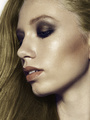
Dec 23 11 11:25 pm Link Maybe I'll learn something here. Can you use my images and mark on them as in how they should be? NothingIsRealButTheGirl wrote: Dec 23 11 11:35 pm Link Ronald Nyein Zaw Tan wrote: I'll mark your image, but here's where I mean. Dec 23 11 11:38 pm Link  There are companion lines that are mirror images of each other in blue, and along them are companion landmarks - the red dots. The ones on the screen right side of the face are easy to spot due to lighting and perspective, but I think it would be good to try and better convey their companions on screen left.  The forehead thing is sort of optional, I guess, but the cheekbone seems less defined and somewhat smoothed over in the after. Anyway - that's my two cents Dec 23 11 11:54 pm Link Thanks for posting this Francis, it would be helpful indeed for me. I'll be sure to edit that picture with your tips after the holidays. NothingIsRealButTheGirl wrote: Dec 24 11 12:05 am Link Thanks  Even that little bright lump at the base of his ear is a landmark that indicates a plane change Dec 24 11 12:17 am Link I would suggest that you read some books on makeup - they will show you the appropriate areas to accentuate in order to create desirable definition. Dec 24 11 12:21 am Link (PLEASE DO NOT QUOTE THIS ENTIRE POST!) I'm hardly an expert in carving, but I do feel that I push it a little farther than Ronald Tan's example (which isn't necessarily a good thing). I went and tried to dig up some of the more dramatic carvings I've done, and I'm also working on a different image just for this demonstration purposes in this thread. These are my fun, experimental retouches that I use to teach myself and practice, so if you think they look really heavy handed to be used commercially you're absolutely right. Also if all these gifs are too big for people's internet let me know and I'll link to a blog page instead.  This was an exercise in extreme tanning which ended up requiring lots of carving to look somewhat right.  I was just having fun with this stock photo. My intent was to exaggurate and mold his features a bit into something I found pleasing to look at. It's way overdone...  Was going for a look reminiscent of the "Milk Money" movie poster. I carved in some depth to her features.  Yes I know I still haven't done the psd walkthrough tutorial of this one that I promised. This one's probably my most dramatically carved.  This was one of my first attempts at heavy amounts of painting highlights. It's a little painful to look at (blown looking areas) and I my eye is drawn to the collarbone I apparently thought looked better protruding. http://1.bp.blogspot.com/-RWaaT3Oxv-U/T … ycomp2.jpg This was another about painting in shiny highlights. Not much done here burn-wise. Like Ashish said, the highlights I painted in are too saturated and look fake.  Went for a really painterly vibe and ended up doing lots of carving. Figuring out how to simplify the anatomy of her back was a real pain - I kept making her look deformed and had to do it over and over until I got lucky and it looked good. I'm sure someone who could paint really well wouldn't have that kind of problem.  This was pretty flat due to the exposing to the right, so I ended up faking the depth of his features with dodge and burn.    I love carving the doll-like features of Kelly E's daughter into even more doll-like features..  This was just a fun image I was working on, and this was actually the full size (I love working on very small images as it forces me to work on just the overall image instead of details). I didn't plan or even notice the slight Greenberg resemblance until after I was done. I tried to save the hair tuft but failed  Download PSD here Feel free to point out any areas where my carving doesn't make sense. I'm no Amy Dresser, but I do love to experiment and hope to get to her level of polish some day. I also have quite a bit to say regarding this subject and have accumulated some resources that help with this kind of theory, so I'll collect all that stuff and try to place it into an organized post later. Here's one I just happened to find now. It tries to teach you how to break down the forms of the face into simple shapes and shows how the transition of the gradient affects how angular a curve of the face is (not a photoshop curve). tiny Amy Dresser carving example->   Dec 24 11 02:39 am Link MP Retouch wrote: Some very nice examples. Gives an nice illustration. Dec 24 11 02:53 am Link Krunoslav-Stifter wrote: indeed good stuff. Dec 24 11 03:10 am Link Well it didn't turn out as dramatic as I'd hoped, but here it is anyway. I used d&b carving to enhance the depth of her features and hopefully make them more appealing while at the same time minimizing depth of the facial features that aren't flattering, like the bottom of the eye socket. If you look at the nose you'll see that I reshaped the highlights and shadows to change its form. Meh. I'm not impressed. I should have chosen an image that's more flat to begin with so I'd have more freedom to shape the features.  Looking at it now this is more about using d&b to change the lighting type/falloff than it is about carving the features. Edit: Yikes, I gave her a really bulbous forehead Dec 24 11 05:08 am Link Those are GREAT examples advanced carving. A little over my head at the level of precise and accuracy. MP Retouch's examples clearly illustrate the "extrapolated" imagined highlights and he clearly have the drawing skills to "see" them. I believe that this advance level of carving requires an "artist eye." That is the point and purpose of this thread is showing the many levels of carving, where my examples are "simple." Dec 24 11 09:54 am Link M P Retouch that is great information, thank you for that. Dec 24 11 12:33 pm Link Krunoslav-Stifter wrote: Just had to say that this is a [huge] universal truth. Beginners in technical pursuits tend to think there is intrinsic value in complexity. There is most certainly none. Dec 25 11 12:34 am Link |


