|
Forums >
Digital Art and Retouching >
Let's Talk About Carving
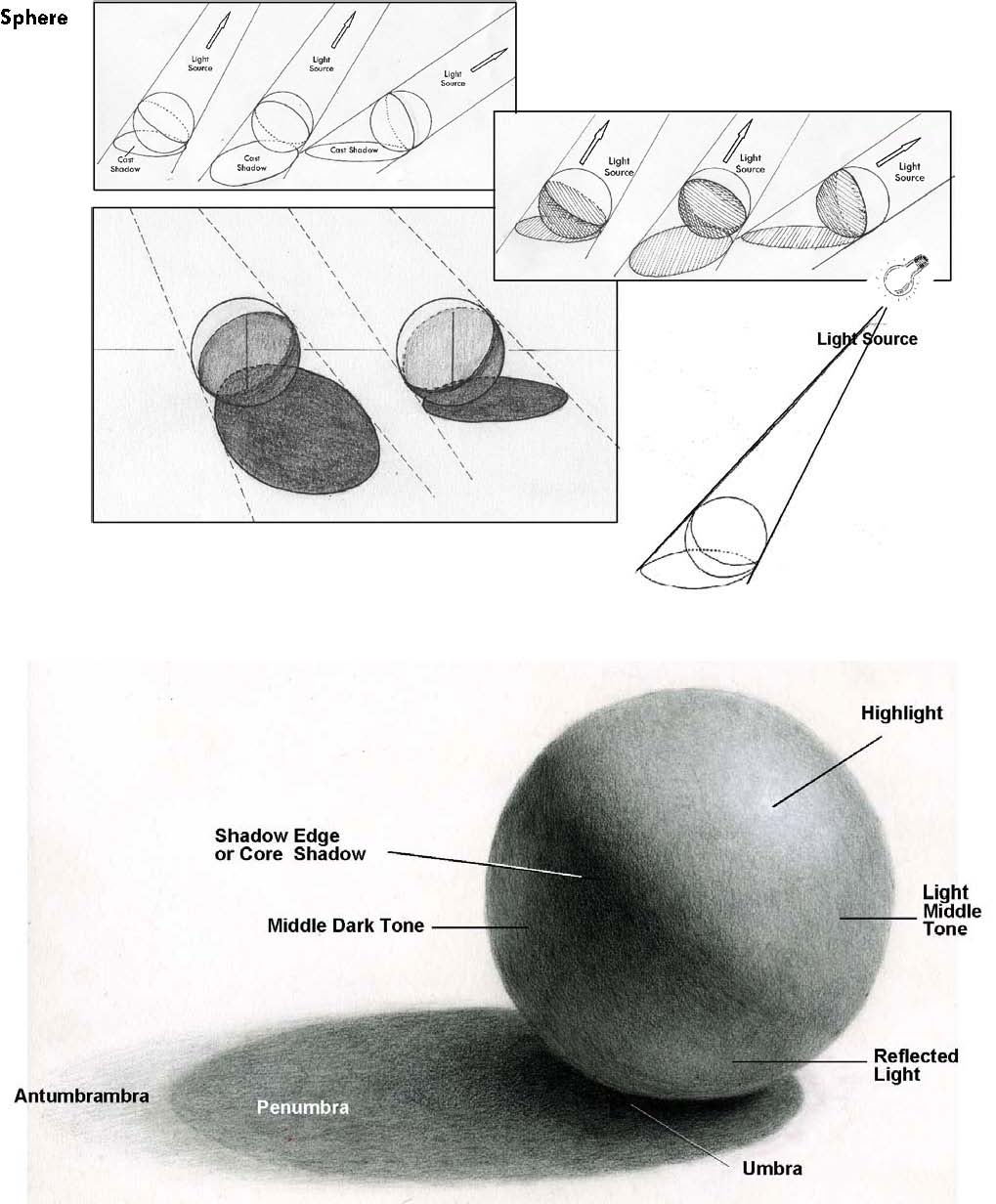
Lanenga wrote: That behaivor of mentally "abstracting" the forms so they are no longer seeing a nose but a pattern of highlights and shadows isn't something that comes naturally to people. It's definitely something that most people I've taught have to learn (and even after teaching them it's still hard for them to do). Once you "get it," then it's super easy and it's hard to imagine other people not being able to think like that, which is probably why it sounds super-obvious to you. Lanenga wrote: Interesting point. I guess it depends on how you define "painting." In this case of the last example and this new example, I wasn't just contouring the nose. A contour generally isn't meant to be viewed from a particular angle, and I think that's the main difference between contour work and "carving." To change the shape of the form to something that isn't there, first you have to build the structure in your mind or draw it on an overlay on the nose, then you have to think about the form of the nose/direction the light will hit/how the light will illuminate the form of the nose, then you have to use your technical understanding of Photoshop to carry it out in a way that reads as realistic (not sure I succeeded in that regard this time). The steps described is very close to the steps that an artist goes through when painting. Stecyk wrote: Thanks, I've heard of this before and experimented with a little bit but maybe I should spend more time with it. Now this may not apply to you but in my personal experience I've noticed d&b newbies tend to dodge waaaay more than burn when they're first starting out, which is something to be careful of. When it comes to carving, dodging is more often used to remove depth by reducing the shadows than to add highlights, while burning is more frequently used to add depth. This is why lots of d&b newbies work looks really flat and bright. Again, not saying this is you, just be aware of this newbie tendency. Natalia_Taffarel wrote: Aww you're too cute Jan 04 12 07:18 pm Link HEEEEYYYY!!! You know what they say...three's a party. Where's my invitation? HAHA. :-P Michael C Pearson wrote: Natalia_Taffarel wrote: Aww you're too cute Jan 04 12 07:56 pm Link I somehow have this or similar imprinted in my mind. That's where my triangles and transitions come from, I guess. During our discussion, I am reminded that I HAD to pay attention to lighting and anatomy. Michael C Pearson wrote: Jan 04 12 08:03 pm Link Ronald Nyein Zaw Tan wrote: I thought the saying was "three's a crowd." I'll ravage you next, ladies first! Jan 04 12 08:04 pm Link Poor Natalia...she's stuck with us. HAHA. Oh boy.... Michael C Pearson wrote: Jan 04 12 08:17 pm Link Michael C Pearson wrote: Thank you for responding to my post and for the heads up. With regard to d&b and retouching in general, I am pre-newbie, so I appreciate your hints for when I put theory into practice. There never seems to be enough time to pursue everything. However, I do like following the posts in this forum. Many of you are generous with sharing your knowledge. Again, thanks. Jan 04 12 09:54 pm Link Michael C Pearson wrote: Great point...I'm pretty certain I'm guilty of too much dodge and not enough burn. Jan 05 12 12:28 am Link The biggest quote I could make here on the Forum wouldnt fill all of your awesomeness Love you all Its sad that we all are living in different areas, i would really like to spend a afternoon with all of you in a Café , i would Pay the First round :-) If only i could Share something back , but my Knowledge is far behind in that Field Jan 05 12 12:35 am Link I see the thread has matured, thanks to some individuals. Especially Michael C. Pearson. Looking forward to see where it goes from here. And thanks Ronald for having faith in it.  Jan 05 12 01:22 am Link You should participate too. You're one of the great artists and know what you're talking about. :-) Krunoslav-Stifter wrote: Jan 05 12 01:44 am Link The illustration by Kevyn is the way make up should be thought out while applying. It doesn't take into account what the light will do, other than if it was flat city. Most retouch on beauty is trying a little too hard to recreate impact, rather than create further depth in a way that was impossible with the light at the time. All too often the chin and beside the mouth corners is hard to do without being obvious, and hard to shape without killing form. In most cases it should be lightened but not so much that there is a lack of contrast and relative depth to the rest of the picture. This stuff is hard to put into words, glad some of you can. Jan 05 12 02:07 am Link Michael C Pearson wrote: Good steps, will remember these and possibly "steal"/borrow them for when someone asks again. Michael C Pearson wrote: No, I quit long before I was close of becoming a doctor. Didn't enjoy it enough. Michael C Pearson wrote: Nice explanation and it seems to be a matter of definition again, as always Jan 05 12 02:44 am Link *Double post Jan 05 12 02:49 am Link Hi, Lovely post coming and coming back to it. Was about to post a sample of carving but but stopped just a second before I saw a sample of make up contouring made by Michael. In terms of retouching is there a difference between carving and contouring? So before I posted my sample I took precaution to ask fellows retouches Jan 05 12 03:15 am Link This was an extended email that was in response to question about carving, might as well repost it here. It mainly discusses some stuff that you'll run into if you decide to take up drawing/painting in an effort to carve/retouch better: The kind of retouching that I posted in this thread is heavy on art theory, so you really need to take up painting/drawing as well as studying composition and color theory quite heavily to be able to do it at that level. When I'm talking about drawing/painting that's essentially inventing form from your imagination using your knowledge of form, the behavior of light, and the rules of perspective. You should be aiming to draw like this (not mine, and I should probably mention that none of the reference drawings in this post are mine):  If you do decide to start painting/drawing expect that your drawings will be really ugly for quite a while. So many people try drawing and then quit because they think they "just aren't talented." The truth is that the mental skills that drawing/painting require aren't really used by humans for anything other than drawing/painting/(photography a little bit) so it takes time to develop them. The people you think are naturally good at drawing either spent a long time practicing, probably because someone told them they're "talented" which made them enjoy it more, or they memorized how to draw arrangement of lines that fools people into thinking they know how to draw.  Here you can see the difference between someone who has memorized the arrangement of line/uses symbols to represent form vs the person who corrected them who has learned how to draw properly by starting with form/perspective, then adding detail If I had to estimate based on people I've personally come across, 90% of all non-professionals who draw anime/cartoons/comic book figures aren't really drawing as much as they are memorizing other artists' figures (meaning the poses/anatomy/other "hard" stuff) and backgrounds then mixing and matching in their mental database of other memorized artists' work in a way that makes them really believe the work they're showing to their friends and family is their own. I know what you're probably thinking: let's talk statistics! Very well. I'd say 55% have no idea they're just memorizing and then regurgitating arrangements of lines, and then other 35% are blatant art thieves who either trace or copy then imply the work is their own to get money or attention. Is it possible the person reading this post is in that unaware 55% who don't realize they aren't learning to draw at a fraction of the speed they could if they learned what in my opinion (abbreviated to imo as I'll be using it quite a bit) is the right way? Here's a way to test yourself. Draw something you find comfortable drawing. A favorite face, character, cute animal, your house, whatever. Now try to lower the viewpoint by about five feet so you're now looking UP at whatever your subject was. Can you draw it from this new angle? If not, you're probably in the 55% who only memorizes symbolism. That's okay if you are. I once was. 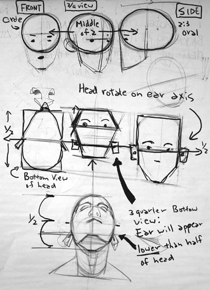 The sooner you admit you're at square one the better. The imo true way to learn involves learning how to see the world in simple shapes, then learn how to apply the theories of perspective to these simple shapes in a way that allows the artist to create the illusion of depth on a 2D surface. From there you study and understand the way light behaves. Once you get that, then it's all about learning how to render different forms, textures, anatomy and all that detail stuff. This is all separate from learning composition and color theory which you should be studying along side the actual "drawing." The composition and color theory is more important to retouching, but this post deals with the part that's harder to master but also important. Behavior of light on a sphere To really draw in a sense that you can construct images from imagination without depending on reference takes a very long time and ANYONE unless they have a mental handicap can learn. Intelligent people learn more quickly. You'll need this true sense of drawing skill to retouch in that appealing-to-look-at-polished-artistic-way, but you can do it if you really want to. The imo best place to start is this guys videos which will teach you how to draw basic forms (cubes, spheres) in space using correct perspective, and how to start thinking with "depth" in mind. http://www.youtube.com/user/moatddtutorials/videos Start at the beginning! Here is a great collection of resources for a developing artist. Also start drawing stuff you see and try to avoid "symbolizing" as much as possible, meaning drawing what you think it should look like (outlines and other shortcuts). Drawing what you actually see will feel really weird for a while. Concentrate on that actual shapes of the shadows and highlights. If you don't see any detail, don't draw any. Worry about details last. First block in the basic forms and try to get them as accurate as you can, but don't spend too long on each piece.  A really good exercise to help you avoid symbolism is to draw outlines around the shadow shapes (but no outlines to describe detail, ONLY places where there is an edge of a shadow) Examples of starting with the basic forms then worrying about details last. See if you can sign up for drawing of life drawing classes/workshops at local community colleges or other private art schools. Browse other art forums and post your work for critique, then take in the constructive advice. Draw for a few hours every day and in a year you'll see a DRAMATIC improvement in both your drawing and retouching. Here are some common beginner mistakes to look out for. Jan 05 12 03:15 am Link nebulaoperator wrote: I discussed the differences in this post, and just to be clear that image was made by the late Kevin Aucoin. Jan 05 12 03:18 am Link Can anyone tell me how to hook up files here without uploading them on the profile? I think I tried to place url from flickr but it didn't work. Thanks Jan 05 12 07:49 am Link You could think of painting as frequency separation in reverse. Then carving is painting, except you are given the first level or two and, jumping in 'already in progress,' you finish it. Jan 05 12 09:31 am Link Glad to have you join us, Thomas! :-) Pull up a seat and help yourself to a virtual cuppa of Earl Grey and let's all be jolly and talk about carving until we all get bored from seeing these carving layers and anatomical graphics. Jan 05 12 10:51 am Link [Redacted]: I'd also like feedback on my carving layer. I know I didn't paint in the the "triangle" without paying attention to gradients. I tried to "see" the cheek bone underneath. Here is my practice on carving. For now, here are the practice files. http://temp.ronaldnztan.com/Justin_Carv … E_ONLY.rar   Jan 05 12 12:22 pm Link To nitpick, I'm not sure I agree with the brightening under the cheekbone bit above the 5 o'clock shadow and angle of the jaw. It looks quite good, though.  I spent some time wondering if the zygomatic arch (where the cheekbone hooks around to meet the ear) should be aiming more for the back corner of the sideburn than the front, but it seems unchanged from the original, so must be right as is. Jan 05 12 12:29 pm Link This is the area that gets "dicey" as I did it for "stylistic" purposes. Unless I did something dreadfully wrong, e.g. burning the forehead black, I think there is some leeway in my current version? Perhaps if I tone down, it would be OK? NothingIsRealButTheGirl wrote: Jan 05 12 12:55 pm Link I updated the files with the correction. I toned down the corrections.    Jan 05 12 01:08 pm Link hi Ron, My carving is based on my observations so far and a little bit of knowledge which is quiet modest. Most of the things I picked up here at MM. Still every time when I do carving, contouring I stop for a while browse some profiles and follow the light and shadow lines, look for the changes in after image. While I d&B I also carve but not too much to a point I think I confident what I do. One's all the preparation is done and image just about to be finished I start my final carving. I use 50% grey for this purpose, I would say quiet a few of them. I paint light and shadows enhance features that I want to stand out trying to follow the natural flow of light(hope I do so) then I use a thick strokes of light and shadow strokes like on my sample and blur them.It happened in the past that I tend to over do.It looks rather fake after. So I rather bit by bit. This is only a small illustration how I do it. Why I chosen 50% grey and blur? because I want to to make smoother transition in the gradient.  Jan 05 12 01:47 pm Link NothingIsRealButTheGirl wrote: Exactly! That`s how I get people to understand FS Jan 05 12 02:29 pm Link this particular thread is GOLDEN! Jan 06 12 12:52 am Link nebulaoperator wrote: When I started redoing my book 5 years ago, I made each image as you did above. Even last year I hacked some images with too much. The agencies DO NOT like it. Jan 06 12 01:07 am Link Neil Snape wrote: Hi Neil, Jan 06 12 02:41 am Link I'm not fan of the carving it's very easy to go over. IMO if the image has great lighting you don't need carving. Yeah you could touch here and there a little but that's all. Jan 06 12 05:31 am Link Let's agree to disagree. The purpose of this thread is proliferating POSITIVE and HELPFUL (& FUN) tips and tricks on carving. Carving isn't your thing, but for others (like myself), I rely on these tips and tricks to give my images my visual style. It is just another tool to go and to be sharpened in my toolbox. Iliana Valeva wrote: Jan 06 12 10:11 am Link Just went through the whole thread again: Thanks for: Ron - for keeping it up. I had a couple of hours of continuing reading and thinking.Such an enthusiasm from you! Michael -you always throw heavy artillery and lots of different ammunition.When reading your reply I have to scroll a lot. NothingIsRealButTheGirl- I have a row of new windows opened after your links Lanenga- I might get Grey's Anatomy eventually. Now Seriously I was doing carving on the samples provided here along the reading at the same time.Introduction to anatomy by fellows participators made it much easier to make a sense where the light should follow or where the shadow should occur. Zygomatic arch this one I will never forget in my life.Somehow it stuck in my mind. Maybe I simply love how this bone defines the face feature. Secretly I was hoping that some guru retouchers would unleash they knowledge and burst it with reply button. Well I was too emotional here Neb Jan 06 12 02:30 pm Link nebulaoperator wrote: I meant of course Gray's Anatomy. Jan 06 12 02:48 pm Link Lanenga wrote: I did learnt a lot about anatomy from http://tinyurl.com/7s5byoc Jan 06 12 03:05 pm Link Lanenga wrote: Do you have link for this one? Jan 06 12 03:19 pm Link Someone forget to count to 10! ;-) Natalia_Taffarel wrote: Jan 06 12 04:16 pm Link wow thank you all & esp ron tan for starting this thread Jan 06 12 04:37 pm Link You're welcome. :-) 1472 wrote: Jan 06 12 11:10 pm Link Head Anatomy (and more) Glenn Vilppu http://www.vilppustore.com/Head-Drawing-Set.htm Marshall Vandruff http://www.marshallart.com/seminars/info/anatomyHuman/ Rey Bustos http://www.reybustos.com/ Jan 06 12 11:14 pm Link I've just printed off this whole thread. It's worth to be treated as a book. Damn guys, you rock. Jan 07 12 11:42 am Link Thanks for joining in, Mat! Please comment and feel free to contribute to the topic on carving. Mateusz Musielak wrote: Jan 07 12 11:49 am Link |


