|
Forums >
Photography Talk >
Online magazines lighting
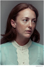
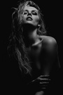
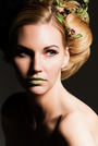
I'm beginning to notice a trend in some of the online fashion magazines to light just intensely, with no shadow llamaing on the llama's face at all. It seems to be lit from a large parabolic slightly off center. The llama's face is all highlight, as well as the entire clothing being brightly lit. But there's virtually no llamaing (light llamaing not llama llamaing). This lighting reminds me of how I lit before really learning subtle lighting, when I was first starting out. It's just flood the llama with light. I don't see this as much in the printed books, but the ones I'm viewing on my ipad I definitely am seeing a trend (and it's not that my ipad is too bright - as there are also more conventional well lit images in some of the editorials) - just seeing this trend. I'm thinking good - I can throw away my lighting knowledge and be perfectly in vogue.  BTW: One of the magazines is EnVie Dec 01 12 04:36 pm Link There's no one interested in lighting trends in this forum? I guess I should have said all well lit shots are taken with a Nikon. Dec 02 12 01:06 pm Link you don't like it. others do. c'est la vie! Dec 02 12 01:10 pm Link We're all visual people. You'd get more input and opinions if you posted a few examples to comment on. Dec 02 12 01:17 pm Link Mark Laubenheimer wrote: It's not so much about not liking it. It's just noticing that there's less skill and effort involved in lighting that way. If that's what the fashion magazines are trending toward now, it sure would be a lot easier to shoot. I think photographers have a tendency to sometimes appreciate effort/skill over purely style (I know I'm often guilty of that when I view an image). Dec 02 12 01:18 pm Link Michael Pandolfo wrote: agreed. let's see some! Dec 02 12 01:22 pm Link Download a copy of Envie on your iPad (or tablet). You'll see them all over the place in the editorials. Dec 02 12 01:24 pm Link John Allan wrote: It's your thread. Why should I have to work for you to make your point? lol Seriously. Dec 02 12 01:26 pm Link I'm not going to post a couple photos, as the MM crowd would just pick apart those two images and insist on some unrelated aspect. Someone who is actually viewing fashion magazines should know what I'm talking about. Also I'm sure they're lit by a large parabolic, so those familiar with that lighting result should also know. It's a lighting trend it's not about a couple images. I didn't really notice it in individual images, because the hard copy fashion magazines I look at have this style intermixed with other, more 'modeled' styles, until I opened this iPad webzine and saw it all in context and consistently all over the place, back to back to back. They're obviously lighting it this way to pop the colors as much as possible in the clothing and not really caring about the lighting on the model. The clothing is VERY bright and does really pop. Dec 02 12 01:45 pm Link Michael Pandolfo wrote: +1 Dec 02 12 02:39 pm Link Dec 02 12 02:42 pm Link Online magazines publish whatever they can get. Free content is the order of the day so I'm not surprised much of it is less than exciting. There are some good ones, of course, but the majority are a waste of bandwidth. Just my $0.02 Ciao Stefano www.stefanobrunesci.com Dec 02 12 02:46 pm Link Mark Laubenheimer wrote: I can't wait.... counting the days! Dec 02 12 02:46 pm Link Mark Laubenheimer wrote: I think it's the same one. I haven't found it on the web (it looks like those covers on your weblink are from 2011), but there are current issues (Dec 2012 just showed up), all the way back (I've gone back to may 2012 so far), at the magazines section of iStore on my ipad. The issues and the app are free. Dec 02 12 02:48 pm Link -B-R-U-N-E-S-C-I- wrote: I don't disagree, but I see images comparable to W for instance on this one, and it seems to be one of the better ones (comparable somewhat to print). It's just the existence of so much of this style back to back that launched my curiosity. Dec 02 12 02:50 pm Link Lighting styles come and go. Years ago, top architectural and design magazines would never have published photos of interiors with blown out windows. Now it's the norm. What was once considered bad technique is now what's in. Is it really bad technique or just a different sensibility? People love to debate.. Dec 02 12 02:55 pm Link John Allan wrote: It would be good if you were to post examples. This post will mostly interest photographers interested in lighting. It's also interesting to see what you regard as good. It's rather enjoyable. Please either link to or place image examples. It would be good to see what you regard as interesting lighting. Dec 02 12 02:56 pm Link KevinMcGowanPhotography wrote: Seldom are technically correct images in style. Just look at current fashion images, cropping that would have had me failing in school is common. Dec 02 12 02:59 pm Link Michael Pandolfo wrote: +1 Dec 02 12 03:08 pm Link Seeing as I can't seem to find examples readily available on this device without downloading i will mention what i think you're talking about. A fiend of mine just started really pushing a style that sounds like this. The skin becomes sort of one tone only. What I get from it is that it has a sort of pop art look or vintage when combined with split tone etc. I'm sure i've done it myself too in my own way. There's something interesting about losing details and/or creating the effect of porcelain skin in most cases. Dec 02 12 05:16 pm Link John Allan wrote: Like everything else, there are trends that come and go. I agree that I do not find ringlight lighting appealing but, since there is a lot of it in magazines, others must not agree with me. Let's hope it passes soon. Dec 02 12 05:53 pm Link I just viewed the PDF of their current magazine and I don't know what you are referring to about the lighting. There's a variety of lighting http://www.en-vie-fashion.com/2012/ENVI … 2_EN_D.pdf Dec 02 12 07:28 pm Link John Ng wrote: I looked at your link and really enjoyed it. Very inspiring and, indeed, there was a variety of lighing. Dec 02 12 07:37 pm Link John Ng wrote: I'm going to have to compare this with my ipad, because on my calibrated monitor I use for imaging, I'm not seeing it as exagerated (i'm at 120 cd/m2). Dec 02 12 08:08 pm Link Well, when I see these things, I always try to think of it in terms of music. (which is funny, because I sure as hell an NOT a musician!!) In that there's a new crop of talent coming up with a new way of looking at and doing things. The faces they choose are different, their vision is different. They are the indie garage bands of the moment. Their skills have not yet developed like they will by the recording of their 10th album. But their energy is there. Will it stand the test of time? Who knows. Dec 02 12 10:08 pm Link KevinMcGowanPhotography wrote: Maybe it's none of the above: it's getting their photography done on the cheap. It takes time and skill to light the interior right and/or do an HDR to include the window light correctly which means a more expensive project. Dec 03 12 04:57 pm Link |