|
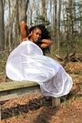
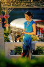
i added more pictures to my port and wanted more people to look at them and give me feedback. thank you Dec 09 12 05:21 pm Link You might change your avatar. In thumbnail size, that image looks like a bunch of bushes. The people just sort of disappear. Just my opinion. Dec 09 12 06:09 pm Link your whole port is very amateurish at the very best. It shows that as of now you have very little artistic sense- spend some time in museums looking at top fashion magazine and TAKE CLASSES if you want to improve. Dec 10 12 07:05 pm Link The Effective Image wrote: further proof that you have, at this point, no clue . Dec 10 12 07:06 pm Link Mark wrote: Woah follow the rules dude. The Effective Image didn't ask for your insult nor critique. Settle it down now. Dec 10 12 07:07 pm Link Your lighting and coloring is way off. It also gives the image a softer look...in other words "not sharp" Practice and have fun. work on your rule of thirds and others things that can add interest and "drama" to your shots. On MM you will always have some haters. Never mind about them. Keep doing what you love and I think in no time you will get some results you can be happy with Dec 10 12 09:07 pm Link Personally, I don't like oversaturated color. Especially green. The skater is better with respect to color. Dec 10 12 09:10 pm Link Samantha Emme wrote: I think he's referring to the OP Dec 10 12 09:11 pm Link |