Model
Axioma
Posts: 6822
Antwerp, Antwerp, Belgium
Photographer
Richard Majerski
Posts: 524
East Hartford, Connecticut, US

They all look fine to me.I prefer the set of vertical images.They look very stylish and elegant and classic and you really embodied the vibe and mood.

Photographer
jesse paulk
Posts: 3712
Phoenix, Arizona, US
why would you want to take them out? is it because theres no bed in them? 

Photographer
You-In-The-Lens
Posts: 133
Grays, England, United Kingdom
Nice set of photos,vet stylish and the nipple ones i find to be much stronger.
That is my view on them,well done you and photographer
Photographer
Marin Photo NYC
Posts: 7348
New York, New York, US
Nothing terrible about them, they are well done but you do have stronger images in your port. Maybe that is why.

Photographer
RachelReilly
Posts: 1748
Washington, District of Columbia, US
Love the middle two especially the one on the left.
And in the bottom two I love the bottom one

Photographer
Jorge Kreimer
Posts: 3716
San Cristóbal de las Casas, Chiapas, Mexico
Very lovely portraits, all of them 
Photographer
SKITA Studios
Posts: 1572
Boston, Massachusetts, US
left nipple image doesn't look great because your hand/arm looks freakishly big/short...right image looks like you're missing both arms from the lighting (might be ok if cropped tighter)
top boob image makes your arm look big and back look bulged....bottom image doesn't have much of an expression (almost like an "I'm testing lights, look this way" image :-)
I like the styling...just that the lighting/posing killed the images...sorry... :-(
I'd agree you have stronger stuff in your port...
Photographer
NothingIsRealButTheGirl
Posts: 35726
Los Angeles, California, US
Axioma wrote:
https://www.modelmayhem.com/portfolio/pic/32112255 (topless) For the top one -- once the nose breaks the cheek line you should go all the way to a true profile. Also I don't like the tangent of the lips against the cheeks.
Might seem like a photographer comment, but I say it since you have editing power over your portfolio...

Photographer
paragonfl
Posts: 293
Saint Petersburg, Florida, US
I don't ever like a model to have multi pics in 1 image...
MUAs before and after is OK, but no where else.
The bottom link, bottom image - topless - needs better composition.
The other 3 as individual images look fine. IMHO

Photographer
mgburke
Posts: 428
Charlottesville, Virginia, US
not bad
just a little to contrasty for my taste
Photographer
NothingIsRealButTheGirl
Posts: 35726
Los Angeles, California, US
The Space Cowboy wrote:
For the top one -- once the nose breaks the cheek line you should go all the way to a true profile. Also I don't like the tangent of the lips against the cheeks.
Might seem like a photographer comment, but I say it since you have editing power over your portfolio... Actually similar comment for the very top one as well.
Photographer
Innovative Imagery
Posts: 2841
Los Angeles, California, US
I think they add variety to your portfolio.
Model
Axioma
Posts: 6822
Antwerp, Antwerp, Belgium
I'll ignore the unconstructive bullshit comments and thank the rest for taking a look and for the opinions, that was great !
Model
Axioma
Posts: 6822
Antwerp, Antwerp, Belgium
SKITA Studios wrote:
left nipple image doesn't look great because your hand/arm looks freakishly big/short...right image looks like you're missing both arms from the lighting (might be ok if cropped tighter)
top boob image makes your arm look big and back look bulged....bottom image doesn't have much of an expression (almost like an "I'm testing lights, look this way" image :-)
I like the styling...just that the lighting/posing killed the images...sorry... :-(
I'd agree you have stronger stuff in your port... that's a little overdramatic isn't it  . .
Photographer
4 R D
Posts: 1141
Mexico City, Distrito Federal, Mexico
Axioma wrote:
So a photographer I respect adviced against using these in my portfolio. I personally did like most of them, so I wanted to hear some other thoughts.
Thanks !
(Constructive please!) Chances are that responses here will be from photographers you do not respect. Anyway, here comes my opinion...
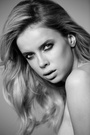
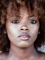
About this picture:
https://modelmayhem.com/portfolio/pic/32111069
You have a beautiful jaw line, but the angle is not equally flattering for your nose, which also blocks your right eye. I love what you did with your mouth here, makes me want a kiss. The cropping is an issue. We cannot see your hair, nor the jewelry on your chest. It is not quite a headshot where your face would fill the frame, nor a three-quarters portrait where we would see more of your chest. Makes me wish the photographer had filled the frame with your amazing neck and jaw line and nothing else.
About this picture:
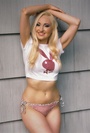
https://www.modelmayhem.com/portfolio/pic/32112505 (nipple)
Picture one, I love your pose here but your hand does not look good. I think there is too much structure/shadow detail that magnify the natural lines we all have in our hands and wrists. The crop is super-tight. Your hair almost touches the top border, your hand almost touches the left border, your nipple almost touches the bottom border. The hair in particular needed more room to be shown more effectively.
Picture two, like in the very first, your head is turned just a little too much or not enough to your right depending on whether this is supposed to show your face at three-quarters or your profile. Again, your nose blocks partially your eye. These issues in particular are responsibility of the photographer who should notice them and direct you to make minor adjustments. Finally, the frame is tight at the sides, cropping your top. These pictures are supposed to show off the clothes too.
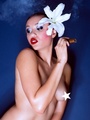
About this picture:
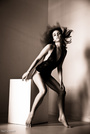
https://www.modelmayhem.com/portfolio/pic/32112255 (topless)
Picture one, love your face and hair. I think this is the one that nails your profile angle the best from this lot. Your arm, shoulder and back do not look good though. I probably would have asked you to keep the pose from your neck up while trying to do something else with your shoulder, probably pushing it back to get a better view of the top you had on. Again, cropping/composition issues. This probably needed to be in portrait -vertical- orientation. I do not need to see all that stuff at the right in fact, you would not need to change the pose at all had this been framed properly in vertical. It would be the strongest easily.
Picture two, your expression seems a little off, does not look natural. Cropping is too tight on your breasts and hair. Either needed more room to work in landscape format or simply going with portrait orientation for a more effective composition.

Model
Nicole Nu
Posts: 3981
Toronto, Ontario, Canada

Photographer
glamourit
Posts: 161
Toronto, Ontario, Canada
you gotta wonder where this advice is coming from... "criticism is prejudice made plausible" , H.L. Mencken ...constructive criticism changes all of that. The mere fact that it's all gotta go...certainly is a clue to the critics mindset ...your are dynamic...
and it shows in the quality ...and diversity of your work...trust yourself...and continue to hone your craft...but don't discard your accomplishments.good luck
Photographer
MichaelClements
Posts: 1739
Adelaide, South Australia, Australia
Pffff what a muppet, definite keepers!

Photographer
Ashley Holloway
Posts: 585
Lutz, Florida, US
I like the second set the best, they look like great images to me
Photographer
B R U N E S C I
Posts: 25319
Bath, England, United Kingdom
Ashley Holloway wrote:
I like the second set the best, they look like great images to me +1 they're cool.
Definitely the best of the bunch.
Just my $0.02
Ciao
Stefano
www.stefanobrunesci.com
|
 !
! 


 .
.