|
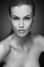
I'm not sure which version I like. Comments? Thank you.  ------------------------- Thanks very much for your input. I've deleted both pictures and I'm trying two very different ones in my portfolio. I appreciate the comments. Aloha! Sep 25 05 01:54 am Link Well the top only partially opens and the bottom one does not work at all... But your forehead looks smashing.... Sep 25 05 01:57 am Link I've been told it's my best feature... LOL I'm so sorry I believe they are working now, thanks for trying to look. Sep 25 05 02:02 am Link Prefer the first. The second one looks washed out. It can be fixed in PS, though. Sep 25 05 02:09 am Link oh the first by far, dont like the second one at all Sep 25 05 02:52 am Link I'd go with the first for sure. The second is way overexposed but might look okay in b/w or a sepia tone. Sep 25 05 03:12 am Link I like the overexposed one. Looks stylized and hides some of the regular exposures problems. Top looks flat and needs to be sharpened a tweak. Sep 25 05 04:18 am Link Neither is flattering. The first one is way too yellow. The second is way overexposed. Sep 25 05 05:55 am Link This is why photographers don't like models playing with the images.  The first one for sure. It's a little warm though and your blouse is partially blown out. Not Mr. Kramer's best work. The first one for sure. It's a little warm though and your blouse is partially blown out. Not Mr. Kramer's best work. Paul Sep 25 05 09:51 am Link I don't think either will enhance your portfolio which is already great. Unless you promised the photographer you would put some of the shoots results on our profile this decision is unnecessary. At this point in your profiles development you might consider some shots which demonstrate a long lean figure. You are 5'10" but none of your shots demonstrate this wonderful asset. Adding another headshot unless it is really outstanding will not benefit you. Many all the other shots demonstrate your awesome eyes and facial features better. If you have to I vote for the first. Sep 25 05 10:17 am Link I like the first shot a lot better. Sep 25 05 10:55 am Link The first shot is better, but I don't like the blown out area in the lower right. In a dark picture the eye is draw to the lighter areas and in a light picture the eye is drawn to the darker areas. In this case the viewer's eyes is drawn away from you and toward lower left hand corner. Sep 25 05 11:21 am Link Paul Ferrara wrote: Paul I can appreciate your point. If a picture has a photographer's name on it every step should be taken to keep the integrity of the photo looking professional and at its best. I would never post this picture as a permanent part of my port without the photographer's approval. Sep 25 05 12:38 pm Link |