|
Forums >
Digital Art and Retouching >
Grad maps for consistant skin tones?
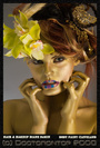
So I'm looking at some of the images floating around here, and wow there are really some amazing PS artists out there. As I'm retouching I'm getting better at better at my skin correction, blemish removal, etc. Over all I've getting very happy:  This image started off with some pock marks from chicken pocks, a few skin blemishes, and was shot at 3 o'clock in the afternoon so the light was especially harsh. One thing however that I'm struggling with is consistent skin ton colors. I do weddings and this can be especially tricky because there are times a bride will cry during a brides maid speech. The skin and cheeks get very red. I was trying to desaturated target areas of an images but haven't had strong results. How do you guys get CONSISTENT even skin tone through out the image? I was trying to make gradient overlays but I was getting mixed results. Thanks a ton, Steven Sep 06 09 06:59 am Link I think it comes down to just painting in areas that are too light or too dark -- usually the latter. The technique (curves, selective color, S/H, etc.) depends on the image, but something like what's described here usually does it for me: https://www.modelmayhem.com/po.php?thread_id=497823 Sep 06 09 07:19 am Link Much as Natalia points out in the HP thread, it's about doing what's right for the image. For some, that is going to come down to using a gradient map to almost entirely replace the skin tones, albeit you'll need a number of intermediate points sampled from the image (or a more pleasing one with similar light / skin) in order to do it properly. Other options include the Hue / Sat hue adjustment trick ala Varis, channel operations in CMYK to pull out magenta, Color Fill overlays in Hue mode, Selective Color adjustment layers as Peano mentioned, and sometimes nothing more than Saturation leveling with a Saturation mask + Hue Sat layer in Saturation blend mode. Each has its purpose and it depends on the image and your style to determine which is most appropriate. Sep 06 09 07:48 am Link Humm actually the selective color method would probably would work really well for my cry brides issue. I find my self commonly using selective color to enhance sky, dress, eye, color, but for some reason I didn't think about masking a part of the skin that was overly red and reducing the amount of red. Good tip. As far as the grad mask maybe I'm not selecting enough color points. I'm guessing that to create a good grad mask you would select a light and dark point from the skin, slowly adding in more points to add in a variety of tones? I know it's got potential, is there a tutorial out there some where? Thanks, Steven Sep 06 09 07:56 am Link Sean Baker wrote: so where do i start to learn to the defining "flags" of the image that determines which method to use to a specific situation? Sep 06 09 09:42 am Link If you choose a color that's around the medium of the skin tones, lower the opacity on your brush, choose soft light blending mode and start painting over all the skin, create an alpha and with black paint over some of the overspray and other areas that don't blend as well to smooth it out. And play with the layers opacity. It'll help start balancing the over all contrast in the tones. Sep 06 09 10:05 am Link Steven Aiello wrote: Tip: It's generally not 'overly red' according to the way Photoshop sees colors; it's too magenta. Removing Magenta from the Reds tends to work wonders for removing exertion flushing, sunburn, red noses from crying, etc. Be careful not to remove the blush from the makeup, though. susan patrick harris wrote: Color theory helps a little bit, but most of it seems to come from practice, and establishing a collection of those flags. I've never seen a list myself, and other than the magenta/red skintone one, can't think of any off the top of my head--the solution usually just comes to me when I hit the problem (or not, which is even more common. Sep 06 09 10:13 am Link I am not being unhelpful but I do not think their is an easy answer to which method you would choose to alter colour as only you know how you want the final image to look. The CYMK Varis method Sean mentioned is specific to removing strong magenta casts although come to think about it their is a variant of that relating to lightening blacks. Selective colour is the method out of these I probably use the most but the best advice I think is try and work non-destructively so that you can always go back a few steps and change your mind. Adjustment layers have small memory overhead and can be easily changed,faded or removed. Also look into LAB mode for colour work. Peano's post gave a good MM link earlier to colour. Lynda.com has some excellent tutorials on colour manipulation by Varis,Mckellend and others. It is a pay site however. oops I thought peano was referring to this thread below although his link should be useful to you as well  https://www.modelmayhem.com/po.php?thread_id=338937 Sep 06 09 10:42 am Link In my opinion gradient mapping for skin has uses, but can also has problems. This because gradient maps only read underlying luminosity only. So the colour of the grads will map to the tones (how light illuminates the shape really) underneath, not to the existing colors, of the flesh or to anything else. If you think this through you realise that its not very natural way to work. So the answer, if you are tryign to produce realistic work, is to reduce the opacity of this kind of mapping or use color/hue mode blends Sep 06 09 12:36 pm Link |


 )
)