|
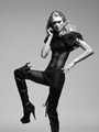
Please critique this series of photos.....  Oct 09 12 04:58 pm Link On all of the photos, I'd personally like to see more separation between the model's hair and the dark background. You could do it with some lighting on the background itself, a lighter background, or some type of rim lighting from behind. It also looks like you used one light source--I'd personally prefer more fill either with a fill card or a second light source. Finally, the model's poses aren't too complimentary for her. Combined with the wardrobe, her arms just blend into her body. The one with the model on the cinder blocks is awkwardly posed leg wise. The most-interesting image is the one on the far left. Oct 09 12 05:28 pm Link Gotcha Bluefin. Anyone else? Oct 09 12 05:46 pm Link I think you did a decent job on the lighting but I would bump up the highlights and shadows a bit. The second pic I would take out. The model's expression is a bit wierd and awkward. I would also discard the third pic. The wardrobe does not compliment the model and her arms are lost. Just my humble opinion. Oct 09 12 08:21 pm Link Bluefin Photography wrote: +1 Oct 09 12 11:48 pm Link |


 having so many images in a horizontal set ruins it for me.