Photographer
Model with Michael
Posts: 391
Frederick, Maryland, US
_eMMe_ wrote:
Let me know what you think. Best:
https://www.modelmayhem.com/portfolio/pic/27723632
Great partial nude. Shows your lovely face from the side and conveys a lot of emotion. Nice pose. This would make a great avatar if you cropped it just above the nipple, much stronger than your current choice.
Worst:
https://www.modelmayhem.com/portfolio/pic/31951560
Much too contrasty and doesn't flatter your face. You are looking away and your hand looks awkward. This photo takes away from your portfolio.
Overall you have an excellent face and form. Very classic. You seem very comfortable with yourself, which comes through in your photos. I would suggest working with photographers who can do you more justice and show your acting ability. Currently the photos have you just staring at the camera without emotion. You are an excellent model, but your skills are not being shown off by your current photographers.
Much success,
Michael
Photographer
Rik Williams
Posts: 4005
Melbourne, Victoria, Australia

Model with Michael wrote:
I've been a professional judge for photo competitions for many decades. I teach professional photographers at workshops, photo schools and seminars. I also teach llamas how to pose. So if you want honest feedback, I will pick out your best and/or your worst. If you want to know why, I'll let you know my reasoning.
If I really like your work, I'll comment and list it.
I wish you much success!
PLEASE NOTE: I am looking for artistic merit and commercial value in the images. While I enjoy creative and artistic nudes, I will pass without comment on portfolios that simply put llamas on display without trying to highlight the llama's beauty.
Michael Love you to if you're still at it
Photographer
MeganJeanne
Posts: 60
San Clemente, California, US
Photographer
Model with Michael
Posts: 391
Frederick, Maryland, US
AndyD10 wrote:
I cordially invite you to judge my photographic efforts. Best:
https://www.modelmayhem.com/portfolio/pic/29465841
Gorgeous model with great hair and porcelain skin. Nice expression and the simplicity of the image has a sweet allure. It would have been even stronger if her right arm were not pressed against her body, but away from it on an angle. The lighting and composition are excellent, making it a strong shot.
Worst:
https://www.modelmayhem.com/portfolio/pic/28656033
Poor composition. Her arm is cropped on the left for no reason. There is not enough space on either her left or right side, making the image feel cramped. The lighting is not great. The pose could have been improved. And her eyes have no sparkle. They are just dark brown orbs, too far to the side of the socket.
Overall you are working with some gorgeous models. But currently it looks like you are depending on them to strike a pose. They are not in the camera and thus can't see the final composition. It is up to you to direct them, so you use the frame most effectively. Your cropping is also too tight in many of your shots.
Much success,
Michael
Photographer
Model with Michael
Posts: 391
Frederick, Maryland, US
Steve Lim wrote:
I'm in.. Best:
https://www.modelmayhem.com/portfolio/pic/31733789
Your current avatar is your strongest photo. Excellent concept, but you are too tight in your composition. Everything needs space and you are cropping too close.
Worst:
https://www.modelmayhem.com/portfolio/pic/31766641
The composition is poor, the lighting is harsh, her skin looks greasy. This is the weakest photo in your port and takes down the rest of your work. You have not decided in the photo which is more important: the tattoo or a possible portrait. One currently competes against the other. It's not good composition.
Overall you are too tight on your composition. Give your subjects more negative space, so the viewer can better appreciate them.
Much success,
Michael
Photographer
Model with Michael
Posts: 391
Frederick, Maryland, US
Cynthia Serrano wrote:
Sure  Best:
https://www.modelmayhem.com/portfolio/pic/14595617
Your strongest shot. Should be used as your avatar as it is much stronger than your current choice. Has a high end professional look and will bring you more attention.
Worst:
https://www.modelmayhem.com/portfolio/pic/13769365
Too dark and not flattering to you. Has no commercial value in a llama's portfolio.
Overall cull your images more, dropping the ones that don't show off your face or form. You have a good look but need stronger shots from better photographers.
Much success,
Michael
Photographer
Model with Michael
Posts: 391
Frederick, Maryland, US
Kanahara23 wrote:
whatcha got for me? These photos are not of a quality that will garner you any work and should not be in a model's portfolio. If you are serious about modeling, work with a good photographer to get some quality shots.
Much success,
Michael
Photographer
Model with Michael
Posts: 391
Frederick, Maryland, US
Flash-Joerg wrote:
Great idea. I am in.
Please tell me also why :-) Your work is all over the place. You have not decided if you want fine commercial shots or images more toward the tragic. I can't pick your best or worst, because I don't know what direction you are trying to go in. But I would suggest you cull your images more.
Much success,
Michael
Photographer
Model with Michael
Posts: 391
Frederick, Maryland, US
Aoify wrote:
I'm new, so I don't have much photo's yet. Still, I'm curios what are my best and worst.
So I can replace it with another photo if my port grows. Best:
https://www.modelmayhem.com/portfolio/pic/31943918
This is by far your strongest image and shows you have great potential. You have the face and form.
The rest of your portfolio is all on the same level and not really the types of photos that will bring you paid work as a model.
I would suggest working toward creating more images like your best.
Much success,
Michael
Photographer
Model with Michael
Posts: 391
Frederick, Maryland, US
PicturePerfectImage wrote:
I would love to hear you comments, thoughts and ideas for improvement! Thanks in advance! Best:
https://www.modelmayhem.com/portfolio/pic/31576887
Your current avatar is your strongest shot. Good color, composition and lighting. But the crop is too tight. I would suggest studying negative space in greater depth.
Worst:
https://www.modelmayhem.com/portfolio/pic/31659265
Poor composition, the model lacks an interesting expression. The image makes no sense. The model is just there.
Your album titles are misleading and some of your images don't match the viewer's expectations based on the title. The only fashion shot in the fashion category is the one with the blue gown and staircase, which is well done, except for the model's expression.
Much success,
Michael

Photographer
Steve Lim
Posts: 63
Falls Church, Virginia, US
Model with Michael wrote:
Best:
https://www.modelmayhem.com/portfolio/pic/31733789
Your current avatar is your strongest photo. Excellent concept, but you are too tight in your composition. Everything needs space and you are cropping too close.
Worst:
https://www.modelmayhem.com/portfolio/pic/31766641
The composition is poor, the lighting is harsh, her skin looks greasy. This is the weakest photo in your port and takes down the rest of your work. You have not decided in the photo which is more important: the tattoo or a possible portrait. One currently competes against the other. It's not good composition.
Overall you are too tight on your composition. Give your subjects more negative space, so the viewer can better appreciate them.
Much success,
Michael Thank you Michael it is very helpful.

Photographer
TDSImages
Posts: 1017
Salt Lake City, Utah, US
Model with Michael wrote:
Sorry for the delay. I'm still going.
Best:
https://www.modelmayhem.com/portfolio/pic/19514862
Excellent couple shot, which is more difficult to finish off well than an individual. Good emotion, composition and lighting. The crop is a little too tight, but otherwise an excellent commercial shot that conveys a lot of feeling.
Worst:
https://www.modelmayhem.com/portfolio/pic/31088291
Very dark and grainy, which takes away from the nice clean look of your other images. The composition, lighting and pose are weaker than in your other shots.
Overall a good portfolio, but it would be even stronger if you didn't crop so tight and left more negative space. Much better to have a lean port like this with strong photos, than many weak images that pull down the quality of your work.
Much success,
Michael Thank you very much for your insight and suggestions. It is very much appreciated!

Photographer
Barely StL
Posts: 1281
Saint Louis, Missouri, US
Model
Ann77
Posts: 175
Atlanta, Georgia, US
If you are still going?
Photographer
BaronBaker
Posts: 20
RESEARCH TRIANGLE PARK, North Carolina, US
Photographer
Model with Michael
Posts: 391
Frederick, Maryland, US
Still going. Will get to everyone eventually. The detailed critiques take awhile to write up.
Thanks for your patience,
Michael
Photographer
DXM Productions
Posts: 10
Houston, Texas, US
Please give me some feedback on my shots... Please ignore the pic of me. It is just so people know what I look like when I'm meeting them. :-)
Photographer
Model with Michael
Posts: 391
Frederick, Maryland, US
Dwight Smalls wrote:
I'd like to know your opinion please. Best:
https://www.modelmayhem.com/portfolio/pic/27876282
Very creative styling. Best composition, lighting and pose. Very good commercial and fine art image.
Worst:
https://www.modelmayhem.com/portfolio/pic/30722460
The model is just there. The lighting, composition and pose don't enhance the model's features. While freckles can be beautiful, I don't see how they are adding to the shot in this photo.
Overall you have some very good models, which strengthen your portfolio. Your headshots are cropped too tight. The lingerie shots are shot in a girlie magazine style, not commercial. The model shots need more work on composition and posing. For instance in this one:
https://www.modelmayhem.com/portfolio/pic/31757301
The model is just standing there. You need to pose the model and the model needs to have an interesting expression for a commercial shot.
Both shots of this model:
https://www.modelmayhem.com/portfolio/pic/31256331
have excellent lighting.
Much success,
Michael
Photographer
Model with Michael
Posts: 391
Frederick, Maryland, US
TS Imagery wrote:
Sure, why not? Passing on this one.
Much success,
Michael
Photographer
Model with Michael
Posts: 391
Frederick, Maryland, US
AaronPawlak wrote:
I'm curious what you might have to say if you can fit me in, but,
I'm not looking for a bio critique, I know that needs re-worked. Passing on this one.
Photographer
Model with Michael
Posts: 391
Frederick, Maryland, US
jesse paulk wrote:
if this is still going~ Passing on this.
Michael

Photographer
EnlightendedPhotography
Posts: 828
Eugene, Oregon, US
This should be interesting to see what you think
Photographer
Model with Michael
Posts: 391
Frederick, Maryland, US
BK Shuman Photography wrote:
I would like to know what you have to say about my work. Thanks Best:
https://www.modelmayhem.com/portfolio/pic/21220359
Strong composition, lighting and pose. Would make a strong avatar image.
Worst:
https://www.modelmayhem.com/portfolio/pic/21222375
The lighting, composition and pose don't enhance the model's beauty. The arm positions are awkward; there is no reason why the elbow should be pointed toward camera. Her expression is blank. Crop is too tight.
Overall I would suggest working more on posing your models. The women you are photographing are good models, but you need to direct them more to fully utilize your full frame.
Much success,
Michael
Photographer
Model with Michael
Posts: 391
Frederick, Maryland, US
mphunt wrote:
Please I'm looking at your port on a calibrated monitor. Your tonal scale is too shallow, which makes the images extremely dark. This is more noticeable when the background is white around the image. It's like driving with high beam on you. If you are going to use images of this tonal scale, you need to find the way that the background around the images is darker. Your image style has been done for many years all around the world. So your style has a lot of competition out there.
Much success,
Michael
Photographer
Model with Michael
Posts: 391
Frederick, Maryland, US
Lela Jesse wrote:
I'd love some feedback! Best:
https://www.modelmayhem.com/portfolio/pic/21789885
This is the best in your portfolio. The negative part of the image is that they cut off the top of your head. There is no reason to cut off the top of the head. The shoulder is not more important than top of the head.
Worst:
https://www.modelmayhem.com/portfolio/pic/31737351
You current avatar. When a model is unable to see without glasses, she has these choices: 1) wear the glasses, 2) wear contacts, 3) look away from the camera so that you do not have to squint trying to see.
You need to work with more skilled photographers. The croppings in your current portfolio are way too tight. They make no sense. The truck photos don't flatter you and should be culled. Also the black and white where you are holding the sign doesn't add to your port.
Overall you could have a good look.
Much success,
Michael
Photographer
Devin Workman
Posts: 166
Los Alamitos, California, US
I'd love to hear your opinion as well.
Photographer
Model with Michael
Posts: 391
Frederick, Maryland, US
Tiffiney C wrote:
I'll play. Thank you in advance
Tiff
www.TiffineyC.com Best:
https://www.modelmayhem.com/portfolio/pic/23861569
Beautiful shot that shows off your classic and fine features. Great styling, lighting, composition, makeup, and pose. A great headshot for a model, though it would be even stronger if it wasn't cropped so tight.
Worst:
https://www.modelmayhem.com/portfolio/pic/21147821
Your current avatar. The light flare is very distracting. No one can really see you. The triptych only worsens it further, as the three images compete with one another.
Overall you are an excellent model with a great face and form. You have varied expressions and are obviously enthusiastic about posing. You seem very comfortable with yourself and project confidence in your images. You would benefit from working with higher-end photographers who could direct you more, helping you create images with stronger poses and greater artistry.
Much continued success,
Michael
Model
Lela Jesse
Posts: 1148
Shasta Lake, California, US
Model with Michael wrote:
Best:
https://www.modelmayhem.com/portfolio/pic/21789885
This is the best in your portfolio. The negative part of the image is that they cut off the top of your head. There is no reason to cut off the top of the head. The shoulder is not more important than top of the head.
Worst:
https://www.modelmayhem.com/portfolio/pic/31737351
You current avatar. When a model is unable to see without glasses, she has these choices: 1) wear the glasses, 2) wear contacts, 3) look away from the camera so that you do not have to squint trying to see.
You need to work with more skilled photographers. The croppings in your current portfolio are way too tight. They make no sense. The truck photos don't flatter you and should be culled. Also the black and white where you are holding the sign doesn't add to your port.
Overall you could have a good look.
Much success,
Michael Thank you!
Model
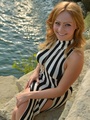
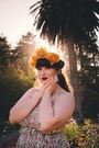
_eMMe_
Posts: 866
Florence, Toscana, Italy
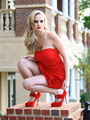
Model with Michael wrote:
Best:
https://www.modelmayhem.com/portfolio/pic/27723632
Great partial nude. Shows your lovely face from the side and conveys a lot of emotion. Nice pose. This would make a great avatar if you cropped it just above the nipple, much stronger than your current choice.
Worst:
https://www.modelmayhem.com/portfolio/pic/31951560
Much too contrasty and doesn't flatter your face. You are looking away and your hand looks awkward. This photo takes away from your portfolio.
Overall you have an excellent face and form. Very classic. You seem very comfortable with yourself, which comes through in your photos. I would suggest working with photographers who can do you more justice and show your acting ability. Currently the photos have you just staring at the camera without emotion. You are an excellent model, but your skills are not being shown off by your current photographers.
Much success,
Michael Thanks for your advice Michael.
Model
Jhomel
Posts: 180
Singapore, Singapore, Singapore
Me pls..I'm still an amateur . Thanks for yr feedback
Photographer
beyond-the-surface
Posts: 96
New York, New York, US
Please do me and with comment why you chose what you chose

Model
Calli Pygian
Posts: 8101
Atlanta, Georgia, US
I would love your input!
Photographer
Ava Photography
Posts: 134
San Francisco, California, US
your opinions please (tia)
(i do intend to prune further)
Photographer
Model with Michael
Posts: 391
Frederick, Maryland, US
Cuica Cafezinho wrote:
Irresistible Sorry for the delay in responding. I've been tied up with work.
Best:
https://www.modelmayhem.com/portfolio/pic/26384603
Your most expressive photo. The outfit, model's expression and pose work together as a unit. Good lighting and composition. Good use of selective focus after the shot was done.
Worst:
https://www.modelmayhem.com/portfolio/pic/26117621
The model is just there. The crop is not flattering. The model has a good face, but is not shown well here. The lighting is not creative enough.
Overall you need to work more on directing the model's pose. She does not know what exactly you are seeing in the camera. Your overall shots have a consistency of showing the model very strained. You need to work on directing the model to have more versatility in expressions, not just a smile or a sad face.
Much success,
Michael
Photographer
Model with Michael
Posts: 391
Frederick, Maryland, US
JoseM Photography wrote:
yess! Best:
https://www.modelmayhem.com/portfolio/pic/30901825
This is the strongest of your portfolio. Good pose on the model, good composition. It would be even stronger if you had given a little more space above her head and picked up some of the trash along the side of the tunnel. Would make a good avatar. Your current avatar doesn't have your strongest composition, pose or crop.
Worst:
https://www.modelmayhem.com/portfolio/pic/31929328
The model is staring up and away from camera for no reason. There is too much wasted dead space on the right. The shot is horizontal, though the model is vertical.
Overall your crops are too tight. You cut off the feet or hands in some shots and give very little space above the heads. I would suggest learning more about negative space and studying images you really like to see why they work.
Much success,
Michael
|