|
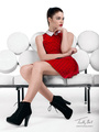
Pick one of the images in my portfolio, any one you want and critique it, be thorough, honest and constructive. I'll then pick one of your images and do the same. Jul 12 13 08:12 am Link Timothy Bell wrote: If I may; I like this image over all the playfulness of the pose and the lighting on the model. Jul 12 13 03:29 pm Link Daniel Mesa wrote: I couldn't agree more. Jul 12 13 04:02 pm Link Glad to see you made it to the critique section. No reciprocation is necessary, but let me take the first image and make some comments.  First of all, as far as portfolio presentation goes, try not to have similar images - It bores people. This is a problem that will cure itself over time. There are thousand's of Do's and Don'ts in photography, so start learning them. Composition... The first thing that hits me as I look at this is that there are two competing areas of interest within the composition - One being the head - The other being the floral work on the dress. With those two areas of interest being widely separated, the eye tends to wander around the image a little too much. I'm not able to quickly offer an improvement on this composition, but the general rule would be to have a consolidated area of main interest. Posing... Looking down on the subject is a fairly common setup, but let's look at the problems sneaking in on you here. Unless she lifts her head up a little so that the plane of her face is more like the plane of your camera, you are naturally going to get those little furrow lines appearing on her forehead as her eyes strain to look upwards. Further, look at the eyes. Too much white in the eye is showing. Photographers refer to this as "canoe eyes" because of the shape that the whites take on. If you do a Google image search for "headshot", you will find examples of getting it right. https://www.google.com/search?q=headsho … 20&bih=886 Stiff fingers - a common problem with non-pro models. It's up to you to look out for it. Tell them to shake out their hands to relax them and just let the fingers droop naturally. Lighting... In your pictures, I'm seeing one, possibly two, speedlights either on or near the camera. This will perk things up a little, but you should be working on getting those lights off the camera and learning the common lighting patterns for portraiture. There are lots of books on portrait lighting, but for an inspirational quick start, try this web site: http://strobist.blogspot.com/ Learn to use modifiers with the light to soften the shadow edges. A typical lighting pattern for the main light in this situation would have the main light (also called the key light) skimming across the female body to bring out the curves, and you would have the model turn her head towards the light to find a good lighting angle on the face. Background... I guess you wanted to harmonize around black, but you found out that dark hair soaks up light like a sponge and the hair vanishes into the background. To get the hair delineated, you either need to get a lighter backdrop or put one or two rimlights on the hair. Yet another way to deal with it would be to put a small light behind her to add some light to the black backdrop behind her head and shoulders. Keep at it and have fun along the way! Jul 13 13 11:46 pm Link Guss W wrote: I really appreciate the in depth critique, this was a shot I did a few years ago and have learned a lot since then, but I still like it so I included it and never could decide between the one with a smile and the one without. Just so you know that shot was taken with a single light (in this case a lamp) 45 degrees between the camera and the left side of the model. I almost never use a flash on top of the camera. Jul 14 13 10:13 am Link Timothy Bell wrote: Go with the smile. Jul 15 13 03:27 am Link |