|
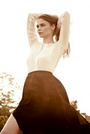
Does anyone know how to reach this exact color scheme? Amongst my many ideas I have: Vibrance Increase Sepia with low opacity or warm filter Contrast Increase I've tried those three which have been the most successful but I'm missing the blueish shades and something about the color is still not right. (check all 5 photos to get the concept please) http://hollywoodlife.com/pics/katy-perr … y-vogue-5/ Oct 15 13 07:51 pm Link You need to do local adjustments. No global setting will make it look like that. Oct 16 13 09:34 am Link Jakov Markovic wrote: What local adjustments would you do? Oct 16 13 10:27 am Link Um, isn't it obvious that the hay, dress, undergarment and her skin are all treated separately, and uniform within their own borders? Oct 16 13 04:57 pm Link Look at the histogram and you will see. Oct 17 13 01:31 pm Link Lol. Sure, hisotgram can help, but isn't it obvious?  Oct 17 13 03:49 pm Link Jakov Markovic wrote: No Its not, Histogram only shows you color/tone/amounts. Cross Processing is popular in Magazines due to its popularity and visually creating mood and balance, especially with the deeper tones and contrasts. You'l find this significantly in Fashion Mags, all over the world. Basically, Cross Processing is King and easy way out for all Fashion mags! That's my honest opinion.;-) Jan 15 14 05:47 am Link If you're looking for similar outfits, Katy's wardrobe designer/stylist owns this store: http://www.newyorkcouture.net/ She custom designs some celebrity wardrobe pieces, but Katy has also been shot in some off-the-rack items from the store. You just missed one helluva sale. Last month (up to Dec. 29) she was closing out items from her 2013 and earlier lines, some of them at 5% of retail. Jan 15 14 06:00 am Link |