|
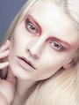
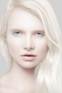
I'd like some professional opinions on my retouch work, both here and here http://alyssajuneretouch.blogspot.com/ I'm in the process of putting images together to build a new website but for now that's where it is. I'm just looking for advice on my images and how they look; if certain ones should be removed and why. How could I improve my port? Whats missing? What do I need to work more on? If you're a photographer or someone who would hire w retoucher, would you hire me, if no, why. No hard feelings, just a little constructive criticism. Thanks so much, in advance! Mar 27 14 10:59 am Link First one, breast is now looking odd, and color needs to be way warmer on the skin. Second one needs a lot more blacks in the shadows. Ones on the bridge are the only ones that look color corrected. The one in front of the tower is much cooler for some reason, make the entire set the same color. P.S. I see now that it's a main page only... I suggest you star with stronger photos and take it from there, Your best retouch by far is the cool(in tone) hair image of girl laying down on the floor under "beauty". Mar 27 14 11:11 am Link CLICK retouch wrote: Thanks, Mar 27 14 11:25 am Link Alyssa June Retouch wrote: Front page. Mar 27 14 11:36 am Link CLICK retouch wrote: That's just how they wanted those. Mar 27 14 11:56 am Link |