|
Hi please critique my images I used for my MM Profile 1/2 Film 1/2 digital from fashion editorials, lifestyle campaign, and personal. Thank you! Aug 26 14 03:40 pm Link 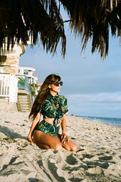 Your strongest image Level the horizon 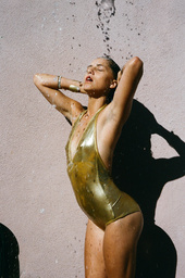 Another interesting capature Wish shadow photo bottom left were not there Wish all of models arm shadow was there 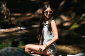 This for me has harsh lighting Model too centered  Too much cliff not enough model Aug 26 14 03:55 pm Link  In general I really like what you're doing, or at least the direction you're heading in. This shot isn't working for me though. She's attractive, she's nude, okay...but she's incredibly under-exposed. And the image is blurry. Doesn't belong in your port. 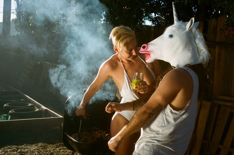 I love this shot. It's weird, humorous, quirky....above all, interesting. Can't say I've seen anything like this in recent memory. I'm curious about what she's about to do though...the story behind the concept. Is she going to brand this half man half beast? Or feed him some steak? Hmmmm  Not feeling this one so much. The blown out highlights bother me. It's just really really bright. When you look at it, where does your eye go 1st? If there was something else in the shot that was interesting to look at, great color, great expression, etc, then maybe it could be passable (although unlikely)...I would toss this one. 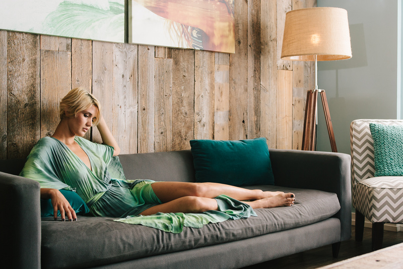 I like this shot. It's elegant. I don't like the claw-like position of her fingers however. The paintings are a bit lost...better color/contrast needed on that back wall. The light bulb showing through the lamp - would retouch that out. The shadow being cast by the lamp - not liking that so much. The sliver of wall (far right) lit by the window...would crop that out.  I really want to like this shot. I love the color. But I don't see her arms, and that's bothering me. Strikes me as art photography, not at all fashion (not sure what you intended). Seems like it belongs in a gallery or coffee table book, as part of a series, along with other art photos.  Highlights are a little too hot (her hand especially), but this could easily be fixed. The rock in the foreground is a distraction. Model's center position is okay, but feel like her pose and composition in general could use some work. Sep 28 14 07:14 pm Link I personally really enjoy your work. I agree with what others are saying about too much cliff, not enough model, etc. but I understand the direction you're going for. Still, it's something to bear in mind, but I'm sure you can frame the photo however you want to depending on your client. Secondly, I have to disagree with what everyone is saying about harsh lighting/overexposed/underexposed etc.   Personally, I LOVE that kind of lighting and you see it in fashion magazines all the time. I'm not a huge fan of perfectly-lit portrait-style photography. I think, if done right, it can look really cool. If done wrong, it can look really tragic and amateurish, but that's not what your portfolio looks like. None of your photos are overly blown out or anything, and even in the photo where your model is in the shadow, you can see her clearly, and I think because everything else is kind of washed out around her, the fact that she's in the dark makes her stand out. Sep 29 14 10:20 am Link |