|
Hey its been a while since i have asked this forum for critique. You guys brought up some crucial issues, e.g. composition, pose, and colour balance. I'm curious to hear if i have improved and if there are any more technical issues that i need to address. cheers! Oct 07 14 06:41 pm Link  Ok I understand it’s a fad to wash out images, but for me I am not a fan. You have a lovely model to photograph; you spent lots of money on your camera and lighting, but I can not see her head clearly As to pose, models chin is tucked in and hair is covering neck thus a short appearing neck Due to position of models left arm and lighting her midsection is lost Middle finger on models left hand looks like it is [You may fill in the blank] Composition is quite nice, she is not in the middle of the photo, and you cropped above her knees so well done on those points 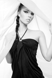 I prefer this one, as to the one I just commented on There is a bit of a conflict between the draw string and her necklace Wish crop was wider to include all of models left arm Right arm is lost under material Since the camera is so low, the model is looking down, this is reducing her eyes from being wide open Think lips could have used a darker lipstick Oct 10 14 05:27 am Link Unlike the previous commenter I do like the washed out look in photographs but I must agree that the photo feels too washed out to me, almost like I'm looking at the model through a foggy room. On your second image I feel a darker background would have offset the composition better. Or if you were wanting that very white look then I agree with having the model darken her lips (and I find the make-up to be a bit heavy handed but likely that wasn't in your control). As I go through the rest of your portfolio I find that the fashion images you have of men seem higher quality and sharper overall than those of the women. The women all seem soft focused or when they are sharper images the poses or facial expressions are a little off. I would focus on your photography of female subjects and trying to reflect the higher fashion look you achieve with the males. I notice that your head shots of women are well composed and in good focus though perhaps a little harshly lit Oct 23 14 11:08 pm Link Thank you very much guys! I'm just getting started with the lighting (who ever knew there would be so many different ways to achieve the white background every way having its own ups and downs. Ill keep experimenting Oct 26 14 08:55 pm Link My first suggestion........to really improve your images, is to take down the black background. You have no idea how much that is hurting your work. One of your images literally is head and shoulders floating in a sea of black. It looks decapitated. It appears to me from the lack of any background and edge lights, that you working with minimal equipment. It is hard to do that on black, because black allows no bounce for fill. You have gotten some good posing and expression, but they don't come across well, because of the lighting. My suggestion would be to shoot a photo of your camera room, showing your types, and number of light sources. Post that, and let's see where the source of your problems really are. Nov 01 14 02:47 pm Link Thank you for the pointers ill shoot you a message when i have the image up! Nov 11 14 05:42 pm Link |