|
Let me know what you guys think of my portfolio Nov 02 14 06:51 pm Link 
Photographer Posts: 1268 Grove Place, Saint Croix, Virgin Islands of the United States I looks like you have a lot of fun with photography. I like fun a lot. You have some technical skills to works on, which with practice you can perfect. Look out for small details like in this one -  The shoes are so bright they take the focus away from the rest of the shot. Learn to make the most important aspects of the photo pop. Also, focus on your focus. There are a lot of photos with soft focus through out. Nov 02 14 07:33 pm Link thank you really appreciate it Nov 02 14 07:40 pm Link I believe they look outdated .... Have you done any recent shoots? Nov 02 14 10:00 pm Link So far so good (y) But Im not sure the crop is right on number 5. too much of the lamppost has been cut off. Plus the lighting/shadow cast across models face. Nov 03 14 01:30 am Link  Too much sky above models head [Simply crop off] Looks like you may have over processed, there is a white rim around models head Models left hand pose is a bit odd Looks like on camera flash The yellow shoes are drawing too much attention, were they white may have worked better? Too much space on photo right, if you were to crop off some, then model would not be in center of the photo  Crop top of photo off so sky and land are removed Then crop photo right half way between model and border 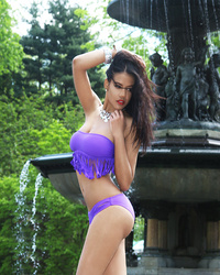 Wish hair were not running through eye and she was looking at camera in more of your photos You have model very centered  Some of the white areas look over exposed Harsh sun light on nose, above lips, shoulders and hand[Could use a scrim between model and sun]  Your strongest image  Over all nice image [Distracting area photo right lower corner]  You cropped his hands off  Models arms too straight, just seem to be hanging at her sides Hints: To get rid of side shadow get a flash bracket so flash is directly over lens Try to avoid harsh sun light, shoot in open shade or use a scrim Composition, try printing out your image and using sheets of paper to try different cropping ideas Nov 03 14 04:35 am Link I think you already have some good comments. I will add this one.......you are not using settings well. The models are being placed too close to large, background objects, that compete with them. Move your models forward in the scene, and utilize the backgrounds as backgrounds. i.e. The fountain added nothing to that image. If you had moved the model forward, and allowed the fountain to be in the background, then it might have added a nice background to the scene, and made the image of the model more interesting. Nov 03 14 06:42 am Link thank you all still learning as i go and the feed back bad or good is great Nov 03 14 06:15 pm Link |