|
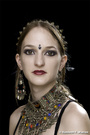
Ladies and Gents; I'd appreciate some constructive critique on my latest image in the gallery. https://www.modelmayhem.com/portfolio/pic/37447382 It was one of those "can't get it out of my head" ideas for a shoot, and while I'm not unhappy, something seems to be missing. So please, do let me know what you think. Happy to hear if you think it's good, bad, or indifferent, but please say why. Cheers! - Warren B. Nov 28 14 09:45 pm Link The Harlequins Mask wrote: I don't like the narrow crop & wish her hands were in the frame. Nov 28 14 09:55 pm Link Hands...yep that's a fair call, I'll take that. Many thanks. - Warren B. Nov 28 14 09:56 pm Link I think you could really make this image work better with a different crop. As the image is now, for me, you did not form a base with the model [Think of a pyramid wide at the base and narrow at the top]. Pose wise the fix would be to move the arms off to the sides, plus if you show the elbow include the hands, or simply crop above the elbows. For this image I would suggest a crop at the bottom of her strands of hair, then crop in on each side till the edge of the photo is at her shoulders. Her shoulders are raised up, so it is giving her neck a shorter look Wish you well Nov 29 14 04:13 am Link I don't mind the crop but her arms look too close together. I'm not crazy about the expression either; her lips look a bit pouty. It's a very interesting subject and background though. Nov 29 14 07:58 am Link The Harlequins Mask wrote: not liking model's expression,and her lipstick kinda bugs me.The concept is cool and the blurred background is nice.Good colors.I also agree that her arms are too close together. JMHO Nov 29 14 08:09 am Link The thing most bothersome, to me, is the down angle. I am not fond of shooting down or up, at people, because it simply distorts, and the shorter the lens, the more severely it distorts. The heavy tattoos take the attention away from the subject, and the image. The heavy beads, are its own statement, in the image, and become the focus of the image, and not the model. Therefore, having eyes to camera, makes no sense. That competes with the beads. There are some little things, like the wisp of hair behind her right shoulder, that needed attention, as well. Nov 29 14 08:11 am Link I like the mass of pearls around her neck; it's a nice way to suggest topless without showing anything. Others have said that they think the crop is too tight, and I agree that a looser crop, with the arms spread a bit, bent at the elbows, and the hands visible, would have been better. Alternatively, it's not tight enough; going in for a tight head shot would also get some/most of the tattoo on her right shoulder out of the frame (which would be a good thing, IMO). Others have also pointed out that you were effectively shooting down at her, and that her arms are too close together. I think you told her to lean forward and press her arms together a bit, but whatever, I agree that it's not a great look. And I don't like the expression on her face much either. Nov 29 14 12:41 pm Link *I would have liked to see you complete the look by having her hair and make-up done professionally.....to go along with the picture..!!...Her hair is too flat for me with unfinished ends and her make-up looks like she did it herself, which is O.K..but not a 'pro' look, for a finished, overall end result that I prefer..!!..Other then that....I like all the pearls and the capture looks crisp..!! Nov 29 14 03:41 pm Link seems to me that the lighting is the same you would use for a headshot, it does the job but does not say much. There's a lot you can do with that combo. I'd start fresh and try again with more dramatic lighting. Nov 29 14 04:44 pm Link I'd like to thank everyone who has replied and offered comments on this, and the general run of opinions seems to be pretty much the same. All taken on board, I do assure you. Cheers! - Warren B. Nov 29 14 06:20 pm Link |