|
Uploaded some new photos. Looking for some critique. I will critique back if wanted  Dec 03 14 06:31 pm Link  The angle of shooting up at a model generally makes them appear more dominate in an image. Because you are square to the camera your hips will also look their largest, since the top is not hugging you it also looses your shape, arms and midsection look like a solid mass of white this may not be the most flattering of images. When you look at the image how much of the photo is you, less then 50%, so as a model portfolio image it may not a great choice.  Notice in this photo how we can see you shape and form This photo seems to be all about distractions; shirts with logos and lettering are distractions, plus when you add the out of focus grass this photo looses value. Models hair not under control  I think you look your best in this photo Suggested changes, best not to point toes together, place hips on angle to camera, better management of hair Posing suggestions, try not placing your hands on head and upper body so much [No return critique required or desired] Wish you well Dec 04 14 04:09 am Link mandy matteson wrote: this one is almost agreat shot.The crop is what kills it.Arm and foot cut off. Dec 04 14 08:28 am Link The first picture is my least favorite. The dress is making your midriff larger, your upper right arm is sort of shapeless and it looks like your hips are square to the camera. Your expression is slightly pained. The color balance is on the cool side (blue) which is giving your skin an odd color cast. Not your fault.  #2 All of what Lee Photo said is true, but I like this shot. Your stance and pose are dynamic and there is intent in your expression. You are very strong in this image and making you a larger part of it would look unbalanced. #3 The opposite of the previous shot. You are way too small in the photo. I don't see this shot as a plus for you.  #4 This is a great shot. Your pose and expression are perfect. The right leg coming forward makes it dynamic. Excellent. I hope the water was warm. 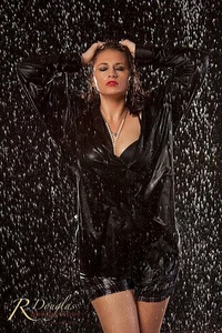 #5 Excellent pose and expression. Viewer reaction is guaranteed. <img src='http://photos.modelmayhem.com/photos/141114/22/5466f17b41c5e.jpg' /> #6 The black light is making the whites of your eyes and the shoes pop. Slightly distracting. The pose is perfect and you are engaged. <img src='http://photos.modelmayhem.com/photos/141114/22/5466f1312d890.jpg' /> #7 Not a portfolio shot (for you). 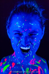 #8 You've got better shots, you don't need this one. Pose ok, you look disengaged, grass is cutting off your legs and is distracting. #9 This shot doesn't do it for me. You're looking off into the distance, I don't know why the bike is there, your legs are a bit awkward but you have a great hip tilt going on. #10 Is this for a movie still? Certainly not flattering to you and that's the point of a portfolio shot. 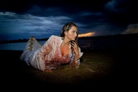 #11 Well done. Good body and head angle and eye contact. 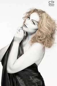 #12 It all works here - pose, eye contact, expression.  #13 Too much work on your face. Almost doesn't look like you. Your pose is dynamic if a little square to the camera. 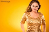 There's enough good stuff here to weed out the weaker ones. Good luck, you've got the goods! Dec 04 14 09:07 am Link |