|
Forums >
Digital Art and Retouching >
How do you achieve this color skin tone? Help Pls
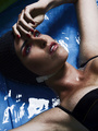
I came across this beautiful image and really wanted to know how they achieved this golden brown skin tone? im guess selective color and dodge & burn? anyone know? [img]  9c7db3fbc9e13516ef98c5830fefc0e3 by Yelssing Espinoza Photography, on Flickr [/img] 9c7db3fbc9e13516ef98c5830fefc0e3 by Yelssing Espinoza Photography, on Flickr [/img]Jan 23 15 07:08 am Link The easy way, I created a blank layer above the model and filled with dark brown, set the blend mode to soft light. Added a mask and painted over eyes and lips, and background. You can play with the dark brown layer's color and opacity. I see in your photo the hair is darker too. If you want to keep the original hair color just paint over the hair on the mask. There's probably 10 other ways to do it but this is the easiest in my opinion. I just grabbed a stock photo, so that's all the retouching I did to this photo, just to answer your question about skin tone.  Jan 23 15 01:15 pm Link Why don't you ask the person who retouched the image...it's shot by S. Bourson and was in the Challenges forum. Jan 23 15 01:50 pm Link GregWatson wrote: How is this even close to what the OP was asking? Did you compare your results to the image in the OP? Jan 24 15 06:01 pm Link yelssingsRetouch wrote: Option 1. Add selective color layer, add cyan and blacks into red channel (numbers obviously depend on the source image) Jan 24 15 06:03 pm Link anyone else knows how to get this? Jan 27 15 09:42 am Link It was answered at least 3 times on the same forum page. Jan 27 15 10:15 am Link Well with many things in Photoshop/Lightroom/RAW - there are a hundred ways to get from A to B - The principles are worth while finding though, for yourself and your own understanding of the interaction of color which is a great book: http://www.amazon.com/Interaction-Color … 0300018460 So, before you go to the thing you 'notice' most - break down what is happening without the color. The freckles are darker, while the shadows are more luminous (lighter) - yea, you might not realize it, but if you increase the global contrast to the darness of skintown those shadows will be much darker than in the resulting image. This 'darkness' IS IMPORTANT - as you'll follow my photoshop 'technique'. So when you increase contrast, you'll also get more reds, more yellows and more greens. So you're getting saturation when you take the image in this direction. To harmonize color, youll need to reduce those saturations. Those saturations are the normal distractions of real life. We try to create a better reality as artsts - so let's simplify. I think that there's a solid brown layer - above the background - set to lighten. and at maybe 50% Mask that out on the blue eyes. Now to 'pop' the freckles. You'll probably go over to the channels, select the blue channel - copy and paste to a new layer. Or make a new layer, Image > Apply Image > blue channel as normal and 100%. Now play with the blending modes to flatten out the highlights, maybe multiply, maybe soft light - I can't tell you now because it's all 'taste'. I'm just giving you the steps I would take to make a color monotone image like that. You'll also want to warm the highlights, you can do that in curves with the blue channel, or Hue Saturation. That Hue Saturation can further help you remove the remaining reds, or greens that might destroy the harmony you're looking for. Hope that helps. Have fun and let your subconscious run you for a while! Jan 28 15 07:51 pm Link Hi yelssingsRetouch, generally it seems that the retoucher added more yellow or desaturated the pink, maybe both. Also the D&B part is a big think for this kind of skin-look. I always get questions about colour grading & looks, so I wrote an article about this and even more. Also about face-shapes, colours which match each other, etc. Feel free to have a look at my article here: https://www.lisa-evoluer.com/blog/knowl … -industry/ Lisa Jan 29 15 10:58 am Link |