|
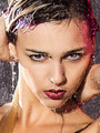
Feb 19 15 09:14 am Link I know I'm in the minority when it comes to "tinting" a B&W image, but, since I used to do it with actual prints, I still like to occasionally do it on electronic ones . . . https://photos.modelmayhem.com/photos/1 … 36ffd4.jpg 18+ . . . I like the image overall, and I like the eye tinting, I think I'd bring it down just a touch, so it wasn't quite so blatant, and, maybe add just a hint of tone in her hair to carry the tinting throughout the image . . . nicely done though . . . SOS Feb 19 15 09:25 am Link I know tinting is a "thing" for some ppl, but if it matters, before I get a bunch of comments about that, I un-B/W-ed her eyes, those really were the colour she had, that's all I did to that. Feb 19 15 09:40 am Link I'm pretty good with portraits so I'll add my two cents. I don't think it's too bad but I do think there's some things that could be tweaked to make it look a lot more fancy. First, try to avoid the spot color effect. It's like the comic sans of photography and is often only associated with amateur images so even if everything else is perfect it can bring the image down overall. Second, I would remove the hat, necklace? and piercings. The hat and necklace cheapen the image since they aren't really high fashion or expensive looking and I think the image would be stronger with out them. I don't mind piercings really, I actually used to have an eye brow piercing of my own but in a classic looking portrait they just look distracting. If it was an edgy shot and she had messy hair and tons of tattoos I feel like it would fit but really I just feel like they're helping more than hurting. Lastly I think your light might be a little low for my taste. For basic head shots I normally like to have the catch light right at the top of the models eye and the shadow on the nose not going upwards. This doesn't always have to be true I just feel like generally in portraits its more flattering and is an easy rule to follow for good lighting. If you need some inspiration here a good collection of classic portraits on pinterst you might like. https://www.pinterest.com/madalena/model-portraits/ Feb 19 15 09:53 am Link Main thing I would like to see different, is the light to be higher. The light is too low. The piercings I don't personally like, but that's personal, and has nothing to do with the execution. I do like a little shoulder, for the head to rest on, so I would not normally like a crop quite that tight. Feb 19 15 01:18 pm Link |
