|
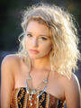
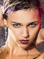
So I have been lurking around here for a while, slowing growing my portfolio. I am now at the point where I am reasonably happy with all of my images, but I suspect I am just too sentimental about some of the images and maybe they need to go. The images span from my first photoshoot 3 years ago to my most recent shoot last weekend. I know the editing from the first shoot was poorly done, and the model was out of focus. It probably needs to go, but this is just one example where I think I am being sentimental (and it doesn't look TOO bad as a thumbnail). So if there are any kind souls out that that could help me purge a bit, I would really appreciate any feedback that can be given. Three things I am looking for: 1) which pictures need to go (and maybe why, if you feel like explaining) 2) which pictures should survive the purge 3) which pictures might be decent with better processing (again, explanations would be appreciated) Input on any one of the topics would be appreciated, all three would be incredible. Thanks! Mar 04 15 10:32 pm Link Haha, as per your bio, I don't shoot nude, or topless, either, that's the model's job, and they always get weird when I join in!  Ok, here's my take. At first glance, your port is better than average.  Could go. The stray hair across her eye-lash is really distracting for me, and it looks like your focus point is on her shoulder-strap, the eyes aren't quite tack sharp. (You may be able to save this in PS, removing the hair is easy, and the eyes aren't so bad that the sharpening tool may be able to save it, other than those 2 things, I like this image)  Can go, I don't mind the stray hairs here, but she's still out of focus, it looks like your focus point was her hand, again, the eyes are out of focus, and they look a little dull... and now that I look at it more, the pose makes her boobs look weird (ya, there's a professional critique sentence for ya! lol )  Can go, not a fan of the vignette effect here, especially over her hair, and 1 eye. 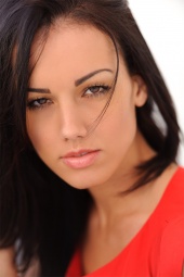 I'm torn here, you nailed the focus, and I don't have any real problem with the shot, but the model looks half asleep (really pretty, but still half asleep).  This one maybe could be re-worked, I'd rather see her right hand, but I think... no scratch that...the face isn't too bad, but the rest of her skin looks a touch overprocessed, it would have been nice to see her nails done, and ya, where's that right hand...Actually, I think it looks a little better if you crop it at the waist too, and tighten up the frame around the other 3 sides... so, maybe...  Can go. Blurry, doesn't look artistically blurry, just blurry, Moving on...  Definite keep, nicely done! 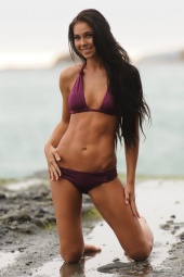 Can go, cute model,but the whole picture seems a little soft on the focus. If I didn't mention a picture at all, I thought it was good, and you should keep those...others may see other things... Mar 04 15 10:52 pm Link Pretty darn good port, I would say. But I am not much of a photographer, so please feel free to disregard my opinion. I have comments: I don't like to bright/burned/washed out effect. I don't know if it is added in as a vignette type thing or if it is part of the shot. To me, it makes the shot look like it has a film over it. Everything about this shot is beautiful except I feel like you caught her at half blink. Maybe not. But the shot is, kinda, all about the eyes and the position of the lids say that maybe she isn't fully invested in the viewer. Mar 04 15 10:54 pm Link As far as photos go this nice 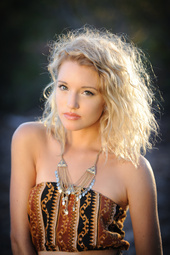 Also a nice image Suggestion to raise crop at bottom of photo to a point above models right elbow, this will get rid of some of the wrinkled top, and is a better place to crop Because you have models left forearm pointed at camera you have shortened its appearance, also prefer to see long elegant fingers Odd pose of hands they look forced Mar 05 15 06:43 am Link Thanks for the great feedback so far. Much appreciated. Mar 05 15 08:36 pm Link |