|
I shot this over the weekend and had a good time. I liked the location and the model was fun to work with. Wanted to know about other peoples thoughts / critiques on the photo. Also I am new to posting in the MM Forums and wanted to give it a shot. Thank you! 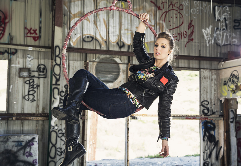 Mar 13 15 11:54 am Link What's with the huge logo on the top? Mar 13 15 11:58 am Link Is it not allowed ? Mar 13 15 11:59 am Link TheCraigBennett wrote: Yes it's allowed. But why would you want a ugly / distracting logo on your photo? Mar 13 15 12:05 pm Link Images by MR wrote: Just how it was after they used it. I can take it off I suppose >< Mar 13 15 12:06 pm Link You've got the beginnings of a wonderful shot here! Love the model, lighting, setting & hair-makeup. Smart to blowout the outdoors to keep that portion non-busy. One would think putting her face at the intersection of the horizontal and vertical 1/3s that one would have a great layout. And her arm along the vertical 1/3 would seem to also be fortuitous or, more likely, well planned. Unfortunately the photo overall is too busy and that layout in this instance is making it busier because of the included background graffiti with the rule-of-thirds layout.. 1. Lop off all of the building right of the window (door?), so you have a higher expanse of (non-busy) blown-out white. Might leave the right vertical window edge and non-busy very small portion of the wall, try it both ways. Cropping in like that takes a lot of the busy building graffiti on the right out of the picture. 2. At that point, at least consider a square format, which would get rid of a lot of graffiti to the left of the model's feet too. 3. Some white paint is partially obscuring the BOKOOOO graffiti. Why not use that same white paint to get rid of most of that tag? 4. (not urgent, but) If you have outtakes from this angle which include the tip of her right boot, consider adding the toe back into this shot along with ground underneath the boot if possible. 5. Clone out the tuft of grass under her left-hand fingers. Or perhaps consider adding that grass nearer the smaller tuft way to the right as I do like the splash of green of that higher tuft, just not under her fingers. 6. That should calm down the excess static, although if it is still too busy consider PSing out some of the other tags, starting with the most graphically eye-catching. The model should be the focus, not the graffiti "artists". . Mar 13 15 03:04 pm Link Toto Photo wrote: Awesome toto thank you very much for taking the time to write me this Critique. I agree with most everything you have said an appreciate the time you spent doing so. Mar 13 15 03:26 pm Link I like the idea, but not the result. It is too busy for me. Way to many things to distract me. Suggestions for improvements: - light the model +2 stops brighter than the back wall to reduce the distractions while keeping the environment/mood - rotate the model in the hoop so her tush is at 5 o'clock and her head is at 2 o'clock to provide a more flattering view of her (especially her hips/legs. This would also help to position the jacket so the top is not visible around the waist and the jacket and the jacket has a more natural and flattering looking fit. - use ND sheets to dull what is outside or do multiple exposures - I'm not a fan of the blown out look of the grass etc. outside - if possible, lower the loop or raise the camera angle to have the model more against the window/door behind her - remove the red object (phone?) from her jacket pocket Mar 14 15 09:42 am Link David Kirk wrote: +1 Mar 14 15 09:50 am Link Toto Photo wrote: By all means, clone out that grass. It's just my taste but I might move it to the left. Mar 14 15 10:59 am Link Great photo if this is your version of "Find Waldo." Effective camouflage of a lovely face and unrecognizable body. Mar 14 15 12:58 pm Link It's an interesting shot and has in retouching great potential. One of the awkward things about the photo is the open jacket, the way it is bulging. Still the composition has power and by first focusing on the model, exposure levels, in camera raw using the adjustment brush, you could make her more powerful. You could also lower exposure on the back ground in areas that you think would help lead the eye more to the subject. I think this was creative of you and a leap forward in your photography. You could take out the phone, etc. Mar 14 15 01:11 pm Link For me, it's a pity the scaffolding poles that run horizontally along the bottom third of the shot are the same height visually as the bottom of the hoop. To my eye this reduces the effect of her being suspended. Mar 16 15 01:55 am Link I'm assuming this shot has been reworked, since I don't see many of the problems already listed here. However, what I still see... 1) fix that tuft of grass, it's unfortunate that her hand ends right at the level where the ground is, it draws the eye to look at that dirt and grass (with the cloning tool, you could move that "dirt horizon" down just a bit) 2) shop out the phone 3) facial expression is somehow just off the mark for me 4) probably a better shape if the jacket was unzipped (if you can fix *that* in photoshop, I'll be impressed!  ) ) 5) I don't have a problem with the blown out look, simple solution, but I do have a problem with the toe that's been cropped out 6) And this one is totally just me, I don't often like putting my subject dead center in my shots, I would have pushed her off to the camera right, cover more of that window, but capture a little more of that interesting grafffiti indoors. I find it personally more interesting if the viewer has to look around a bit, and then "discover" the subject of the shot But hey, what do I know? Mar 16 15 08:33 am Link An interesting notion....composition/crop leave a lot to be desired. Mar 16 15 12:53 pm Link |