
Photographer
JeremyGelber
Posts: 4
London, England, United Kingdom

Photographer
Lee_Photography
Posts: 9863
Minneapolis, Minnesota, US
You seem to crop off the models hands, best place to crop is above the first joint, that is between the elbow and body, and above the knee, otherwise showing the whole hand and foot works best. ![https://photos.modelmayhem.com/photos/150701/22/5594d1d720c81_m.jpg]() It's a flash back to the 70'S ![https://photos.modelmayhem.com/photos/150701/22/5594d1089d37c_m.jpg]() [Joke] Your photos bug me [Joke] I wish you well
Photographer
NewBoldPhoto
Posts: 5216
PORT MURRAY, New Jersey, US
JeremyGelber wrote:
(I read through the rules and think what I'm posting is ok, but if it isn't please accept my apologies and delete my post.)
I shot the following images today, most of which are now in my portfolio:
http://i902.photobucket.com/albums/ac22 … 9r1q3d.jpg
http://i902.photobucket.com/albums/ac22 … oaluxn.jpg
http://i902.photobucket.com/albums/ac22 … vlzmbq.jpg
http://i902.photobucket.com/albums/ac22 … ntgmuy.jpg Alrighty then...
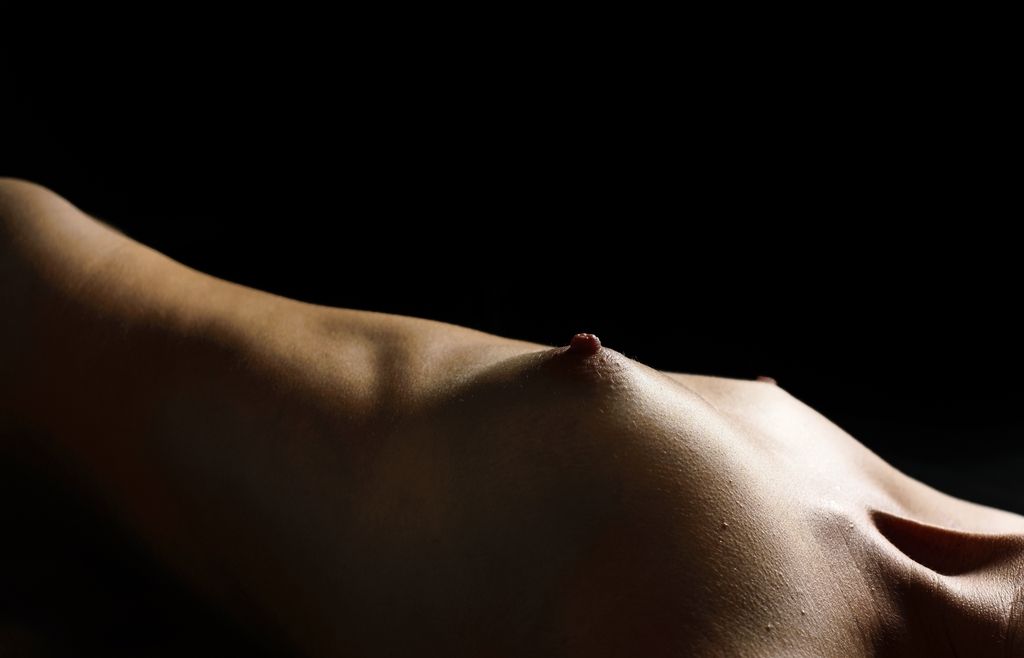
First up- well that's a nipple- yup. Now I will admit to a certain fondness for nipples, breasts as well, and while these seem like rather nice examples of human mammaries the image doesn't engage me. The image includes a large portion of the torso that is rendered out of focus which doesn't add any interest. The breast and upper chest area seem over or under exposed and out of focus save for a small section that provides some texture and visual interest but this section is rather small and seems more accidental than intentional.
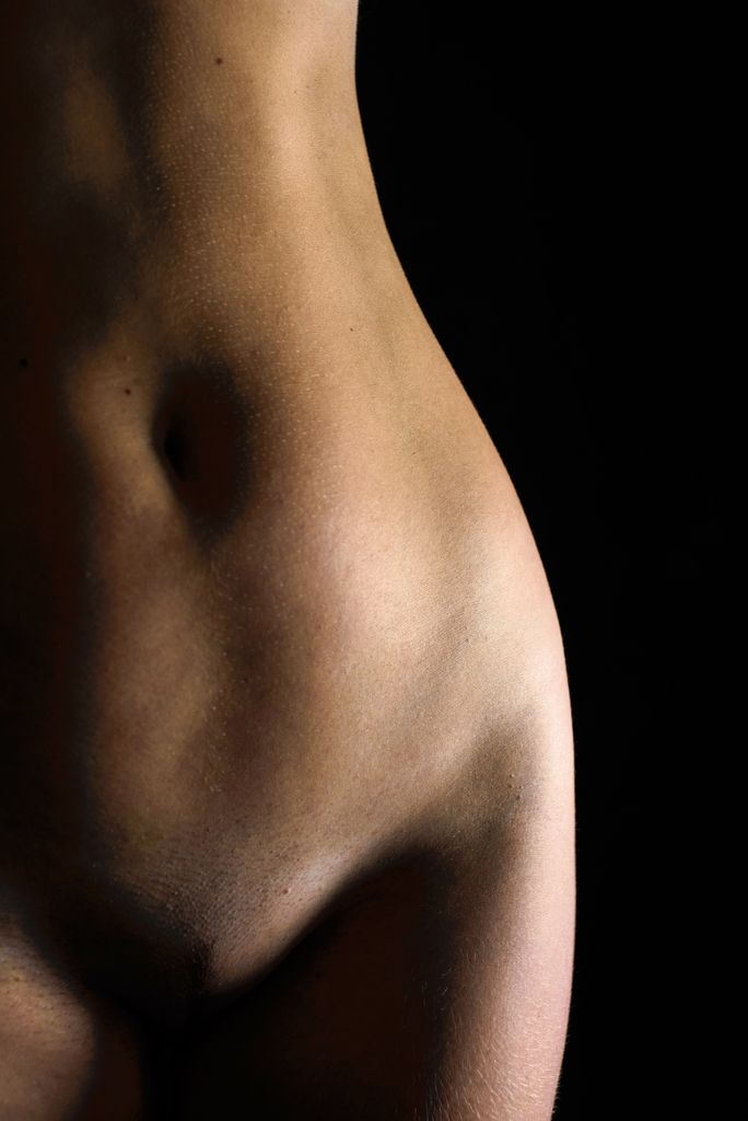
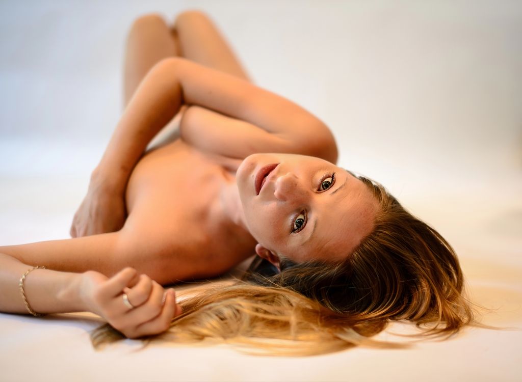
Number two: single light nude. There is an interesting fact about humans when one looks at an image the eye tends to go to the point of highest contrast in the image and look to the areas about one third of the way in from the edges. My eye is drwn to the blown out elbow then to the odd hotspot/s on the nose then to the knee. The lighting you have used here is a bit harsh and tend to call attention to the models scars and the spot she missed while shaving her legs- I'm not sure that this was your intention.
Three- it feels like you don't have full control of your light again we have blown highlights and muddy shadows. You also may want to invest in PS or some other pixel pushing software GIMP or what have you. It is often considered kind to retouch out the angry follicles, minor scars and skin tags unless they add to the image.
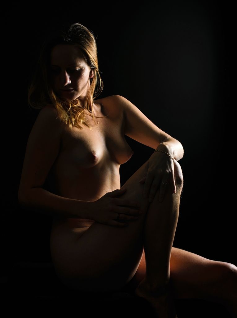
Last Not exactly the expression I would have chosen. Do you think it adds to the image to see that she is nude or would the image work just as well with the body cropped out?
Photographer
JeremyGelber
Posts: 4
London, England, United Kingdom
Thanks both for the comments, I appreciate you taking the time.
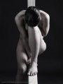
The first picture, and indeed all of the low-key ones: I wanted to achieve a sculptural look rather than tell a story specifically. But when you say the first one doesn't engage you, is that because of the shallow DoF or just the image is a bit "blurgh"?
You pointed out the over- and under-exposure in most of them. The point of the shoot was to try to learn more about light placement, light strength, and shadow. I obviously didn't learn as much as I hoped! To what extent does the under-exposure in the first picture matter? If the DoF was deeper then I guess it would make more difference?
Now you say it, I see the over-exposure from this picture and the 2nd one with the elbow. The first one looks perhaps as if the light is slightly too low and too close to her neck. Would that sound right to you? I shot with a Nikon SB-910 on 1/8 power for this one, and also had a Nikon SB-R200 bouncing into an umbrella to attempt to fill a bit more. The lights in the room were very dim, I'm wondering if perhaps putting the lights up a bit would help or would I then fail to get the deep shadows and "tail-off"?
You're right about the stubble etc, I'm using Lightroom so marginally limited by what I can do although after your comments and some research I downloaded PolaDSR which seems pretty darn miraculous albeit not compatible directly with Lightroom.
With the last image, what is it about the expression? Is it her mouth being neither open nor closed? Does the fact that her hand in the foreground is out of focus because of shooting at f1.4 to get super-sharp on her eyes make it better or worse? And I'm not sure about whether it adds to the image to have her nude, you're right.
I'm sorry for vomiting up loads of questions, but you guys are incredibly helpful with your comments and I want to keep on learning if I can.

Photographer
Lallure Photographic
Posts: 2086
Taylors, South Carolina, US
Assuming you mean the types of images posted are acceptable images on the site.............it would seem so. The only one that raises any question for me, is the crotchless hose image, but I think it also works within the boundaries.
Photographer
NewBoldPhoto
Posts: 5216
PORT MURRAY, New Jersey, US
JeremyGelber wrote:
Thanks both for the comments, I appreciate you taking the time.
The first picture, and indeed all of the low-key ones: I wanted to achieve a sculptural look rather than tell a story specifically. But when you say the first one doesn't engage you, is that because of the shallow DoF or just the image is a bit "blurgh"?
You pointed out the over- and under-exposure in most of them. The point of the shoot was to try to learn more about light placement, light strength, and shadow. I obviously didn't learn as much as I hoped! To what extent does the under-exposure in the first picture matter? If the DoF was deeper then I guess it would make more difference?
Now you say it, I see the over-exposure from this picture and the 2nd one with the elbow. The first one looks perhaps as if the light is slightly too low and too close to her neck. Would that sound right to you? I shot with a Nikon SB-910 on 1/8 power for this one, and also had a Nikon SB-R200 bouncing into an umbrella to attempt to fill a bit more. The lights in the room were very dim, I'm wondering if perhaps putting the lights up a bit would help or would I then fail to get the deep shadows and "tail-off"?
You're right about the stubble etc, I'm using Lightroom so marginally limited by what I can do although after your comments and some research I downloaded PolaDSR which seems pretty darn miraculous albeit not compatible directly with Lightroom.
With the last image, what is it about the expression? Is it her mouth being neither open nor closed? Does the fact that her hand in the foreground is out of focus because of shooting at f1.4 to get super-sharp on her eyes make it better or worse? And I'm not sure about whether it adds to the image to have her nude, you're right.
I'm sorry for vomiting up loads of questions, but you guys are incredibly helpful with your comments and I want to keep on learning if I can. Well I'm not 100 percent certain how one defines "blurgh" but I think I fathom the intent and that's not quite it. You present a image of which the upper half is negative space, the left hand half is negative space, and all the interesting shadows and textures are crowded into one small arc of the image. Try recropping the image to include just the lower half or even just the lower right quarter... see what you think. I am curious to know what a "sculptural look" is to you.
I'm not sure how much impact an increased DoF would have on that image it appears that your light was falling off rather rapidly past mid torso- an increased subject to light distance might have been a helpful.
Farther back-yes but keep in mind that light falls off by the square of the distance (inverse square law https://www.youtube.com/watch?v=PAjHb-o2WzQ not the world greatest video but mercifully short and concise) moving the light up or down will change the shadows which may or may not be helpful. Regarding room lights I suggest taking a meter reading to determine how impactful the ambient will be on your exposure... I'm betting not terribly on any but the lowest power settings.
The angle of the head seems awkward, it seems to give her forehead wrinkles, calls attention to a crooked tooth and a zit on her chin.
Photographer
JeremyGelber
Posts: 4
London, England, United Kingdom
NewBoldPhoto wrote:
Well I'm not 100 percent certain how one defines "blurgh" but I think I fathom the intent and that's not quite it. You present a image of which the upper half is negative space, the left hand half is negative space, and all the interesting shadows and textures are crowded into one small arc of the image. Try recropping the image to include just the lower half or even just the lower right quarter... see what you think. I am curious to know what a "sculptural look" is to you.
I'm not sure how much impact an increased DoF would have on that image it appears that your light was falling off rather rapidly past mid torso- an increased subject to light distance might have been a helpful.
Farther back-yes but keep in mind that light falls off by the square of the distance (inverse square law https://www.youtube.com/watch?v=PAjHb-o2WzQ not the world greatest video but mercifully short and concise) moving the light up or down will change the shadows which may or may not be helpful. Regarding room lights I suggest taking a meter reading to determine how impactful the ambient will be on your exposure... I'm betting not terribly on any but the lowest power settings.
The angle of the head seems awkward, it seems to give her forehead wrinkles, calls attention to a crooked tooth and a zit on her chin. Thanks, that makes sense. Weirdly though, when I recrop to do the lower right quarter I don't like it nearly as much! But I totally get what you're saying so I need to play around with the crop until it's not mostly negative space. I guess I've overplayed the blackness card in this and a few others.
In terms of flash power, I changed from TTL to using a fractional guide number and this one was shot at 1/8th GN. I tried both 1/4 and 1/16 but this got closest to what I was after. I also used spot metering which presumably explains why the torso is exposed correctly despite being out of focus? I really want to find out more about how to use flash power adjustments to affect the end-result. Is there a good guide or tutorial somewhere that I can read through? By introducing a non-TTL flash the number of variables has sky-rocketed - flash placement, flash strength, flash distance, metering mode, interaction of more than one flash. It seems to me that trying to control all of these things is impossible unless I know what I'm doing!
Photographer
NewBoldPhoto
Posts: 5216
PORT MURRAY, New Jersey, US
JeremyGelber wrote:
Thanks, that makes sense. Weirdly though, when I recrop to do the lower right quarter I don't like it nearly as much! But I totally get what you're saying so I need to play around with the crop until it's not mostly negative space. I guess I've overplayed the blackness card in this and a few others.
In terms of flash power, I changed from TTL to using a fractional guide number and this one was shot at 1/8th GN. I tried both 1/4 and 1/16 but this got closest to what I was after. I also used spot metering which presumably explains why the torso is exposed correctly despite being out of focus? I really want to find out more about how to use flash power adjustments to affect the end-result. Is there a good guide or tutorial somewhere that I can read through? By introducing a non-TTL flash the number of variables has sky-rocketed - flash placement, flash strength, flash distance, metering mode, interaction of more than one flash. It seems to me that trying to control all of these things is impossible unless I know what I'm doing! I'll go you one better than a tutorial: http://www.strobist.blogspot.com/
So it seems you were looking for something more abstract with that first image... In that case I would suggest that you try to simplify things: I suggest monochrome to eliminate color as an issue (in camera or in post... each has it's pluses and minuses), you may want to try working with the back as when you have breasts, chest, nipples, shoulder, and neck you are looking at a whole variety of textures and tones. The back in more homogeneous and should allow you to play with just the topography while sorting out the lighting.
Hope this all has been helpful
Photographer
JeremyGelber
Posts: 4
London, England, United Kingdom
NewBoldPhoto wrote:
I'll go you one better than a tutorial: http://www.strobist.blogspot.com/
So it seems you were looking for something more abstract with that first image... In that case I would suggest that you try to simplify things: I suggest monochrome to eliminate color as an issue (in camera or in post... each has it's pluses and minuses), you may want to try working with the back as when you have breasts, chest, nipples, shoulder, and neck you are looking at a whole variety of textures and tones. The back in more homogeneous and should allow you to play with just the topography while sorting out the lighting.
Hope this all has been helpful That's an awesome blog. Just what I need. Thank you!
|

