|
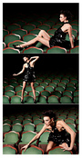
Evening my critters! Well, it is here in NY. And on this rainy NY day I decided to PURGE MY ENTIRE PORTFOLIO. Deleted everything that was in there even things with comments / lists in favor of uploading all new work. Id really love some feedback on what you feel about the portfolio overall and or what shots you think are the best / worst of the lot. Oct 03 15 03:27 pm Link Hi Kassandra, First, let me say that that's a bold move to purge everything - good for you!! My first piece of advice would be to not go to Starbucks one day, save the $6 and upgrade your MM membership so that you do not have to double your images. It's somewhat distracting when viewing them. IMO. Fav: The topmost image (I don't like the crop at the knee though) 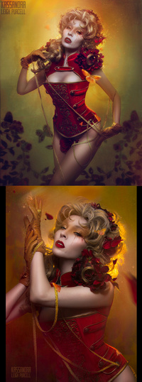 Dislike: The topmost image (poor composition - needs more "looking room" or negative space, bad photoshop work)  Oct 03 15 04:52 pm Link First, I fully agree that doubling the images is distracting, especially in cases like this where the images aren't the same size: 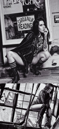 or in cases like this where your name is cropped on the top image but not the bottom one:  Second, I'd personally only put one watermark/name on the image OR find a way to seamlessly integrate the two; and that needs to be kept consistent. Selecting a favorite image was difficult because of your double image system but I really adore the top image in this photo because the play of light and shadow on the model's face is quite intriguing, in contrast though I don't like the bottom photo because of the fact that the models are overworked to the point that a real (I'm assuming) background looks fake because it's so dark and flat in contrast (this image also shows what I'm referring to in terms of the name not being written on the photos in a consistent manner): 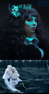 I have a similar feeling about this image, I think the top shot is compelling but the bottom one is over edited e.g. the model has been softened to the point he looks like he's a computer rendering: 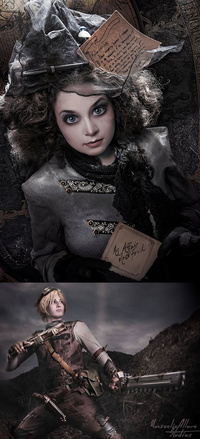 Finally, I really like your style overall, it has an elegant whimsy that is intriguing in many instances. Oct 20 15 08:05 am Link |