|
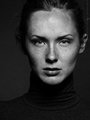
Please critique my portfolio images. Being new I am nervous but if I don't stick my neck out I won't learn anything. Let me know which image shows a positive direction for me and which one I should scrap. If you don't mind including what is going well and what is not. It may help to know what direction I would like my work to go in. I would like to provide solid headshots/portraits for individuals/families and for fun (maybe more with experience) I like dramatic fashion but I don't have any examples of that yet. Your opinion matters a great deal to me. I am new and have only been shooting in the studio about a month. I am a little limited with gear. Guidance now will be easier to incorporate for me since I (hopefully) do not have any bad habits yet. I am taking classes but I do not have a way of gaining constructive critique. If you know of educational material, classes, books, etc. that addresses issues you find in my images please direct me to them. I have numbered my images to simplify responses. https://www.modelmayhem.com/portfolio/3871260/viewall Thank you in advance. Mar 18 16 02:58 pm Link  [Remove] The wrinkled backdrop is not the sign of a professional photographer, when you know you missed the focus, your better off not displaying the image.  Wrinkled backdrop Do you see the apparent size difference between the womans right and left elbow, the womans right is dominating the image Due to pose you have eliminated appearance of models neck  This photo feels off balance Light is too high see how nose shadow is almost touching upper lip  Due to position of arms and shoulders being up, you have lost appearance of neck To add some dynamics place models body on angle to camera, keeping head as it is  While not perfect this appears to be your strongest Dark hair against a dark background will get lost, use side light or rim light Exposure on forehead looks hot, light seems too high here as well [See nose shadow]  Suggested edit: Rotate top of image to photo right by 3 degrees or so Tighten up crop to back of models right shoulder Bring crop in front so it just cuts off cascading hair at bottom Remove fly-away hair in Photoshop Next time rotate nose toward camera a bit more so you do not cut inside edge of eye off with bridge of nose A nice side light would add interest to models head I wish you well Mar 19 16 04:12 am Link Let's start with what is strong: I like the lighting. Suits the mood/expression well. Lowering the key light slightly would raise the nose shadow slightly which in this case would provide a cleaner looking portrait. I like to offset many of my portraits from center, but this one feels a little too far off center for my taste. I like to see a touch of light on the dark side of a portrait like this so it is still in dark shadow, but not complete silhouette. Adding a reflector on the right side of the frame would accomplish that. Lots to like about this one. Cute expression, good light on the subject. However, the completely void/black background creates a flattening/2D effect. A little light in the background would solve this. No need to 'light up' the background - just a subtle splash of light somewhere to provide depth to the image. This one is also very good. Nice focus on the subject with enough of the environment without being distracting. The light dappled light on the face works for kids (you can get away with alot with kids), but I wouldn't try this light with an adult. The composition is unusual (leaving little room in front of the subject, but due to the direction she is looking it works well.  Now for the not so good: Why do you have this image in your portfolio? It is very similar to the one I mentioned above, but the pose (leaning backward) and expression are much less flattering and make it look like an outtake. The angle is poor (we're looking up her nose and at the underside of her neck/chin. I am guessing that you are at a fairly close working distance here as her knee looks to be about the same size as her head. Avoid having limbs where are significantly closer to the camera than others by shooting from a greater distance (and then cropping or using a longer focal length). Also, the lighting on her legs make them disappear at the knee. Same with the hair. Shadows are great, but zero light is not a shadow it is a void. Sometimes a void really works, but more often it does not. For me the dominant element in this photo is her right shoulder - probably not what you want the viewer to be focusing on. This is due to lighting, composition, and camera angle. Make sure all of these elements are working together to draw the viewers attention to the area you want their eyes to come to rest at when viewing the photo.  Why the many different aspect ratios (most of which are landscape oriented) when shooting headshots? This can be done to great effect (I like it in the self-portrait mentioned above), but I think you want to really think about why you're doing this and perhaps do it very sparingly. In this one i think you tried to correct the model's posture by having her lean forward rather than back. Unfortunately, it is too much (try to be more subtle with the posing) and the lighting just doesn't work and the focus is off. Also, the wrinkly white cloth as a backdrop is very distracting - is that why you lit the others with a void? The advice I would offer (given your goals) would be to really simplify your setup as much as possible. It is more difficult (I find) to pose someone well when seated than when standing especially for a full body shot. It is more difficult to work with really dramatic (dark shadows) lighting. It is more difficult to work with strobes than continuous light (unless the strobes have bright, accurate modeling lights). Start with the simpler setups and work your way up from there. Something like this is a great one to build on:  I hope that's helpful. Mar 19 16 08:01 am Link Thanks everyone!!! I can clearly see what you both spoke of. I greatly appreciate the advice. I had a good idea beforehand of several things and some others I am glad to have been told about. I haven't cropped any and definitely should. I also am limited to an FD 85mm 1.2 L at the moment which makes certain distances just not doable. Hoping to get a quality zoom soon. The lens is the least of my concern. I can't wait to try everything you guys mentioned! I'll drop the bad images and work on the items you both pointed out. I will see about some composition training as well as just keep on working toward better lighting technique. I really appreciate the input. Thank you very much!!! Now I have something to work toward. Have a great day!! Mar 19 16 09:50 am Link The one of the gal with tatoos standing. It works if your main point is the tatoos themselves and it kind of looks that way. If not the arm should not be the "point of cantact". ( the portion of body closest to camera lens) because the image makes the statement-- this (the tatoos) are the main purpose of the image. On the one of the gal in green - the far arm should be pulled back enough that only the hand should show . This way it does not distract. Also if you only show the hand of that arm- make sure it appears in a horizontal position and is maybe just partially the same height as the (Lumbar) curve of your body. This causes the hand to bring attention to your shapely beautiful figure. Beware however about showing only the hand if you shoot a couple as it might not work. Since I bought up the subject of hands I might as well mention another image. The one of you in black and white outfit sitting where one hand I resting on top of the other. Have the fingertips of those hands pointingalmost the same direction - stretched outward toward the viewer of the image and directly on top of each other. With the fingers stretched outward toward the viewer it looks more appealing and feminine. Mar 19 16 01:47 pm Link I would also like to elaborate about the "point of contact"mentioned in my earlier remark ( the area of the subject which is of the most importance in the image -- which should be the same spot the camera lens is closest to).Example- let's pretend the photographer is photographing a still shot of an indian ( as in Native American) and decides the facial paint and the decorative wrist bands are the most important features . So "BOTH" should be shown in the image with the camera lens at exactly the same distance to either one. both should also be the areas in the image that have the sharpest (and equal) focus.By doing so you are telling the viewer- look at these as these are the spectacular area. So how do you do that . Simple ( or not always simple) . In your mind draw an imaginary red line between his wrist and the front of the face. Then the photographer should position his lens in such a way that if he were to draw another imaginary red line from his lens to the first one( the diagonal red line between wrist and facial paint) the point along that imaginary where the distance from lens to forehead is exactly the same as the distance from lens to the decorative armbands the subject is wearing. These two spots will be the closest point of contact to the lens and should both be in the sharpest focus. Sometimes it may be neccessary for the photographer to stand on a stool step to do this. ( his lens angle is at the same angle ( 30/50 degrees - whatever) as the line connecting the forehead to the wrist bands).If that's not practical ( as it would not be practical during a crowded outdoor art show then the photographer needs to wait for the subject to move so he can get a better angle that will not draw negative attention or disrupt the event in any way. Mar 19 16 03:04 pm Link Thanks! Yes I can see what you're suggesting and it definitely makes sense. I am taking some posing classes right now. I am learning so much. I know I will need to go back through the material numerous times in order to practice it all. I've learned with anything one hopes to do well in they must constantly look back at instruction. The better we get the more instruction makes sense. What I think I understand now will have a whole new meaning five years from now. I realize from these comments that framing/composition is one of the larger areas for improvement. It makes sense as I have taken no classes on this yet. I wasn't even thinking much about it before everyone's help. Thank you all for the time you put in for me. I feel like I received honest critiques and not just fluff. I can't wait to get back in the class as well as the studio! Again, thank you all so much! This is more help than I expected!!! Mar 19 16 04:39 pm Link mrbob wrote: Again, Thank You!!! YES. I remember this from a recent class. Exactly why I ask for help. Everything is so new that if I don't get other eyes on my work I might work on what "I" think I need to work on and therefore never truly improve. I try to pick specific areas to work on each time I am in the studio. This will definitely be high on the list. Also, the image with the tattoos was intended to show off the tattoos. Like I keep saying. All this advise is worth a fortune. I am taking notes and hope to slow down the pace of my shoots (the models are very gracious) so that I can simplify and work on these items. I'm excited. The best part about photography is there is no rush to get better. I don't have a boss breathing down my neck telling me I have to perform at this level by this date. I can take the time to get a real feel for the changes I am hoping to incorporate. Mar 19 16 05:00 pm Link Thank You ! Mar 19 16 09:50 pm Link |