|
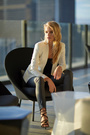
In second year of shooting and looking for feedback. The good, bad and ugly... Thanks in advance Sep 16 16 07:13 pm Link Shooting photos for an artistic wall hanging, or a photographer’s portfolio is more of what these photos bring to mind. As for showcasing a model I’m not so sure. Example:  In this photo you have extremely harsh shadows on the models face, models left hand position is not the most flattering, due to shoulder position she has lost appearance of her neck, hips quite square to camera.  Over ¾ of this photo is not of the model it is mostly walls and windows. Left fore arm of model looks too small, might be due to lens perspective distortion. Bright things will distract viewer’s eyes, in this case you have a bright white tile wall photo right, for me cropping this out would strengthen the models importance in the photo.  Model lacks pose, tighten garment under models right armpit by using clips at back of garment. Harsh shadows on models face. I wish you well Sep 17 16 03:13 pm Link Too much PhotoShop comes to mind as my 1st impression. Sep 18 16 12:30 am Link My first impression is that you could have done so much more with AK Model She is Amazing ! Sep 18 16 12:38 am Link First of all, you are picking some great models to work with. A+ in that department. Think about context for your scenes. Independently, the law library and this dress work well enough, but the combination of this legal/formal setting doesn't make a lot of sense to me with the dress. Not sure what kind of statement or storyline you are trying to create with this scene. Just seems odd to me.  Stylistically, this image is a departure from your other work. It feels too fantasy like in my opinion. You have this gritty location with a refined model, which should work in theory…however, the composite treatment seems artificial. I think you would have done better to keep the gritty feel of the actual factory interior. The light beams are obviously fake and feel like it. You're probably relying too much on filters. Or at least not executing them in an attractive way. I find your boudoir images the most appealing, but the desaturated treatment looks hazy. I'd recommend allowing at least part of the image to reach a full black. Do some homework on boudoir posing. Keep in mind what is taking place in the background. The shot with MoRina has a table next to the bed which seems tilted and out of place.   I think you could use more depth of field in your work, the backgrounds are showing too much and distracting attention away from the model. Keep at it. Sep 18 16 02:54 pm Link Thanks Kris noted! Sep 18 16 03:35 pm Link Blur them and we have masterpieces! Overall pretty cool for a noob! Sep 18 16 03:49 pm Link Looks solid to me and several look great. Sep 18 16 03:51 pm Link The Full-length library image is good. On compositing: You should continue working on compositing but with a direction. If commercial-look at commercial composite retouching. If you're going for art look at artists who successfully do this. I looked at your website and here and there you achieve some interesting selections but the blending and the understanding of lighting are such that there is a feeling of exploration rather than direction in your work at present. On F-stoppers something for you to explore: https://fstoppers.com/post-production/s … eling-5063 Here's some work of David Hill: https://design.tutsplus.com/articles/th … -psd-18665 This was done for a shopping center: http://www.picturecorrect.com/tips/the- … hotograph/ Since you're so interested in composites, this is a commercial photographer's technique guide: https://www.photigy.com/how-to-use-a-mu … -tutorial/ http://blog.topazlabs.com/liquid-commer … avid-lund/ A New York Commercial Photographer: http://www.dalemayphotography.com/ A few creative composites http://petapixel.com/2013/10/25/shootin … oto-cheap/ You may be inspired by this: http://www.picturecorrect.com/tips/ligh … otography/ 18+ Sep 18 16 04:58 pm Link Thanks LA, yes composting is a side project I am still working on. After 2 years Im still finding my path and what have potential in. Thanks for all the links they will be well used! Sep 18 16 06:17 pm Link ty Gerardo, def a compliment your stuff is an inspiration. Compliments! Sep 18 16 06:19 pm Link ty Tony, funny how opinions vary from some very good photographers. Regardeless the feedback both good and bad is welcome in this journey. Sep 18 16 06:20 pm Link Azzano X Photography wrote: A real eye opener is to get your work in front of a art director at a advertising agency. On a website where a nude model wrapped in caution tape with her legs spread wide is considered good... What members say at least most means little. What do published professionals think of your work is key. Not to insult anyone who has given their opinion here. I'm guessing you're paying models. Sounds like your very serious. Join this: http://www.ppa.com/ Take your work to some of their events. Sep 18 16 06:34 pm Link Personally, I liked what I saw. You have the ability to do what a lot of other photographers can't do, which is to capture mood. You also have a nice style that's consistent throughout your shots. Your work needs some refining to be top notch, but you're off to an excellent start. I don't care if a photo is "technically" perfect (i.e. exposure, framing, lighting, etc). I want to see photos that hold my attention and make me want to take a closer look at them. Just from the thumbnails in your portfolio, I knew I wanted to take a closer look at each individual photo. A lot of portfolios on this site don't do that for me. I take a quick glance and know right away I'm not going to be impressed. I imagine any agency or publication looking to hire a photographer is looking for the same thing. Keep up the good work. Sep 19 16 12:21 am Link TY Eros, will work on the "little things" as they say... Sep 19 16 04:46 am Link |