|
Forums >
Photography Talk >
Lower saturation portraits - conventions? Methods?
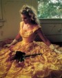
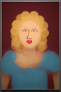
Here's a headshot I just finished. In the process of retouching I happened to accidentally change colorspace and ended up with the lower-saturation version on the right. (But it's not just lower saturation: I can't find a direct way of reproducing it other than to save with ProPhoto-RGB and open with a viewer that applies sRGB. Is there a better word for the rendered effect?) When I saw the version on the right I thought, "Wow, that looks more professional." The subject, however, given both versions, says he thinks the right version makes him look "drained of blood." Of course the customer is always right, but I'm curious for opinions between the two. And in particular whether other portrait shooters: 1. Prefer the version on the right? 2. Have equipment or post-processing habits that tend to produce images with tonality more like that on the right. Edit on 20161019: This version has hue adjustment on the right image. To understand prior discussion the original version with an uncorrected color cast is here.  Oct 16 16 12:22 pm Link It's a little like apples and oranges. There was a slight color shift in the right one so comparing them based on contrast alone is difficult. The issue is really digital added contrast which gives it the look of more sharpness. Mainstream (traditional) portraits were never super sharp, contrasty pictures. They usually were low contrast and sharp but not super sharp. The purpose was to make the person look better and more human, not so a techie would go, "wow, that's really sharp." Even people like Karsh who did a lot of black and white portraiture produced work which had good contrast but were not contrasty. They were sharp but not so sharp you could cut yourself on them. Btw, the one on the right is a really nice monochrome portrait.and to me more human looking. Oct 16 16 12:31 pm Link sweet tea or unsweetened, whats your preference? Oct 16 16 12:36 pm Link I'm just on my phone now, but I would think that a truly accurate version would probably be around 70/30 left/right. Of course, clients will usually prefer the warmer image because they look healthier, and artists will often prefer the colder image because it looks moodier. I like blue myself - especially Schneider blue. Oct 16 16 12:55 pm Link Serves me right for not using a color card on this session. I just went and made sure my Sony body didn't have any enhancement settings turned on. But believe it or not the one on the left is already desaturated from what the camera recorded. Yes, there's a color shift between the two, and the one on the right is, as @VectorOne says, somewhat monochromatic -- like halfway between color and B&W. (Is contrast the thing that's jumping out as the difference, as opposed to saturation?) I can't quite put my finger on why the right one seems more sophisticated to me. Maybe it's because I've never been able to get such a relatively monochromatic gamut before, even though it is common in many of the photos and photographers I admire. Maybe it's because I never worked with color film? If so I guess I'm just advertising my inexperience again.... Oct 16 16 01:01 pm Link My eye is fooled into thinking his skin is tinted green, presumably because cyan and yellow are so high compared to magenta. I wouldn't use the image on the right for that reason. There may be somewhere between the two which leaves his skin looking less 'alien'. Oct 16 16 01:06 pm Link I wouldn't label the right one more "professional". Actually, it looks a little on the green side. The left one one looks a lot more natural and the average client will prefer it. I say this becuase I shoot a lot of headshots and pretty much know what most will like. Artsy? Maybe. For a regular client's headshot? Not so much. Stick with your regular color spaces like AdobeRGB or sRGB. I shoot sRGB all day long. Never a problem. THese days MOST headshot are seen on the web. May as well shoot to that color space. But. That's just me. My colors always look fine. Oct 16 16 01:18 pm Link The one on the right is light bile green. Not attractive. Oct 16 16 01:28 pm Link The right image does not look more professional, at least not on a calibrated EIZO CG275W. What you are looking at is simply a mistake you have made which creates the illusion. That is most probably the result of converting the image to ProPhoto RGB and then assigning sRGB to it which squeezed it in the color space (less saturation) and moved it towards green. In this way the red areas on the skin are less visible and that creates the illusion of it being more professional (i.e. as if the redness has been fixed though it is not). But that is not a correct result and not the right way to do color correction or grading because right now the whole head simply looks greenish. If you take the right image (which is currently sRGB) and assign to it ProPhoto you will see more correct colors. After that simply work to reduce the tiny red spots on the skin. But of course it is best to start from raw and work directly in ProPhoto, then when you are done convert (not assign) to target color space and export. Oct 16 16 01:35 pm Link @anchev - If I'm understanding correctly: The left image does merit further color correction, and the right image is an accidental step (too far) in the right direction? If so, is it because the left image colors appear incorrect (something a color card would ideally fix)? Or is it just that good retouching would not leave the subject with red blotches in the skin? Oct 16 16 02:04 pm Link dbooker wrote: About the left one - yes. About the right one - it is not a step in the right direction because 1) skin looks green 2) it is the result of a technically incorrect process and hence it can't be right. You are simply getting certain impression about it because on this particular image there is pretty much only one color and black. If you try what I explained on an image with richer colors you will end up with something very bad looking. If so, is it because the left image colors appear incorrect (something a color card would ideally fix)? Or is it just that good retouching would not leave the subject with red blotches in the skin? If you are aiming at colorimetric accuracy a color target could certainly help. It can't be ideal as with all measurements there always a certain error (no device is perfect) but of course it can give you a much better starting point for further post processing and consistency for your shoots long term. Certainly the image can benefit from some retouching as not only the skin but the shirt also has areas to fix. Oct 16 16 02:23 pm Link Agreed that this example was achieved by accident, and not by a process one would intentionally follow to correct an image. (And, as others have noted, the actual tint of the right image is too green.) The original question was more along the lines of, "When (if ever) is the more monochromatic tonality characterized by the right image more desirable, and how is it properly achieved?" Again, I don't know why, but personally, there's something about that "compressed tonality" (which I'll call it, for lack of a better term) that seems better to me (+/- some fine-tuning of the tint). In particular, I have often admired portrait and product photos with such "compressed tonality" and looked back at many of my own photos and thought, "Mine have a sort of amateurish saturation to them, but just desaturating doesn't give the same effect as what other people are showing." Oct 16 16 02:45 pm Link There is no really a right answer to what is desirable. It is pretty much up to you. As for the how part - colorimetry is a whole science and the art of color grading follows that. It can't really be put into a recipe or a preset. For this particular image less saturation may work because it is a very simple portrait, nothing extra, just the light interacting with the character. But that surely doesn't mean all images should look more professional desaturated. Look at Lethal Weapon, Top Gun or other movies - quite dense color, not faded at all. Still it looks great. So for a strong image all factors need to work together, not just color itself. Oct 16 16 03:04 pm Link dbooker wrote: Welp, in that case ... Oct 16 16 05:02 pm Link I think when it comes to photos of people in color photography the skin tone is the most important thing. It should be as real and natural as possible. When Kodak produced Vericolor film and now Porta they designed it with the wedding photographer in mind and accurate skin tone rendering was the main priority. Your photo on the left does not look natural to me. He does looked drained. Of course people have a pretty big range of skin tone hues but his looks ash like here. Oct 16 16 05:59 pm Link In another recent thread I mentioned perception is different than reality. Sometimes you have to alter the colors from something that's technically 100% accurate simply because people 'think' of the subject as being a different color. Oct 17 16 05:42 am Link Oct 17 16 06:00 am Link It looks yellow verging on green like a movie monster. Roll the hue -18 degrees and it looks pretty good again. My 2 cents. Oct 18 16 04:42 pm Link I think I understand the look you're trying for in the right, but its not really there. The color you're looking for is more somewhere between a desaturated gold and brown cardboard. It reminds people of sketches on gray/brown paper. It works better if its not a solid black background. Get a roll of storm gray seamless and light it to give a gradient.  Oct 19 16 08:51 am Link Yingwah Productions wrote: Yes, I think you're right. I just went through all the Lightroom Quick-Develop presets, but they're all too extreme. Some more subtle variation of that. I probably just need to desaturate and then play with color balance. Oct 19 16 10:16 am Link Your best bet might be to use HSV or HSL mode. Or duplicate the layer and set the blend on the layer on top to saturation. Either gives more scope for de-saturating without unwanted colour shifts. If you want colour shifts, then experiment and find the separate curves for r g and b that you like. Oct 19 16 11:02 am Link Mike Collins wrote: Eagle Rock Photographer wrote: +3 Oct 19 16 12:05 pm Link Mike Collins wrote: Eagle Rock Photographer wrote: Mark Salo wrote: +4 Oct 19 16 12:22 pm Link The other thing the OP could try is downloading the Nik collection - it's free now. He/she could start by playing with the film emulation collection, which includes low contrast options. Oct 19 16 12:59 pm Link dbooker wrote: Try looking at this on a bunch of different monitors. Oct 19 16 01:42 pm Link Since the color cast on the right version was so distracting I just corrected it by rolling hue a bit (thanks @Augustine!) and updated in the original post. With that out of the way hopefully the effect is more clear: Something like contrast/saturation has been reduced, but at the same time the image has been hardened and cooled. (Really, I'm just guessing at adjectives here. Standardized descriptions of the differences welcome!) If one pixel-peeps the image now one might be tempted to go back for more smoothing. Given the process by which the image on the right was rendered from the image on the left (i.e., just (a) downsampling from another colorspace and then (b) making a hue adjustment) I have a hard time understanding how this was the result, and I haven't found any simple filters or adjustments I can apply to the left the produce a comparable effect. P.S. I also had somehow missed the fact that Nik went free -- thanks @thiswayup! But playing with it I have not yet found any revelations. Oct 19 16 06:32 pm Link dbooker wrote: Now it is too magenta. Oct 20 16 01:28 am Link I'm a contrast / Saturation guy . I like the image on the left. A post referred to monitors, what type of monitor are you using IPS OR LED? even the monitors model # I have an odd feeling that might be a factor. I use the pb279q ips monitor from asus via displayport, then I do a double check on my iphone before posting to instagram. Oct 20 16 09:36 am Link dbooker wrote: You've changed the contrast by changing the luminosity. You're liking the highlight recovery that's happening. Oct 20 16 07:38 pm Link |