|
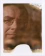
https://www.modelmayhem.com/portfolio/pic/41756894 18+ It's mostly about attitude, and I like it because of that. However, I'm always grateful for opinions and reactions to my work, whether positive or negative. Jan 06 17 05:07 pm Link I mean, technically the photo is really you in terms of being a fairly recognizable style. I'm not sure about the attitude, that wouldn't be what, to me, comes across as being the focus of the image (unlike, say, your avatar, which is very much in-your-face attitude). It may be a lack of context, however, as I haven't seen other images from this shoot. Did her demeanor in this particular shot of her stand out for you? Jan 06 17 06:33 pm Link To me she has a shy quality in this photo. I am missing the attitude you are seeing in it. Jan 06 17 06:59 pm Link For what you do, it's nothing new. Jan 06 17 08:32 pm Link I don't see attitude, I see uncomfortable. The pose isn't very strong and the composition feels a little off. I think it's one of the weaker shots in your portfolio. Jan 06 17 10:52 pm Link Run of the mill. Sadly its very similar to everything else you have. Nothing wrong with a signature style but this is weak tea. Jan 07 17 10:50 am Link It's a very simple portrait as stated above. Jorge light, as I like to call it. Run of the mill? Yes, of course. Not my best work? It doesn't pretend to be. I just liked the awkward pose, the model's expression, and the empty space. She has her own style of attitude. Smaller than my avatar, and very different, but I see it. Just a nice little portrait  Thank you for your thoughts, so far, Jorge Jan 07 17 02:37 pm Link Jorge Kreimer wrote: Well then, nothing else really matters, does it not? Jan 07 17 04:49 pm Link I won't get into the posing or expression since it seems like everyone else has been focusing on that, but regarding the white background, I think it might improve the pic if the space on the right was even to the space on the left, if it were to be cropped slightly. Also, looks like there is a diagonal line on the right side in the background...maybe a wrinkle in the backdrop or a shadow or something? If you could make that part even with what's around it, I think it would help the continuity of the white space. Jan 12 17 06:04 pm Link |