|
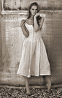
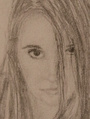
Any thoughts or comments are welcome on these two new uploads: https://www.modelmayhem.com/portfolio/pic/41978313 https://www.modelmayhem.com/portfolio/pic/41977269 Feb 20 17 11:39 pm Link The shot in the forest would probably work better as a black & white. As it is, the darker red at the top of her head draws the viewer's eyes right to it. The green from the leaves and the brown from the tree behind her also demand attention. On top of that (no pun intended) you have this huge dead space above her. It's pointless. Everything basically distracts the viewer from what should be the most captivating part of the image, which is her eyes. Her left eye is in shadow though, so it just sort of blends in to the muddled mess around her. And then her arms are folded in this weird way that give her body/form no easily identifiable shape. I'd say crop in a lot tighter, so the top of her head is closer to the top of the frame, and then lighten her eyes to make them really stand out. Also, crop the bottom just below her tattoo. Convert it to black & white, and you just might salvage the image. Hell, it might even still work as a color photo just by cropping it alone. The second shot is just kind of...there. The composition is dull, with the model near the middle of the frame, and the color tint looks too yellow. Again, you have all this dead space around her, and then you have this little dangling black object at the top of the frame. It's distracting and useless, so just clone it out. The lamp, sofa, and plant in the background also compete for the viewer's attention. Our eyes are normally drawn to the strongest contrast. In this case, the dark lamp on her left and the blown out highlight over her right shoulder are what automatically draw the eyes in. I keep trying to look at her eyes, but find my eyes darting back and forth between the light and dark in the background. Her face needs better lighting. Feb 21 17 01:25 am Link The first image I love...but it could benefit from a few edits. First, there is a lot of dead space above her head that is distracting. I would crop the top down to where her eyes are about a third down from the top of the image, and I would crop the sides in -- particularly the left side -- to keep the original aspect ratio. Second, since this seems to be a mostly top-lit image, her left (right facing) eye is in shadow. This shadow looks natural given the angle of the light source on her hair, so I would caution against removing it completely, however, the eye could stand to be brightened a bit to draw in the viewer's attention. I think the color of the first image is fine how it is, but go ahead and try it in black and white, perhaps with boosted contrast and see what you think. Also, you may like to experiment and see what it looks like in color but with the colors intensified. I'd say the crop and eye edits are necessary, while the color changes should be whatever suits your tastes. The second image I would crop in tight: Left side to the edge of her hair, right side to the edge of her shoulder, top to the top of her head. The dead space around her is distracting. The entire image does seem to have a yellowish hue, but it may be an optical illusion because of the background. After the crop you will better be able to tell if you need to adjust the color. Great photos, thanks for sharing! Feb 21 17 05:29 am Link Hmm -- I have a different take from the other commenters on the first photo. I might have shot it further out, more of a 3/4 or full body shot. But it would be a very different photo at that point. I also agree with the "try it in black and white" and see what you get. If you can still keep the good contrasts, then that could turn it into a more compelling photo. Feb 21 17 08:48 am Link The first image is arresting. However I think it could benefit with some more post production work: something soft and natural. The second image has a lot of lovely golden hues and I think it needs a bolder post production treatment. Feb 21 17 09:18 am Link |