|
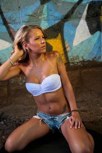
Apr 02 17 08:20 pm Link I don't see the right elbow and half of the left kneecap! The cropping seems to be extremely tight for comfort, almost constricting the model. Post production work with the light (face yellow from artificial light, neck is natural white light) needs to be done. The angular alignment does not flatter me, either! You can do better  Apr 03 17 11:10 am Link I like the yellow light and the posing but I agree the cropping is a little tight. Apr 05 17 12:15 pm Link Aside from what has already been said I feel like the background is too distracting Apr 18 17 08:29 pm Link Bad limbs all around. With both your arms and both your knees the camera needs to "leave space" between them and the edge of the frame. Avoid cropping off the limbs ( out of the picture) . Also leave some space between the arms and the body. This assures that you look thin. If an outfit contrast the skin color significantly you can sometimes get away with not leaving space between your arms and your main body. Elbows are best pointing down toward the ground and moved back more behind you so your face and main body are the center of attention. If the arms or elbows are the closet thing in the frame to the lens of the camera it implies your face and figure are not so important. Apr 22 17 08:40 pm Link As has already been said the cropping isn't good, either make it looser or tighter, be a bit more decisive, but in general not on limb joints. The BG is very distracting either make it darker, or throw it out of focus. But what bothers me the most is the highlight on her nose, its very distracting and shows a lack of attention to detail. All these could be fixed in post. keep these in mind and good luck. Apr 25 17 03:53 pm Link Maybe it's just me. But the bands on both wrist is distracting. I'd put them on one wrist. The lighting across the face. And the background is way too much. May 07 17 04:31 pm Link |


